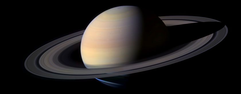
The splash screen font sucks !

The place to discuss creating, porting and modifying Celestia's source code.
ElChristou
Developer
Posts: 3776
Joined: 04.02.2005
With us: 19 years 9 months

Post #161by ElChristou » 30.06.2007, 22:29

I like the soft tone of the pict... (there is some tweacking in PS, no?)

EDIT: Oops, I was looking on another screen with a setting much yellowish... (On a normal screen it's clearly a direct grab...)

Once think one must have in mind is the average screen size; perso I've done the actual splash to be used for an average 1024 screen. This one here seems to be a bit too large for such screen config.

Edit bis :roll:: mine is already a bit too large for a 1024!!
Last edited by ElChristou on 30.06.2007, 22:34, edited 1 time in total.
Image

Avatar
t00fri
Developer
Posts: 8772
Joined: 29.03.2002
Age: 22
With us: 22 years 7 months
Location: Hamburg, Germany

Post #162by t00fri » 30.06.2007, 22:32

While the font looks great, I strongly prefer the original image, including the reversed orientation and closer perspective. Just mor "dynamical" & exciting...

Bye Fridger

Image
Image

dhromed
Posts: 10
Joined: 24.06.2007
With us: 17 years 5 months
Location: Netherlands

Post #163by dhromed » 30.06.2007, 22:37

I upped the saturnation a bit, and tweaked the star field per your earlier suggestion. Much better.

The splash screen's size seems perfectly suitable for 1024.
= zonk =

ElChristou
Developer
Posts: 3776
Joined: 04.02.2005
With us: 19 years 9 months

Post #164by ElChristou » 30.06.2007, 22:52

dhromed wrote:I upped the saturnation a bit, and tweaked the star field per your earlier suggestion. Much better.

The splash screen's size seems perfectly suitable for 1024.


It's ok for a 1024, you can even increase it a bit more, but this is fine for a piece of art, just fine to watch it alone on an empty screen... Now among icons and windows it's another story... Perso I even find mine a bit too obtrusive (for a daily use)...
Image

Avatar
Topic author
Cham M
Posts: 4324
Joined: 14.01.2004
Age: 60
With us: 20 years 10 months
Location: Montreal

Post #165by Cham » 30.06.2007, 23:14

Not bad. But I think I prefer with the semi-translucent bar.

If you want to play with some high-resolution picts of Saturn, with a transparent background for composition and OGL2 shadows, here's a small pack of 6 PNG pictures :

http://nho.ohn.free.fr/celestia/Cham/Divers/saturn.zip (5.1 MB zip file)
"Well! I've often seen a cat without a grin", thought Alice; "but a grin without a cat! It's the most curious thing I ever saw in all my life!"

dhromed
Posts: 10
Joined: 24.06.2007
With us: 17 years 5 months
Location: Netherlands

Post #166by dhromed » 04.07.2007, 17:13

Wholly agree with toofri on the closer zoom. I lost track of that a bit.

Cham, how did you get thos ultra-clean alpha channels? Just using the image as a mask and solidifying Saturn's bulk by hand?

I'll toy with it and have a couple new versions up in a bit.
= zonk =

Avatar
Topic author
Cham M
Posts: 4324
Joined: 14.01.2004
Age: 60
With us: 20 years 10 months
Location: Montreal

Post #167by Cham » 04.07.2007, 17:28

dhromed wrote:Cham, how did you get thos ultra-clean alpha channels? Just using the image as a mask and solidifying Saturn's bulk by hand?


I made a small addon which adds a "green screen" in Celestia. I then take a screenshot with a green background (with stars turned OFF), and erase all the green in Photoshop using the background eraser tool. 8)

Here's the green-screen :

http://nho.ohn.free.fr/celestia/Cham/green_screen.zip (12 KB zip file)

Edit the SSC to place the screen around any object you want. Works great with spaceships too. Of course, you may prefer to edit the .3ds file to change the screen color to blue, or red, depending of the object's main colors. In some cases, green may be inappropriate.

Use it, and you'll feel working for a real movie FX company ! :mrgreen:
It's a pretty efficient technique.
"Well! I've often seen a cat without a grin", thought Alice; "but a grin without a cat! It's the most curious thing I ever saw in all my life!"

dhromed
Posts: 10
Joined: 24.06.2007
With us: 17 years 5 months
Location: Netherlands

Post #168by dhromed » 04.07.2007, 19:27

Hah! When in doubt: hack it yourself.

Splashes go here. http://www.pliv.com/show/celestia/
= zonk =

glcanon
Posts: 11
Joined: 24.08.2007
With us: 17 years 3 months
Location: Houston

Post #169by glcanon » 24.08.2007, 08:38

Some of you folks are plain crazy. If you don't fancy a splash, create one yourself, or modify what's been presented. You'll find creating a good one isn't so easy, even when you know what you like. I've created tons of them for MS Flight Simulator. One fellow created a program which changes the splash each time you start the program, so I have tons.

The name Celestia sounds like a pharmaceutical. Are you having problems sleeping at night? Take the little purple pill, Celestia, and you'll be counting stars in no time (or sheep).

It's really up to the creator to choose a name, logo, and image which incorporates a very specific font. There's all kinds of astronomy software out there, from "Deep Sky," and "Starry Nights," which is a play on Van Gogh's famous painting, to "Redshift," and "Dance of the Planets." I'm not sure Celestia is any better or worse than any other, it just reminds me that TV commercial for the drug Lunesta.

That being said, this is simply a great program; it's hard to knock something that's so nice and so free.

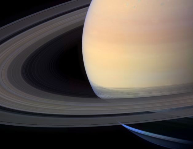
There was an excellent show on TV about Saturn recently, probably Discover channel or PBS, wish I could remember. There were excellent images, computer images as well - simply astounding.

On that note, I'll leave you with a Cassini photo of Saturn: now have at it and have a splash with it:
Image

glcanon
Posts: 11
Joined: 24.08.2007
With us: 17 years 3 months
Location: Houston

Post #170by glcanon » 24.08.2007, 08:45

A couple more for you:

Image

Image

Avatar
t00fri
Developer
Posts: 8772
Joined: 29.03.2002
Age: 22
With us: 22 years 7 months
Location: Hamburg, Germany

Post #171by t00fri » 24.08.2007, 12:54

glcanon wrote:Some of you folks are plain crazy. If you don't fancy a splash, create one yourself, or modify what's been presented. You'll find creating a good one isn't so easy, even when you know what you like. I've created tons of them for MS Flight Simulator. One fellow created a program which changes the splash each time you start the program, so I have tons.

Celestia also can switch splashes at least for certain OS's.

The name Celestia sounds like a pharmaceutical.

That sounds more like a very personal judgement... Look here,
Image

It's really up to the creator to choose a name, logo, and image which incorporates a very specific font.


Don't forget we have quite a number of professional designers
in our community, who master their profession VERY well. I doubt
that you could compete, despite your "tons of splashes". Chris Laurel
is NOT a designer either. In general we tend to make things as well as
we possibly can. Since money is not a factor (unlike the commercial
software you mentioned) this seems like a perfectly sensible approach.

Bye Fridger
Last edited by t00fri on 24.08.2007, 19:27, edited 2 times in total.
Image

Avatar
t00fri
Developer
Posts: 8772
Joined: 29.03.2002
Age: 22
With us: 22 years 7 months
Location: Hamburg, Germany

Post #172by t00fri » 24.08.2007, 18:11

glcanon wrote:Some of you folks are plain crazy.
...
On that note, I'll leave you with a Cassini photo of Saturn: now have at it and have a splash with it:

Image


Certainly most of the local texture experts & developers have your Saturn images already in their data base since end of 2004!

e.g. see also here

http://apod.nasa.gov/apod/ap041225.html

Bye Fridger
Image

glcanon
Posts: 11
Joined: 24.08.2007
With us: 17 years 3 months
Location: Houston

Post #173by glcanon » 24.08.2007, 20:25

Well I've done some logos for companies, but I did it pro bono. A professional is by definition someone who does what they do for a fee or compensation. By that definition I guess I'm not a professional.

Whether to dot an "i" or make it skinny or thick... egads, I wish I had that much time.

Lunesta. Celexa. Celestia. Celebrex. Xanax. Lexapro. Lovenox. Claritin. Coreg. Xanex.

Ask the average person to pick out the drug/name that doesn't belong... wonder how many could do it..

I like the name, but maybe it needs a logo? Or a name/logo combination like the Solaris on the top of this page.

The owner/developer/creator reserves those rights of course. At some point one would think he/they would want to formalize a standard, so that others could incorporate their font/logo, etc..

rthorvald
Posts: 1223
Joined: 20.10.2003
With us: 21 years 1 month
Location: Norway

Post #174by rthorvald » 24.08.2007, 20:31

glcanon wrote:W
I like the name, but maybe it needs a logo? Or a name/logo combination like the Solaris on the top of this page.


It has. Looky here: http://www.celestiaproject.net/celestia/images/logo.jpg

- rthorvald
Image

Avatar
t00fri
Developer
Posts: 8772
Joined: 29.03.2002
Age: 22
With us: 22 years 7 months
Location: Hamburg, Germany

Post #175by t00fri » 24.08.2007, 20:40

glcanon wrote:
The owner/developer/creator reserves those rights of course. At some point one would think he/they would want to formalize a standard, so that others could incorporate their font/logo, etc..


We the Celestia devs collaborate with Chris now since 5.5 years. Just believe me, we all know meanwhile how to arrive at a satisfactory decision about those and other matters.

We have all sorts of experts in the team and tend to exploit this fact to the best of the product.

Bye Fridger
Last edited by t00fri on 24.08.2007, 21:05, edited 1 time in total.
Image

Avatar
Topic author
Cham M
Posts: 4324
Joined: 14.01.2004
Age: 60
With us: 20 years 10 months
Location: Montreal

Post #176by Cham » 24.08.2007, 20:46

t00fri wrote:we all know meanwhile how to arrive at a satisfactory decision about those and other matters.


Tssk ! Tssk ! :?
"Well! I've often seen a cat without a grin", thought Alice; "but a grin without a cat! It's the most curious thing I ever saw in all my life!"

Avatar
t00fri
Developer
Posts: 8772
Joined: 29.03.2002
Age: 22
With us: 22 years 7 months
Location: Hamburg, Germany

Post #177by t00fri » 24.08.2007, 20:48

Cham wrote:
t00fri wrote:we all know meanwhile how to arrive at a satisfactory decision about those and other matters.

Tssk ! Tssk ! :?


:lol: :lol:
Image

rthorvald
Posts: 1223
Joined: 20.10.2003
With us: 21 years 1 month
Location: Norway

Post #178by rthorvald » 24.08.2007, 23:55

The name Celestia sounds like a pharmaceutical. Are you having problems sleeping at night? Take the little purple pill, Celestia, and you'll be counting stars in no time


Yes, well, it might be time to make Celestia more mainstream. Reach the masses, so to speak. Here??s the optimal Splash Screen for this purpose... designed to invoke interest rather than a wish for purple pills. Or both.

Let??s see it in 1.5 final:
Image
(... Not in any way to be taken as if the program is buggy :-D )

- rthorvald

PS to Selden: feel free to move it to purgatory...
Image

ElChristou
Developer
Posts: 3776
Joined: 04.02.2005
With us: 19 years 9 months

Post #179by ElChristou » 25.08.2007, 00:02

rthorvald wrote:PS to Selden: feel free to move it to purgatory...


Why? this one is freaking cool...
BUT, what about a purple alien in the bottom right corner to balance the green one? :wink:
Image

glcanon
Posts: 11
Joined: 24.08.2007
With us: 17 years 3 months
Location: Houston

Post #180by glcanon » 25.08.2007, 06:39

rthorvald, that is genius! But I think your font selection could be better, perhaps in a non-italic bold helvetica :wink: And I'm not sure that's the best selection of all possible hues of hot pink (maybe I need to adjust my monitor)

The scorpion spider makes me think of Scorpius, which I'm sure was your intent. Again, pure genius! But if Celestia is to be the end-all and center of everything, perhaps you should consider substitutting a Kessel (Sagitarius) for Scorpius.

And to be politically correct, the little alien should probably be a color-conglomeration of flesh-tones consisting of white, yellow, black, brown..

Once you make those 4 changes, voila - perfection! Or, if I too may have a little fun:

Image
Last edited by glcanon on 25.08.2007, 14:06, edited 1 time in total.


Return to “Development”