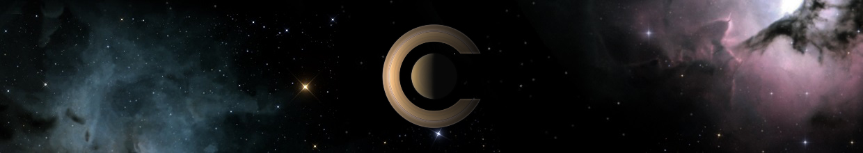
The splash screen font sucks !
Cham wrote:Aaah c'mon Fridger, you must be joking.
I advocate pure, simple and clear things, Zen like aspects for a jewel like Celestia. IMO, "Classy" styles are retrograde, for a modern computer program (we're not talking about an appartment here). In some way, it's looking "amatteur".
Totally disagree. Taking it to the opposite extreme, would you rather see some blocky futuristic "digital clock" style-writing, something "futuristic"? That'd look tacky. Besides, sans serif fonts are generally the ones regarded as "amateur-looking" and informal in printing circles.
Funnily enough, the current text does remind me of sextants and old telescopes (I suspect it's because it's a brass colour) and I think that's entirely appropriate. I think actually the current font makes it stand out a lot more too - everyone and his dog uses Arial, but serif fonts are classier and more formal and impressive.
My Celestia page: Spica system, planetary magnitudes script, updated demo.cel, Quad system
-
ElChristou
- Developer
- Posts: 3776
- Joined: 04.02.2005
- With us: 20 years 3 months
-
 Topic authorCham
- Posts: 4324
- Joined: 14.01.2004
- Age: 60
- With us: 21 years 3 months
- Location: Montreal
Malenfant wrote:Totally disagree. Taking it to the opposite extreme, would you rather see some blocky futuristic "digital clock" style-writing, something "futuristic"? That'd look tacky. Besides, sans serif fonts are generally the ones regarded as "amateur-looking" and informal in printing circles.
Malenfant, you're talking about PRINTED text on paper. I agree that sheriff are important in this case. But here, we are talking about a picture on a computer screen. Not a printed sheet of paper. Standards may NOT be the same ! Sheriffs are often hard to see, or are jagged on screen, because of the lower resolution than what we get on paper, even if the font is acctually pretty large on screen.
And of course, I'm not asking for the opposite extreme ! I'm just asking to remove that kitsch gold/brass finish, and a more modern font, that's all.
"Well! I've often seen a cat without a grin", thought Alice; "but a grin without a cat! It's the most curious thing I ever saw in all my life!"
-
Christophe
- Developer
- Posts: 944
- Joined: 18.07.2002
- With us: 22 years 9 months
- Location: Lyon (France)
It's funny how the more things change, the more they stay the same. We had the exact same argument for the 1.4.1 splash image.
Conservative americans vs modernist europeans...
Being european, I never have a single serif font on my screen, and I certainly wouldn't say that serif fonts look more "professional". Printed materials are another matter entirely.
Conservative americans vs modernist europeans...
Being european, I never have a single serif font on my screen, and I certainly wouldn't say that serif fonts look more "professional". Printed materials are another matter entirely.
Christophe
-
t00fri

- Developer
- Posts: 8772
- Joined: 29.03.2002
- Age: 23
- With us: 23 years 1 month
- Location: Hamburg, Germany
Christophe wrote:It's funny how the more things change, the more they stay the same. We had the exact same argument for the 1.4.1 splash image.
Conservative americans vs modernist europeans...
Being european, I never have a single serif font on my screen, and I certainly wouldn't say that serif fonts look more "professional". Printed materials are another matter entirely.
hi hi,
another one of these "old world" guys speaking up...
Just look at the most bought colors of American cars and their creamy bright pink velvet interiors..
Cheers,
Fridger

-
cartrite

- Posts: 1978
- Joined: 15.09.2005
- With us: 19 years 7 months
- Location: Pocono Mountains, Pennsylvania, USA Greate Grandfother from Irshava, Zakarpattia Oblast Ukraine
What about one of these found here? http://www.celestiaproject.net/forum/viewtopic ... 6012#76012
VivoBook_ASUSLaptop X712JA_S712JA Intel(R) UHD Graphics 8gb ram. Intel(R) Core(TM) i5-1035G1 CPU @ 1.00GHz, 1190 Mhz, 4 Core(s), 8 Logical Processor(s) 8 GB ram. Running on Windows 11 and OpenSuse 15.4
-
chris
- Site Admin
- Posts: 4211
- Joined: 28.01.2002
- With us: 23 years 3 months
- Location: Seattle, Washington, USA
I don't think there's quite as significant a continental basis for preferring serif vs. sans serif fonts as others are suggesting.
My personal preference is for flat text rather than extruded metallic text. I think some of ElChristou's minimal designs are very nice.
The serifed font on the Celestia web page looks very good, and works well with the antique elements on the page. In general, I don't care for serifs for screen fonts. An exception is mathematical notation, which I've never seen look good with sans serif glyphs.
--Chris
-
Starshipwright
- Posts: 78
- Joined: 08.08.2006
- With us: 18 years 8 months
-
Topic authorCham
- Posts: 4324
- Joined: 14.01.2004
- Age: 60
- With us: 21 years 3 months
- Location: Montreal
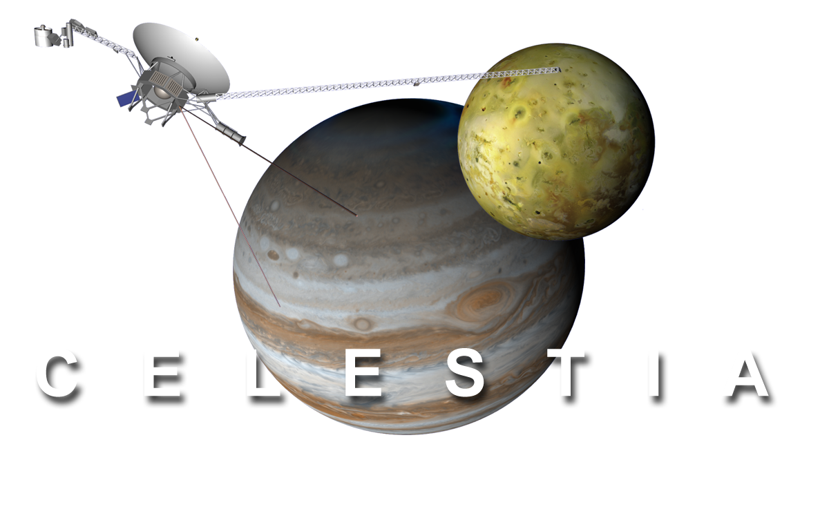
Here's a quick splash I made tonight. It's a bit too big (I have a large screen), but it's so nice to look at. The white font needs to be edited. This is a PNG picture, and all the black space is actually transparent. Take note that the scene depicted is consistent with Celestia's icon.
"Well! I've often seen a cat without a grin", thought Alice; "but a grin without a cat! It's the most curious thing I ever saw in all my life!"
-
Topic authorCham
- Posts: 4324
- Joined: 14.01.2004
- Age: 60
- With us: 21 years 3 months
- Location: Montreal
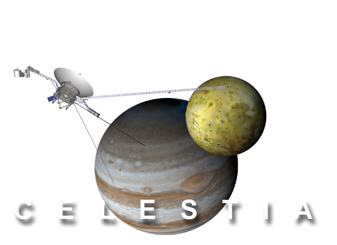
If ppl want to try it, here's a modified version (smaller and well placed for the version number and loading process). Maybe should I add a transparent nebula to the background, or inside the white letters ? Just drag the image from your web browser to your desktop :
"Well! I've often seen a cat without a grin", thought Alice; "but a grin without a cat! It's the most curious thing I ever saw in all my life!"
Well for starters, Jupiter looks upside-down (yes, yes, "there's no up in space", I know, but it's what I'm used to!). And sorry, but the sans serif font looks dire - it's just so *bland*. IMO.
I much prefer the existing splash page graphic too - the view of Europa in the foreground just looks more impressive.
I much prefer the existing splash page graphic too - the view of Europa in the foreground just looks more impressive.
My Celestia page: Spica system, planetary magnitudes script, updated demo.cel, Quad system
-
ElChristou
- Developer
- Posts: 3776
- Joined: 04.02.2005
- With us: 20 years 3 months
Cham wrote:If ppl want to try it, here's a modified version (smaller and well placed for the version number and loading process). Maybe should I add a transparent nebula to the background, or inside the white letters ? Just drag the image from your web browser to your desktop :
You should wait a bit to test this one with my next Voyager...

-
tech2000
- Posts: 258
- Joined: 14.02.2006
- Age: 52
- With us: 19 years 2 months
- Location: Skepplanda, Sweden
tech2000 wrote:ElChristou wrote:As the author of the splash, I must say that the present font was not my first choice, but this has been discuss a long time by the dev team. It's the font used on the official site for the logo...
About the "CELESTIA" at start up, I agree it should be removed.
Everybody is free to propose something else to replace this splash, so guys at your PS and other image editing soft!!
Atleast the font for the splash should be changed since it looks horrible on Windows Vista. By that I mean, It's almost not readable.
Bye, Anders
Seemse like we are not talking about the same font.
The font I'm talking about is the one that shows:
Version v1.4.1
Loading: ...
That font is unreadable in Vista.
bye
-
ElChristou
- Developer
- Posts: 3776
- Joined: 04.02.2005
- With us: 20 years 3 months
Cham, I tested your last splash, but one of the major problem is that this design is very nice on a blanck desktop, but when you have thousands of icons on it + several windows open, the splash become almost unreadable...
This is also a point to meditate, a good splash must be adapted to several habits of use...
Again, it's really frustrating but creativity must be adapted to all those points for a public (massive) distribution...
This is also a point to meditate, a good splash must be adapted to several habits of use...
Again, it's really frustrating but creativity must be adapted to all those points for a public (massive) distribution...
The one problem I have with the current splash is that it's always on top of all the windows. When I click on a window behind it, I can control that window, but the splash screen is still on top. With my new PC it's not so much of an issue, but my old PC took sometimes close to a minute to start up Celestia, and having that splash screen ontop of all the other windows was sometimes annoying. Just my 2 cents 
AMD Athlon X2 4400+; 2GB OCZ Platinum RAM; 320GB SATA HDD; NVidia EVGA GeForce 7900GT KO, PCI-e, 512MB, ForceWare ver. 163.71; Razer Barracuda AC-1 7.1 Gaming Soundcard; Abit AN8 32X motherboard; 600 watt Kingwin Mach1 PSU; Windows XP Media Center SP2;

-
ElChristou
- Developer
- Posts: 3776
- Joined: 04.02.2005
- With us: 20 years 3 months