The splash screen font sucks !

The place to discuss creating, porting and modifying Celestia's source code.
rthorvald
Posts: 1223
Joined: 20.10.2003
With us: 20 years 11 months
Location: Norway

Post #141by rthorvald » 13.05.2007, 15:20

ElChristou wrote:Now we just need to rename Celestia to "C"! :x

... And the EDU version to C++ ...

- rthorvald :D
Image

ElChristou
Developer
Posts: 3776
Joined: 04.02.2005
With us: 19 years 7 months

Post #142by ElChristou » 13.05.2007, 15:46

rthorvald wrote:
ElChristou wrote:Now we just need to rename Celestia to "C"! :x
... And the EDU version to C++ ...

- rthorvald :D


Not bad! :lol:
Image

Avatar
Chuft-Captain
Posts: 1779
Joined: 18.12.2005
With us: 18 years 9 months

Post #143by Chuft-Captain » 14.05.2007, 03:18

rthorvald wrote:
ElChristou wrote:Now we just need to rename Celestia to "C"! :x
... And the EDU version to C++ ...

- rthorvald :D
or C# :)
"Is a planetary surface the right place for an expanding technological civilization?"
-- Gerard K. O'Neill (1969)

CATALOG SYNTAX HIGHLIGHTING TOOLS LAGRANGE POINTS

dhromed
Posts: 10
Joined: 24.06.2007
With us: 17 years 3 months
Location: Netherlands

Post #144by dhromed » 24.06.2007, 16:41

Ello.

I hope I'm not breaching this forum's etiquette by posting in a month point five old thread, but recently fell in love with Celestia, and wanted to do my bit.

As far as the splash goes, I was thinking along the lines of this:

Image

I personally felt that this Saturn image posted way in the beginning had a nice iconic feel to it, as well as capturing what space is about and what Celestia is trying to convey.

I like Christou's dogtag thingy, but I have to say feel it could do with less of that fat shadow and enormous bevel.[/img]
= zonk =

Avatar
Topic author
Cham M
Posts: 4324
Joined: 14.01.2004
Age: 60
With us: 20 years 8 months
Location: Montreal

Post #145by Cham » 24.06.2007, 16:43

Not bad ! Not bad at all ! I like it ! :D

And I agree with you about the fat title with huge bevels.

Could you elaborate ? Maybe you could do a final version (several variations) to propose here ?

EDIT : Experiment a bit with the font spacing. But I think this one is already good.
Last edited by Cham on 24.06.2007, 16:50, edited 1 time in total.
"Well! I've often seen a cat without a grin", thought Alice; "but a grin without a cat! It's the most curious thing I ever saw in all my life!"

Avatar
t00fri
Developer
Posts: 8772
Joined: 29.03.2002
Age: 22
With us: 22 years 6 months
Location: Hamburg, Germany

Post #146by t00fri » 24.06.2007, 16:47

I like it, too!

Close-up views always create "dynamic feelings" and the white letters (of the right font! ;-) ) on semi-transparent ground also look very appealing.

Bye Fridger
Image

ElChristou
Developer
Posts: 3776
Joined: 04.02.2005
With us: 19 years 7 months

Post #147by ElChristou » 24.06.2007, 17:32

dhromed wrote:Ello.

I hope I'm not breaching this forum's etiquette by posting in a month point five old thread, but recently fell in love with Celestia, and wanted to do my bit.

As far as the splash goes, I was thinking along the lines of this:

...


Not bad at all!

I have just a remark concerning the overall equilibrium, the slash tend to be "heavier" on the left be cause of the black corner and less luminous information on the right (the white CELESTIA increase this feeling)

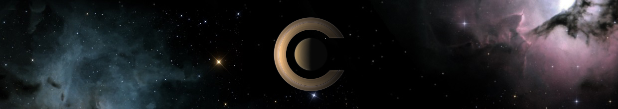
dhromed wrote:I personally felt that this Saturn image posted way in the beginning had a nice iconic feel to it, as well as capturing what space is about and what Celestia is trying to convey.

I like Christou's dogtag thingy, but I have to say feel it could do with less of that fat shadow and enormous bevel.


I'd love to do something with Saturn but my machine don't render the ring's shadows... so I could not explore this kind of stuff...

The shadow on the actual splash is a bit Mac related... :wink:

Welcome to the game, I hope to see some more example of cool splash! (it's time to change the actual one for 1.5)
Image

dhromed
Posts: 10
Joined: 24.06.2007
With us: 17 years 3 months
Location: Netherlands

Post #148by dhromed » 24.06.2007, 18:21

Couple of font variations.

Christou, I see what you mean with the balance of the image, but I don't feel it's bad, and the effect doesn't seem that strong to me. Plus I've always been a sucker for off-balance compositions. I mostly just eyeball these things.

Image
= zonk =

Avatar
Topic author
Cham M
Posts: 4324
Joined: 14.01.2004
Age: 60
With us: 20 years 8 months
Location: Montreal

Post #149by Cham » 24.06.2007, 18:26

Very nice start !

I don't like the seriff fonts, however. The first and last one seems pretty good.

You may try inverting Saturn's orientation, also, for more equilibrium. But I don't feel that bad about this orientation too.
"Well! I've often seen a cat without a grin", thought Alice; "but a grin without a cat! It's the most curious thing I ever saw in all my life!"

dhromed
Posts: 10
Joined: 24.06.2007
With us: 17 years 3 months
Location: Netherlands

Post #150by dhromed » 24.06.2007, 18:34

Hey, that inverted Saturn aint so bad. 8)

Image

Since variation is Good For You, does anyone have more of such pretty crisp space pictures?

Hell, maybe there could be a random selection of such closeups every time Celestia starts. Earth, Jupiter, Mars, Luna, a quasar, Andromeda, Voyager, Cassini etc.
Last edited by dhromed on 24.06.2007, 18:41, edited 1 time in total.
= zonk =

ElChristou
Developer
Posts: 3776
Joined: 04.02.2005
With us: 19 years 7 months

Post #151by ElChristou » 24.06.2007, 18:38

I like options 2 and 4.

Note how the balance is better with the ultra thin font.

Perso I don't like much the pseudo bevel. Perhaps a thin one on the very edge?
Image

Avatar
t00fri
Developer
Posts: 8772
Joined: 29.03.2002
Age: 22
With us: 22 years 6 months
Location: Hamburg, Germany

Post #152by t00fri » 24.06.2007, 18:40

I agree with ElChristou (aka Christophe)

Bye Fridger
Last edited by t00fri on 24.06.2007, 18:42, edited 1 time in total.
Image

Avatar
Topic author
Cham M
Posts: 4324
Joined: 14.01.2004
Age: 60
With us: 20 years 8 months
Location: Montreal

Post #153by Cham » 24.06.2007, 18:41

You should also try to take a screencapture of the same orientation, in Celestia, with the sun light coming from the left.

Experiment with many combinations. It's really an art.
"Well! I've often seen a cat without a grin", thought Alice; "but a grin without a cat! It's the most curious thing I ever saw in all my life!"

dhromed
Posts: 10
Joined: 24.06.2007
With us: 17 years 3 months
Location: Netherlands

Post #154by dhromed » 24.06.2007, 18:51

ElChristou wrote:I like options 2 and 4.

Note how the balance is better with the ultra thin font.

Perso I don't like much the pseudo bevel. Perhaps a thin one on the very edge?


Agreed on the thin font.

There's no bevel going on there. It's a flat 2px border at 25% opacity. I'll try one with a thin bright line.
= zonk =

ElChristou
Developer
Posts: 3776
Joined: 04.02.2005
With us: 19 years 7 months

Post #155by ElChristou » 24.06.2007, 19:14

dhromed wrote:
ElChristou wrote:I like options 2 and 4.

Note how the balance is better with the ultra thin font.

Perso I don't like much the pseudo bevel. Perhaps a thin one on the very edge?

Agreed on the thin font.

There's no bevel going on there. It's a flat 2px border at 25% opacity. I'll try one with a thin bright line.


Right, without looking with attention it looks like a all in one effect...
Image

dhromed
Posts: 10
Joined: 24.06.2007
With us: 17 years 3 months
Location: Netherlands

Post #156by dhromed » 24.06.2007, 20:20

I edited my post on the previous page, but was a bit too late and I think nobody got around to reading it:

I've grabbed a 4K texture of jupiter, and put that in the splash -- as a variation. Looks great.

I was wondering, maybe there could be a random selection of such closeups every time Celestia starts. Earth, Jupiter, Mars, Luna, a quasar, Andromeda, Voyager, Cassini etc.

Image
= zonk =

Avatar
Topic author
Cham M
Posts: 4324
Joined: 14.01.2004
Age: 60
With us: 20 years 8 months
Location: Montreal

Post #157by Cham » 24.06.2007, 20:25

The effect is much less interesting with Jupiter. You should concentrate on Saturn.

A random splash screen at each startup could be fun. But this is really a very low priority among the dev team, I guess.
"Well! I've often seen a cat without a grin", thought Alice; "but a grin without a cat! It's the most curious thing I ever saw in all my life!"

ElChristou
Developer
Posts: 3776
Joined: 04.02.2005
With us: 19 years 7 months

Post #158by ElChristou » 24.06.2007, 20:26

dhromed wrote:...I've grabbed a 4K texture of jupiter, and put that in the splash -- as a variation. Looks great.

I was wondering, maybe there could be a random selection of such closeups every time Celestia starts. Earth, Jupiter, Mars, Luna, a quasar, Andromeda, Voyager, Cassini etc...


Not bad, but if we change, perso I'd like see something else than Jupiter! :wink:

Just a comment for this one, you could perform a better star background by shooting first a simple star background, Jupiter with no stars then recompose under PS... now clearly it's extra work for a tiny detail... :x
Image

Christophe
Developer
Posts: 944
Joined: 18.07.2002
With us: 22 years 2 months
Location: Lyon (France)

Post #159by Christophe » 25.06.2007, 07:42

Cham wrote:A random splash screen at each startup could be fun. But this is really a very low priority among the dev team, I guess.


Actually, that's already available in the KDE version, along with the dynamic setting of the version and loading strings.
Christophe

dhromed
Posts: 10
Joined: 24.06.2007
With us: 17 years 3 months
Location: Netherlands

Post #160by dhromed » 30.06.2007, 21:57

A tweak here, a tweak there.
Slightly thicker variant of Helvetica, plus I decided to drop the translucent white bar altogether. After all, design is about what you can remove. :)

Image
= zonk =


Return to “Development”