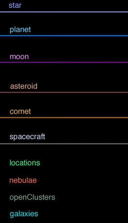
Here's a comparison of both palettes. You'll notice that it's
almost the same set of colors (the colors at the right are a bit more intense, for the ease of reading on screen, especially in the case of planets and locations, since the background may be very different from one case to another).


Now some objective crittics :
In the case of the left palette :
1- The stars labels aren't of the same kind of color as their associated orbit. This is inconsistent with the rest.
2- The stars labels are "vivid" and agressive on screen while in Celestia (yellow on black), especially when many stars labels are shown, even with the transparency effect. Actually, the transparency effect has some problems in the case of yellow on black. It appears ugly on screen.
3- Labels are much harder to read on planets background. As I have shown above, the planet name may be totally unreadable for several cases (Venus, Earth, Uranus, Neptune, and even Jupiter), WITHOUT adding some new "adaptive" code to Celestia.
4- The nebulae and clusters labels are too alike. In Celestia, it's very hard to tell which is which. This isn't good, since nebulae are physically very different in nature than clusters (even if they are DSO objects). They don't have to be in the same "familly" of colors, since it's confusing and kills the usefullness of labels.
5- The galaxies labels are harder to read on screen, as shown above.
6- The planet label/orbit colors are of the same kind as for the openClusters, which is confusing.
In the case of the right palette :
1- Some labels and orbits are a bit too "vivid" and may be "agressive" on screen. This is the case of the Moons labels and orbits, and of the Locations. The Locations need to be "vivid", because of the body's texture (planet, moon), and it's about the same as for the left palette anyway (barely harder to read, since it's just a bit less "vivid"). The Moons labels and orbits need to be changed.
What else ?
Some may say that the asteroids, comets, nebulae and galaxies labels are "vivid", in the case of the right palette. Well, they must take into account the transparency effect, which reduces considerably that intensity (especially in the case of the galaxies). So I don't think that we could consider these labels as "vivid", while in Celestia.
A good compromise could be to use the Moons labels/orbits from the left palette into the right palette. I will test this to see if there isn't any conflict with other similar colors (stars and openClusters in the right palette).
"Well! I've often seen a cat without a grin", thought Alice; "but a grin without a cat! It's the most curious thing I ever saw in all my life!"


