"Pegasus"
[
[ "Epsilon Peg" "Theta Peg" "Zeta Peg" "Xi Peg" "Alpha Peg" "Gamma Peg" "Alpha Peg" ]
[ "Kappa Peg" "Iota Peg" "Eta Peg" "Beta Peg" "Mu Peg" "Lambda Peg" "9 Peg" ]
[ "Alpha Peg" "Beta Peg" ]
]
Orbits and Labels colors
-
Vincent
- Developer
- Posts: 1356
- Joined: 07.01.2005
- With us: 19 years 10 months
- Location: Nancy, France
The line between Alpha Peg (Algenib) and Gamma Peg (Markab) is drawn twice. This is confirmed in the declaration of Pegasus in asterism.dat:
@+
Vincent
Celestia Qt4 SVN / Celestia 1.6.1 + Lua Edu Tools v1.2
GeForce 8600 GT 1024MB / AMD Athlon 64 Dual Core / 4Go DDR2 / XP SP3
Vincent
Celestia Qt4 SVN / Celestia 1.6.1 + Lua Edu Tools v1.2
GeForce 8600 GT 1024MB / AMD Athlon 64 Dual Core / 4Go DDR2 / XP SP3
-
Vincent
- Developer
- Posts: 1356
- Joined: 07.01.2005
- With us: 19 years 10 months
- Location: Nancy, France
Cham wrote:Vincent,
could you correct it and submit it to CVS ?
Yes, that's what I was about to do...
This should be fixed in CVS in a few minutes...
@+
Vincent
Celestia Qt4 SVN / Celestia 1.6.1 + Lua Edu Tools v1.2
GeForce 8600 GT 1024MB / AMD Athlon 64 Dual Core / 4Go DDR2 / XP SP3
Vincent
Celestia Qt4 SVN / Celestia 1.6.1 + Lua Edu Tools v1.2
GeForce 8600 GT 1024MB / AMD Athlon 64 Dual Core / 4Go DDR2 / XP SP3
- t00fri
- Developer
- Posts: 8772
- Joined: 29.03.2002
- Age: 22
- With us: 22 years 7 months
- Location: Hamburg, Germany
Vincent wrote:The line between Alpha Peg (Algenib) and Gamma Peg (Markab) is drawn twice. This is confirmed in the declaration of Pegasus in asterism.dat:"Pegasus"
[
[ "Epsilon Peg" "Theta Peg" "Zeta Peg" "Xi Peg" "Alpha Peg" "Gamma Peg" "Alpha Peg" ]
[ "Kappa Peg" "Iota Peg" "Eta Peg" "Beta Peg" "Mu Peg" "Lambda Peg" "9 Peg" ]
[ "Alpha Peg" "Beta Peg" ]
]
I made asterisms.dat a long time ago. I cannot see a thick line on my screen due to the going forth and back from alpha to gamma. Anyway, one may skip the last "Alpha Peg" and things work the same on my screen. So if Vincent wants to commit it, please...
Bye Fridger
-
Vincent
- Developer
- Posts: 1356
- Joined: 07.01.2005
- With us: 19 years 10 months
- Location: Nancy, France
t00fri wrote:Anyway, one may skip the last "Alpha Peg" and things work the same on my screen. So if Vincent wants to commit it, please...
This is now fixed in CVS.
@+
Vincent
Celestia Qt4 SVN / Celestia 1.6.1 + Lua Edu Tools v1.2
GeForce 8600 GT 1024MB / AMD Athlon 64 Dual Core / 4Go DDR2 / XP SP3
Vincent
Celestia Qt4 SVN / Celestia 1.6.1 + Lua Edu Tools v1.2
GeForce 8600 GT 1024MB / AMD Athlon 64 Dual Core / 4Go DDR2 / XP SP3
- t00fri
- Developer
- Posts: 8772
- Joined: 29.03.2002
- Age: 22
- With us: 22 years 7 months
- Location: Hamburg, Germany
As to ElChristou's label colors, I have several comments after looking more closely at his colors now at home:
1) The blue planet label color is INVISIBLE in case of blue Neptune! And badly visible in case of Jupiter (cloud belts...)
2) While the blue of the clusters is very nice in the present parameter setting of my new label code that Cham favorises so far, the transition to intensive color is too slow to be well readable.
Please note: unlike galaxies where the differences of distances are partly VERY large, in case of clusters most from Selden's database are from a narrow strip near the Orion arm in our Milky way, in which also the Sun is located. So it seems to me that we must tune my parameters in the code such that within much shorter distance ranges the transition takes place from invisible to untransparent!
To simply try out what I mean make a simple hack and check:
substitute in the line (near 7241)
Note this is not to be final code, but just a simple hack to play with a faster transition as function of distance.
Let me also encourage everyone NOT to use older versions of render.cpp! Please update first from CVS before making changes in render.cpp. Otherwise, I have to incorporate all proposed changes for testing tediously by hand into the actual render.cpp, which is error prone and takes unnecessary time!
Bye Fridger
1) The blue planet label color is INVISIBLE in case of blue Neptune! And badly visible in case of Jupiter (cloud belts...)
2) While the blue of the clusters is very nice in the present parameter setting of my new label code that Cham favorises so far, the transition to intensive color is too slow to be well readable.
Please note: unlike galaxies where the differences of distances are partly VERY large, in case of clusters most from Selden's database are from a narrow strip near the Orion arm in our Milky way, in which also the Sun is located. So it seems to me that we must tune my parameters in the code such that within much shorter distance ranges the transition takes place from invisible to untransparent!
To simply try out what I mean make a simple hack and check:
substitute in the line (near 7241)
Code: Select all
           renderer->addLabel(dsoDB->getDSOName(dso),
                              Color(c.red(),c.green(),c.blue(),distr),
                              Point3f(relPos.x, relPos.y, relPos.z));
Code: Select all
distr -> distr * distr * distr
Note this is not to be final code, but just a simple hack to play with a faster transition as function of distance.
Let me also encourage everyone NOT to use older versions of render.cpp! Please update first from CVS before making changes in render.cpp. Otherwise, I have to incorporate all proposed changes for testing tediously by hand into the actual render.cpp, which is error prone and takes unnecessary time!
Bye Fridger
-
Topic authorCham

- Posts: 4324
- Joined: 14.01.2004
- Age: 60
- With us: 20 years 10 months
- Location: Montreal
I don't like ElChristou's palette for several reasons.
He changed the colors of the constellations and the asterisms. I don't agree with his choice. The original colors are better, IMO. See this example :
My palette with original constellations and asterisms :
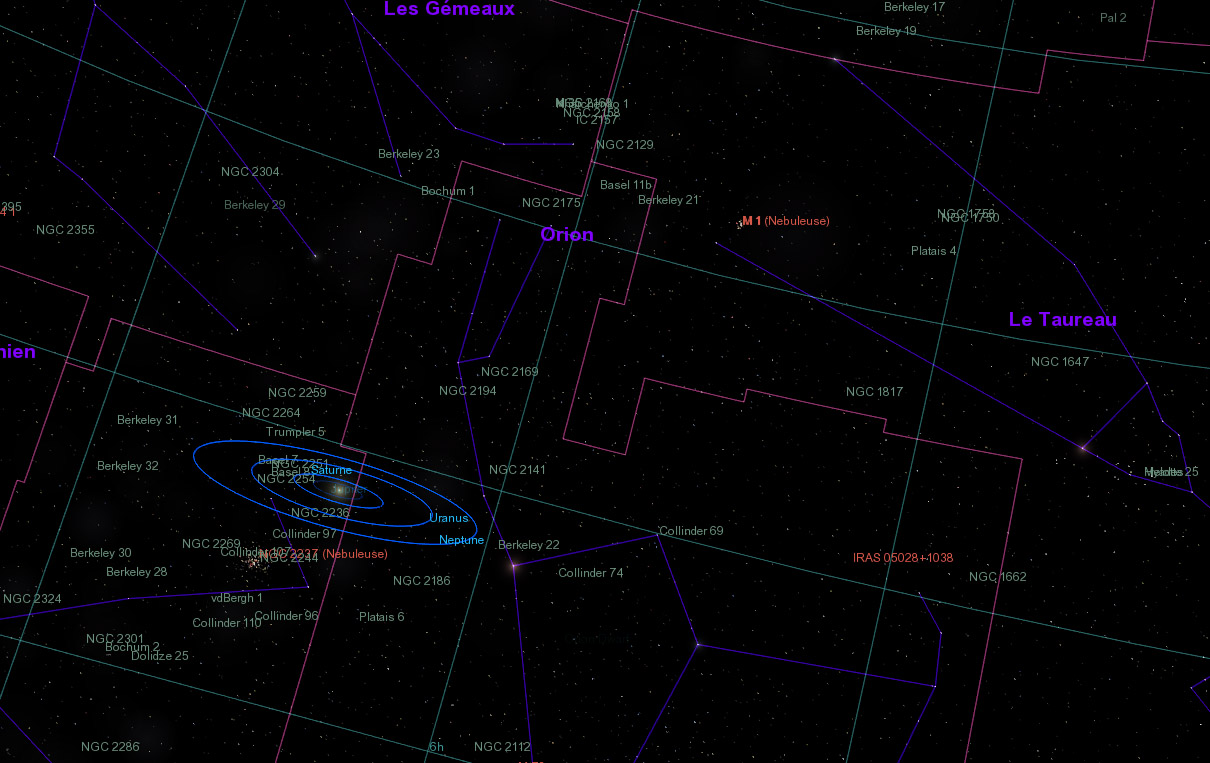
ElChristou's palette :
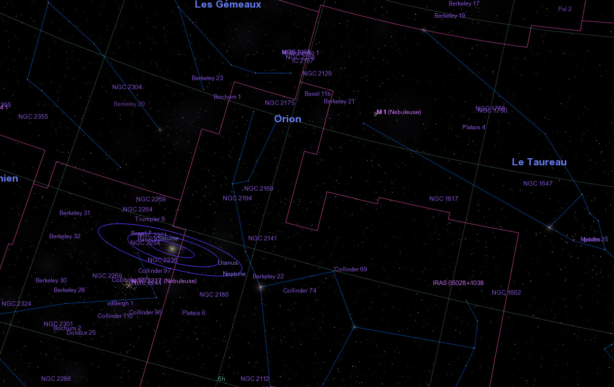
I like better HIS grid, however (more subtle).
Here's another example :
My palette (with original default constellations and asterisms) :
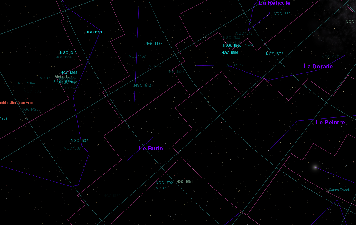
ElChristou's palette :
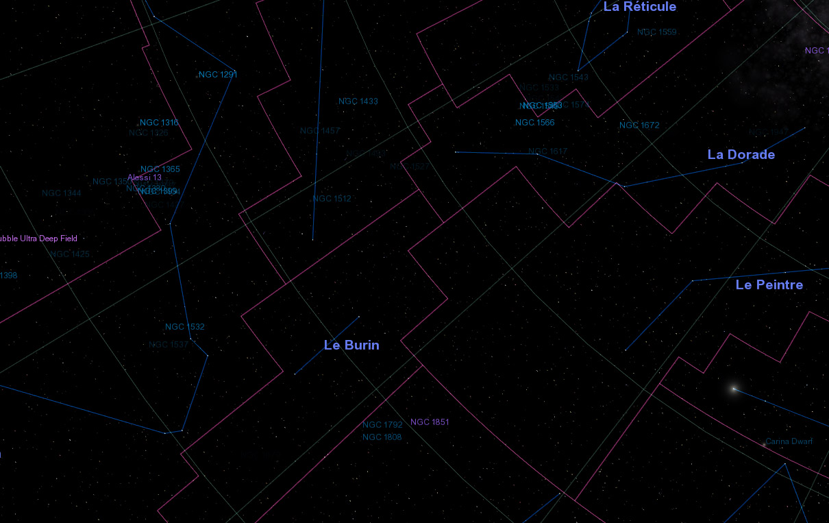
A third example with the solar system. Notice that I use the original color for the planet orbits.
My palette (with original planet orbits) :
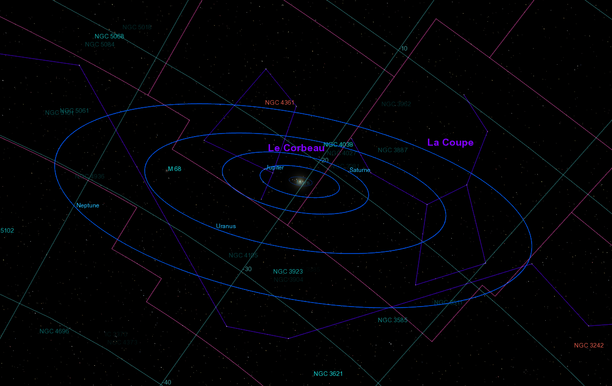
ElCristou's palette :
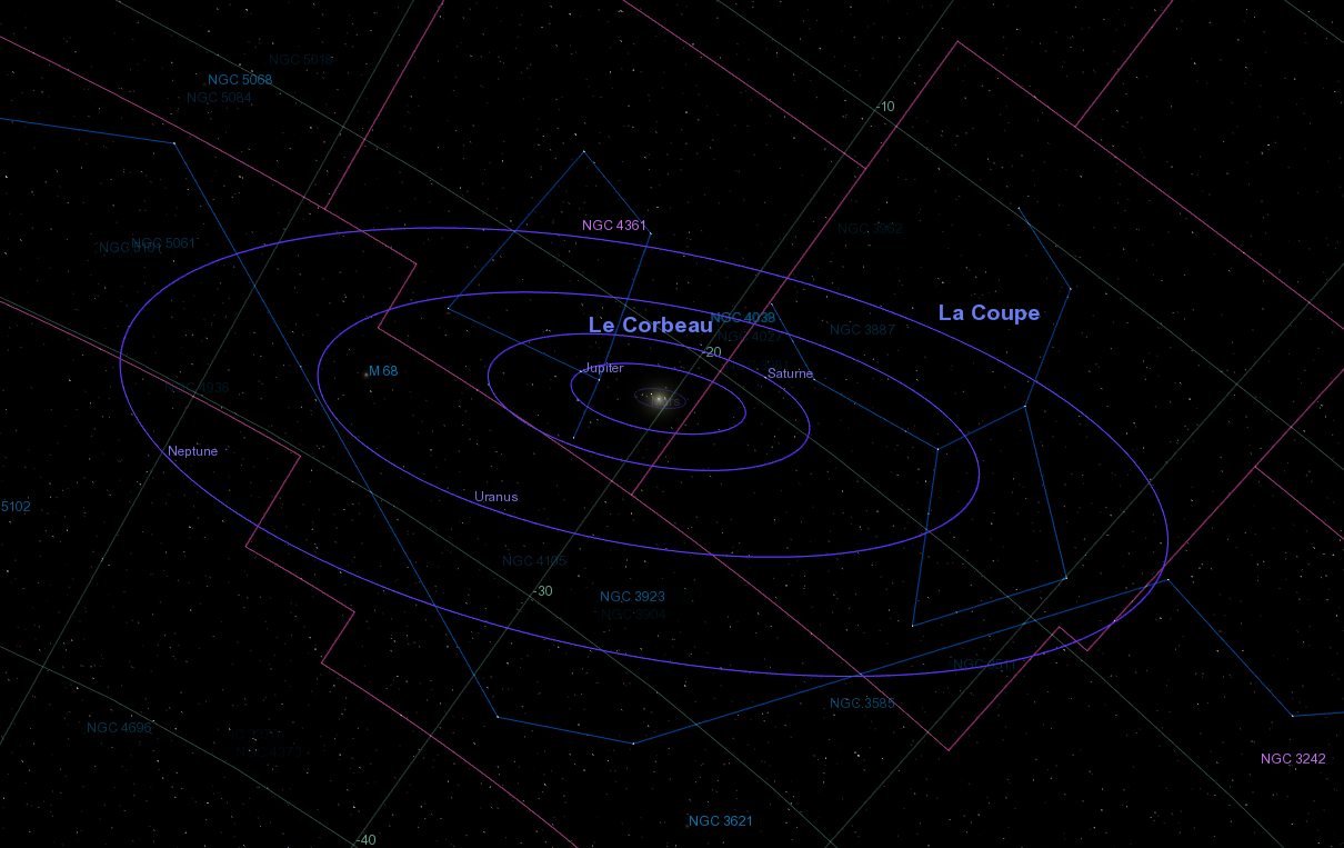
I think these pictures shows clearly that my palette is offering a clearer view.
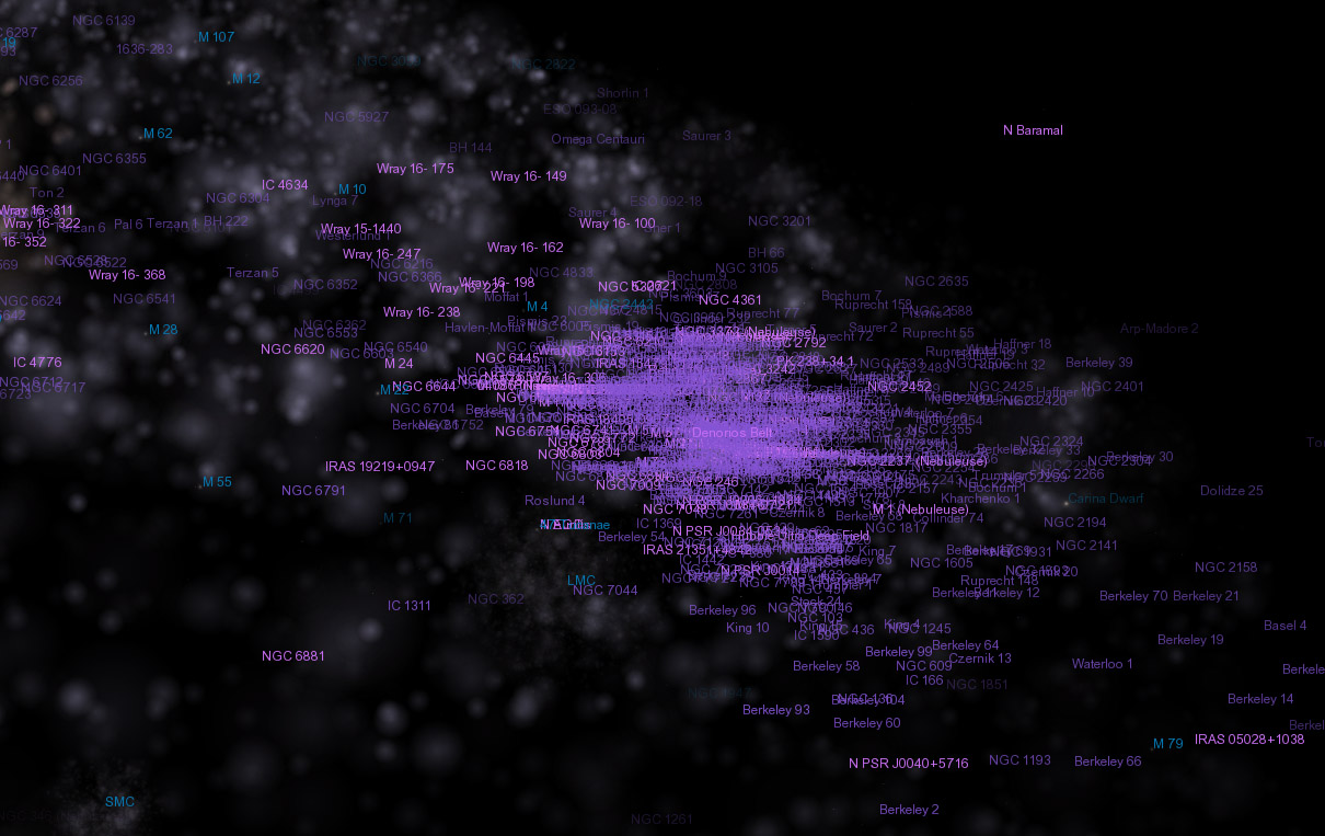
Also, ElChristou's palette makes difficult the distinction between nebulas and clusters (which are really different things). Here's an example :
My palette (corrected by Fridger) :
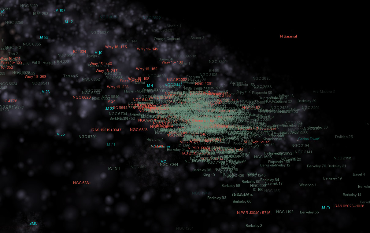
ElChristou's palette (hard to tell which are the nebulas) :
ElChristou's stars labels are also too vivid. If you're showing more stars on the screen, it's even becoming pretty agressive. Here's an example :
My palette (I'm actually using the default original color) :
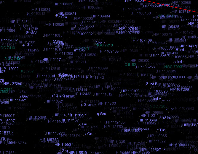
ElChristou's palette :
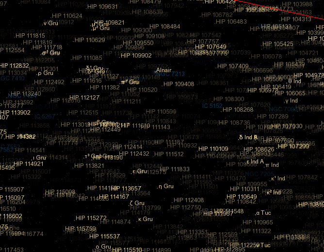
ElChristou's galaxies are harder to identify. I think Fridger's original color is better.
The nebulas color I'm using in my palette is also justified by the fact that many nebulas are actually red.
The only thing which remains to be fined tuned, in my palette, are the comets labels and orbits colors, which are a bit too vivid for my taste. The moons could also be fine-tuned a bit.
He changed the colors of the constellations and the asterisms. I don't agree with his choice. The original colors are better, IMO. See this example :
My palette with original constellations and asterisms :

ElChristou's palette :

I like better HIS grid, however (more subtle).
Here's another example :
My palette (with original default constellations and asterisms) :

ElChristou's palette :

A third example with the solar system. Notice that I use the original color for the planet orbits.
My palette (with original planet orbits) :

ElCristou's palette :

I think these pictures shows clearly that my palette is offering a clearer view.
Also, ElChristou's palette makes difficult the distinction between nebulas and clusters (which are really different things). Here's an example :
My palette (corrected by Fridger) :

ElChristou's palette (hard to tell which are the nebulas) :

ElChristou's stars labels are also too vivid. If you're showing more stars on the screen, it's even becoming pretty agressive. Here's an example :
My palette (I'm actually using the default original color) :

ElChristou's palette :

ElChristou's galaxies are harder to identify. I think Fridger's original color is better.
The nebulas color I'm using in my palette is also justified by the fact that many nebulas are actually red.
The only thing which remains to be fined tuned, in my palette, are the comets labels and orbits colors, which are a bit too vivid for my taste. The moons could also be fine-tuned a bit.
Last edited by Cham on 19.06.2007, 18:17, edited 1 time in total.
"Well! I've often seen a cat without a grin", thought Alice; "but a grin without a cat! It's the most curious thing I ever saw in all my life!"
- t00fri
- Developer
- Posts: 8772
- Joined: 29.03.2002
- Age: 22
- With us: 22 years 7 months
- Location: Hamburg, Germany
While Elchristou's colors are undoubtedly more pleasing for my artistic soul  , Cham's are more functional. No doubt.
Question: is there a compromise??
I definitely like my original galaxy color, I must confess.
Bye Fridger
Question: is there a compromise??
I definitely like my original galaxy color, I must confess.
Bye Fridger
Last edited by t00fri on 19.06.2007, 18:30, edited 1 time in total.
-
Topic authorCham

- Posts: 4324
- Joined: 14.01.2004
- Age: 60
- With us: 20 years 10 months
- Location: Montreal
I think functionality is more important, especially for a professional astronomy tool. We must be able to identify things with ease.
ElChristou's grid is bettter (more subtle), so we could use his color.
My palette needs some fine-tuning for the comets, and maybe the moons, and that's all.
EDIT : I also found that the 3D feel of labels (especially with transparency) is less obvious with ElChristou's palette. Everything looks like "flat", like a drawing on a sheet. My palette is offering a clearer view of the 3D distribution.
"Well! I've often seen a cat without a grin", thought Alice; "but a grin without a cat! It's the most curious thing I ever saw in all my life!"
-
Topic authorCham

- Posts: 4324
- Joined: 14.01.2004
- Age: 60
- With us: 20 years 10 months
- Location: Montreal
t00fri wrote:Cham,
but I bet, your planet labels are ALSO invisible on Neptune!?
It's visible here :
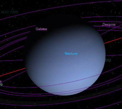
Here's a similar view with ElChristou's palette :
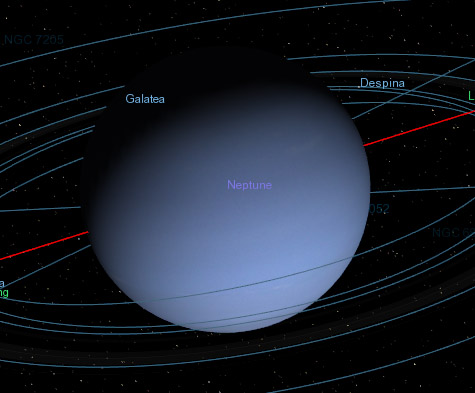
Notice also the difference for the galaxies labels. Almost invisible in ElChristou's palette. I think I like better the moons with my palette (notice the confusion with Neptune, with ElChristou's palette).
"Well! I've often seen a cat without a grin", thought Alice; "but a grin without a cat! It's the most curious thing I ever saw in all my life!"
Well, in this thread I have seen a lot of colour palettes proposals, each one with defects and qualities.
But it looks like all the authors prefer their own work to all the others one.
And the problem is exactly this, the fact that colours are obviously a matter of scientific clearness of different classes of objects, but it?€™s too simplicity, visibility AND (in capital letters!), a matter of taste.
And here I'm going back to my old doubt: ALL software have a long list of "aesthetic" settings, allowing each final user to self determine what is closer to his own feeling on how the screen should appear, so that it will be satisfactory for his monitor type and quality, his eyes capabilities and, last but not least, his personal taste on colours.
Just e.g, personally I hate colours from lilac to magenta and violet, I find them unpleasant (but it's only a matter of taste, obviously, and probably true only for me).
So, Chris, Fridger, Christophe and all the developers, why don't you eliminate all this empty chattering and working, where each of the developers will use his own product, and all the other people will be obliged to use something that, chosen by other people, probably will not satisfy them?
A change in celestia.cfg could make everyone happy and free in his colours choice.
And this is equally valid for a lot of settings that actually are not possible (like the impossibility to choose up to what distance the orbits-globes-labels will be visible).
My little cent.
Bye
Andrea
"Something is always better than nothing!"
HP Omen 15-DC1040nl- Intel® Core i7 9750H, 2.6/4.5 GHz- 1TB PCIe NVMe M.2 SSD+ 1TB SATA 6 SSD- 32GB SDRAM DDR4 2666 MHz- Nvidia GeForce GTX 1660 Ti 6 GB-WIN 11 PRO
HP Omen 15-DC1040nl- Intel® Core i7 9750H, 2.6/4.5 GHz- 1TB PCIe NVMe M.2 SSD+ 1TB SATA 6 SSD- 32GB SDRAM DDR4 2666 MHz- Nvidia GeForce GTX 1660 Ti 6 GB-WIN 11 PRO
-
Topic authorCham

- Posts: 4324
- Joined: 14.01.2004
- Age: 60
- With us: 20 years 10 months
- Location: Montreal
Andrea,
this is all about the next DEFAULT palette. So it has to be done, even if the developpers adds the preferences options in the .cfg file.
And we need to pass OVER the personnal taste here (you don't like lilas, he doesn't like green, I doesn't like this or that color...). Functionality is of prime importance here, so it's the first constraint.
"Well! I've often seen a cat without a grin", thought Alice; "but a grin without a cat! It's the most curious thing I ever saw in all my life!"
- t00fri
- Developer
- Posts: 8772
- Joined: 29.03.2002
- Age: 22
- With us: 22 years 7 months
- Location: Hamburg, Germany
ANDREA wrote:So, Chris, Fridger, Christophe and all the developers, why
don't you eliminate all this empty chattering and working,
where each of the developers will use his own product, :
My little cent.
Bye
Andrea
Andrea,
sorry, but honestly I think your critique does not do justice to the
hard amount of creative work that has been done and
discussed during the last couple of days in this thread.
Finding the right palette of label colors and the right
parameters in my label fading code is a quite complex task!
Throughout, there are compromises to make between
(objective) rules of color matching, artistic feelings and
functionality.
It is quite admissible and CERTAINLY not empty talking, if
some personal preferences are underligned by the people
concerned.
Altogether, I am convinced, we have made substantial
progress already. These discussions MUST be tedious
otherwise we have little chance of truely finding out the
OVERALL best solution.
Bye Fridger
-
Topic authorCham

- Posts: 4324
- Joined: 14.01.2004
- Age: 60
- With us: 20 years 10 months
- Location: Montreal
It is not so bad. I can still read it clearly.
With ElChristou's palette, it's completelly washed out :
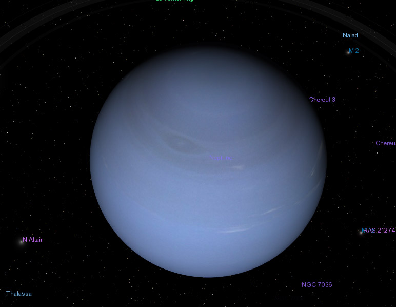
I also tried with several textures, to see if there can be a difference.
With ElChristou's palette, it's completelly washed out :

I also tried with several textures, to see if there can be a difference.
Last edited by Cham on 19.06.2007, 19:36, edited 1 time in total.
"Well! I've often seen a cat without a grin", thought Alice; "but a grin without a cat! It's the most curious thing I ever saw in all my life!"
-
ElChristou
- Developer
- Posts: 3776
- Joined: 04.02.2005
- With us: 19 years 9 months
-
ElChristou
- Developer
- Posts: 3776
- Joined: 04.02.2005
- With us: 19 years 9 months


