Orbits and Labels colors
-
Topic authorCham

- Posts: 4324
- Joined: 14.01.2004
- Age: 60
- With us: 21 years 1 month
- Location: Montreal
Done. It works. A very small glitch still remains (I've probably experienced it before but never caired to report it). The jump in luminosity is very small, almost unperceptible, but it's there. Maybe a rounded value ?
Anyway, have a nice sleep Fridger. I will continue to test the build.
Anyway, have a nice sleep Fridger. I will continue to test the build.
"Well! I've often seen a cat without a grin", thought Alice; "but a grin without a cat! It's the most curious thing I ever saw in all my life!"
- t00fri
- Developer
- Posts: 8772
- Joined: 29.03.2002
- Age: 22
- With us: 22 years 10 months
- Location: Hamburg, Germany
Actually, I think the daylight visibility of the labels is related to what Frank (fsgregs) just reported in the thread above this one: The zenit sky in 1.5.0pre3 at daytime seems to be way too dark 3m above ground??? I can reproduce Franks observations! It was not like this before 1.5.0pre3.
Bye Fridger
Bye Fridger
-
Topic authorCham

- Posts: 4324
- Joined: 14.01.2004
- Age: 60
- With us: 21 years 1 month
- Location: Montreal
I solved my Orion nebula blinking problem. Adding a magnitude to the DSC definition was the cause. Apparently, the magnitude is interfering with the label and model rendering. Maybe this is a clue for something deeper in the code ?
MAD SCIENTIST EXPERIMENT II
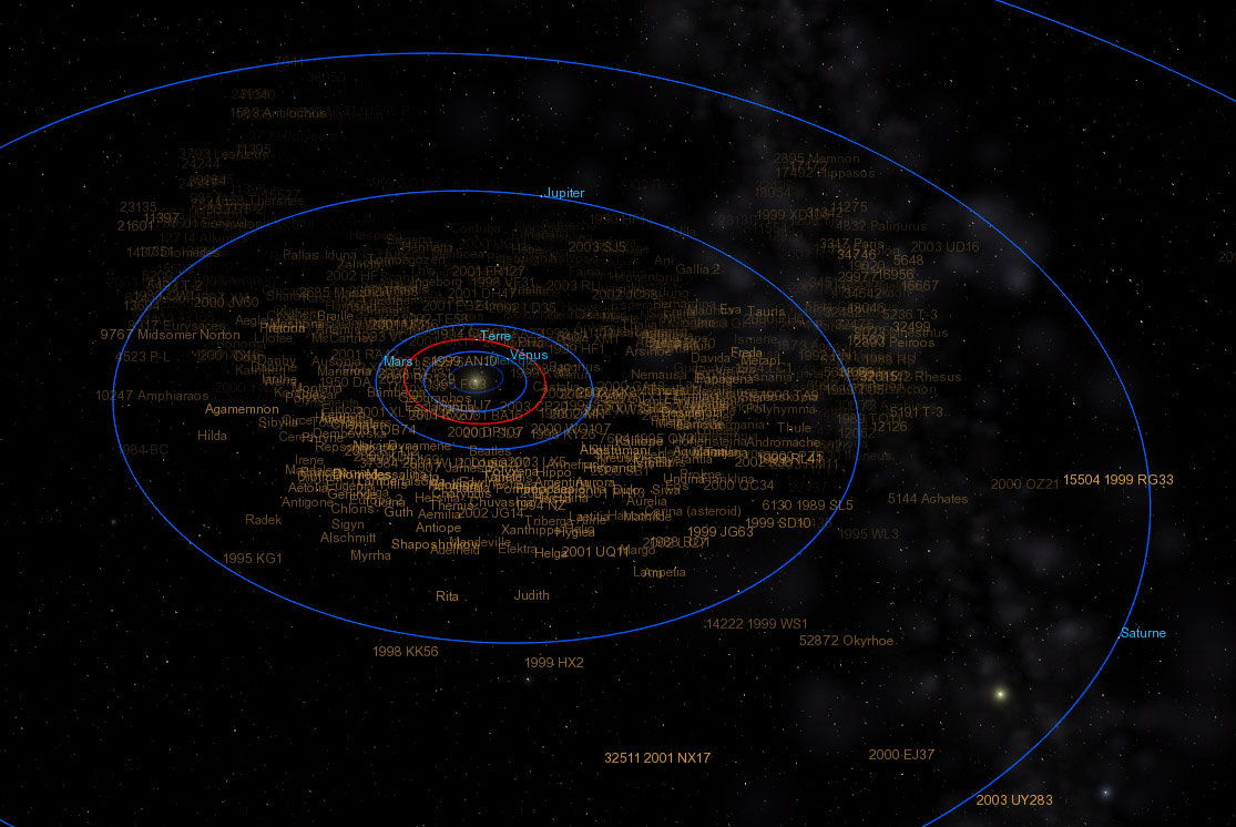
I hacked the code to add some transparency effect to the asteroids ! It works (well, okay, this is just a test to watch the color fading, so don't hurt me !). My code isn't taking the FOV into account, and not even the asteroid size. And the fading scale isn't even right :

"Well! I've often seen a cat without a grin", thought Alice; "but a grin without a cat! It's the most curious thing I ever saw in all my life!"
- t00fri
- Developer
- Posts: 8772
- Joined: 29.03.2002
- Age: 22
- With us: 22 years 10 months
- Location: Hamburg, Germany
Cham wrote:I solved my Orion nebula blinking problem. Adding a magnitude to the DSC definition was the cause. Apparently, the magnitude is interfering with the label and model rendering. Maybe this is a clue for something deeper in the code ?
I had taken out again the AbsMag entry from that add-on. But going attentively arround the nebulas several times there was NOTHING abnormal...What should I do to confirm that problem??
Bye Fridger
-
Topic authorCham

- Posts: 4324
- Joined: 14.01.2004
- Age: 60
- With us: 21 years 1 month
- Location: Montreal
You did tried to rotate around the nebula with a magnitude defined in the DSC file ? In my case, adding a magnitude makes the model (and its label) to "blink".
Oh, and you are already up !?
Oh, and you are already up !?
"Well! I've often seen a cat without a grin", thought Alice; "but a grin without a cat! It's the most curious thing I ever saw in all my life!"
- t00fri
- Developer
- Posts: 8772
- Joined: 29.03.2002
- Age: 22
- With us: 22 years 10 months
- Location: Hamburg, Germany
Cham wrote:You did tried to rotate around the nebula with a magnitude defined in the DSC file ? In my case, adding a magnitude makes the model (and its label) to "blink".
Oh, and you are already up !?
It's all the same here, with and without AbsMag entry. Did you perhaps make typo when entering magnitude?
Oh yes, 6h20 is my regular needed time.
Bye Fridger
PS: and if you want a strong distance dependence of the labels with barely any overlap, try
distr -> distr * distr * distr
in the Color transparency entry.
-
Topic authorCham

- Posts: 4324
- Joined: 14.01.2004
- Age: 60
- With us: 21 years 1 month
- Location: Montreal
t00fri wrote:It's all the same here, with and without AbsMag entry. Did you perhaps make typo when entering magnitude?
I don't think so, or else the DSC file wont be recognised by Celestia. What magnitude did you used ?
"Well! I've often seen a cat without a grin", thought Alice; "but a grin without a cat! It's the most curious thing I ever saw in all my life!"
-
Topic authorCham

- Posts: 4324
- Joined: 14.01.2004
- Age: 60
- With us: 21 years 1 month
- Location: Montreal
t00fri wrote:AbsMag -4.1 for M42
Very strange. Adding this magnitude makes the label to blink.
Fridger, what do you think of the idea to make the selection label to be drawn in red ? Imagine you have a huge amount of asteroids, then select one and its label is contrasted in red. It could help to locate it in the crowd, with or without the markers enabled. To be consistent, this feature should be general and working on any object (planets, asteroids, comets, moons, galaxies, etc). I'm not sure it would be a good feature, so that's why I'm asking.
"Well! I've often seen a cat without a grin", thought Alice; "but a grin without a cat! It's the most curious thing I ever saw in all my life!"
- t00fri
- Developer
- Posts: 8772
- Joined: 29.03.2002
- Age: 22
- With us: 22 years 10 months
- Location: Hamburg, Germany
Cham wrote:t00fri wrote:AbsMag -4.1 for M42
Very strange. Adding this magnitude makes the label to blink.
Fridger, what do you think of the idea to make the selection label to be drawn in red ? Imagine you have a huge amount of asteroids, then select one and its label is contrasted in red. It could help to locate it in the crowd, with or without the markers enabled. To be consistent, this feature should be general and working on any object (planets, asteroids, comets, moons, galaxies, etc). I'm not sure it would be a good feature, so that's why I'm asking.
The red label idea sounds interesting. I'm not sure whether it would range high on my present task list, though. Unfortunately, these days, I am very busy professionally, whence I tend to only have time for Celestia after 12+ hours, while being pretty 'worked out' ...So more serious coding work is out of the question, during the week.
Bye Fridger
-
Topic authorCham

- Posts: 4324
- Joined: 14.01.2004
- Age: 60
- With us: 21 years 1 month
- Location: Montreal
How do we call for an object size, in the code ? Is there a special function for that ? I want to test the asteroids labels dependant on distance (easy) and also on size. It should be dependant on FOV too, but I don't know how to do that.
"Well! I've often seen a cat without a grin", thought Alice; "but a grin without a cat! It's the most curious thing I ever saw in all my life!"
-
Topic authorCham

- Posts: 4324
- Joined: 14.01.2004
- Age: 60
- With us: 21 years 1 month
- Location: Montreal
MAD SCIENTIST EXPERIMENT III 
I've found a nicely looking transparency effect over distance which gives a real impression of depth in the solar system, for both the comets and asteroids. My code isn't right since it doesn't take into account the size nor the FOV, but it's nice to see anyway :
In brief, I used the alpha function C * Log10(1 + exp(- d/a)), where a = 53.5 AU defines a "decay" scale and C is just a normalisation constant (C = 1/Log10(2))
Here's a preview for the asteroids :
Here's a similar view for the comets :
Moving inside the solar system is very nice. You can feel the spatial distribution of asteroids and comets.
I've found a nicely looking transparency effect over distance which gives a real impression of depth in the solar system, for both the comets and asteroids. My code isn't right since it doesn't take into account the size nor the FOV, but it's nice to see anyway :
Code: Select all
case Body::Asteroid:
                    if ((labelMode & AsteroidLabels) != 0)
                    {
                  float Chamdistr = 1.0f * (log10(1 + exp(-distanceFromObserver/(8.0e9f)))/log10(2));
                     if (Chamdistr > 1.0f)
                        Chamdistr = 1.0f;
                        labelColor = Color(0.84f, 0.62f, 0.28f, Chamdistr);
                        showLabel = true;
                    }
                    break;
                case Body::Comet:
                    if ((labelMode & CometLabels) != 0)
                    {
                  float Chamdistr = 1.0f * (log10(1 + exp(-distanceFromObserver/(8.0e9f)))/log10(2));
                     if (Chamdistr > 1.0f)
                        Chamdistr = 1.0f;
                        labelColor = Color(0.87f, 1.0f, 0.43f, Chamdistr);
                        showLabel = true;
                    }
In brief, I used the alpha function C * Log10(1 + exp(- d/a)), where a = 53.5 AU defines a "decay" scale and C is just a normalisation constant (C = 1/Log10(2))
Here's a preview for the asteroids :

Here's a similar view for the comets :

Moving inside the solar system is very nice. You can feel the spatial distribution of asteroids and comets.
"Well! I've often seen a cat without a grin", thought Alice; "but a grin without a cat! It's the most curious thing I ever saw in all my life!"
-
ElChristou
- Developer
- Posts: 3776
- Joined: 04.02.2005
- With us: 20 years
Despite the good work from Cham, there was some points that could be improved, but after many punctual tries (without good global result) I decide to redo from scratch the whole palette.
So here it is, not too far from Cham's one but with a few drastic changes. It's really not easy to achieve something coherent, readable and harmonious. What is below is what IMO is quite good but I'm sure there must be a bit more room for further tuning. Before I'd like some opinions...
The palette:
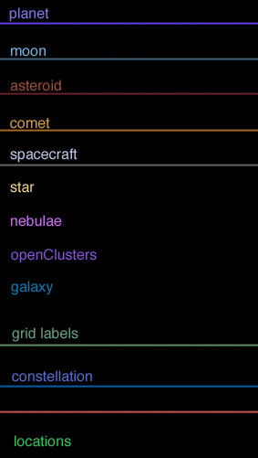
As you can see there is a bit of logic here, planet/moon, asteroid/comet and nebulae/openClusters/galaxies are groups then comes the rest, trying to keep a pleasant palette...
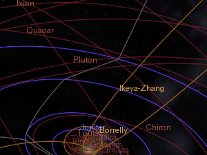
Some screenshots:
Asteroids/Comets/Planets,
(Click to enlarge)
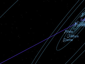
Planets/Moons,
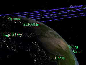
Planets/Locations,
Celestial grid/Boundaries/Constellations/Stars,
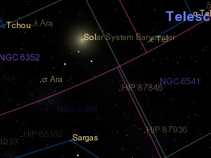
Galaxies/Nebulae/OpenClusters,
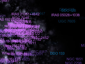
For those who can compile, here my render.cpp:
http://nho.ohn.free.fr/celestia/preview/render.cpp.zip
Opinions please!
So here it is, not too far from Cham's one but with a few drastic changes. It's really not easy to achieve something coherent, readable and harmonious. What is below is what IMO is quite good but I'm sure there must be a bit more room for further tuning. Before I'd like some opinions...
The palette:

As you can see there is a bit of logic here, planet/moon, asteroid/comet and nebulae/openClusters/galaxies are groups then comes the rest, trying to keep a pleasant palette...
Some screenshots:
Asteroids/Comets/Planets,
(Click to enlarge)

Planets/Moons,

Planets/Locations,

Celestial grid/Boundaries/Constellations/Stars,

Galaxies/Nebulae/OpenClusters,

For those who can compile, here my render.cpp:
http://nho.ohn.free.fr/celestia/preview/render.cpp.zip
Opinions please!
ElChristou wrote:As you can see there is a bit of logic here, planet/moon, asteroid/comet and nebulae/openClusters/galaxies are groups then comes the rest, trying to keep a pleasant palette...
Chris,
I agree that this palette, with soft but distinct colours, is very pleasant to watch.
I just find the green location label color a little bit "flashy".
It reminds me the color of clothes that we used to wear at the end of the 80's ...
Beside this, you're all doing a very good work here !
@+
Vincent
Celestia Qt4 SVN / Celestia 1.6.1 + Lua Edu Tools v1.2
GeForce 8600 GT 1024MB / AMD Athlon 64 Dual Core / 4Go DDR2 / XP SP3
Vincent
Celestia Qt4 SVN / Celestia 1.6.1 + Lua Edu Tools v1.2
GeForce 8600 GT 1024MB / AMD Athlon 64 Dual Core / 4Go DDR2 / XP SP3
- t00fri
- Developer
- Posts: 8772
- Joined: 29.03.2002
- Age: 22
- With us: 22 years 10 months
- Location: Hamburg, Germany
Christophe,
sorry I was extremely busy throught this working day, so I was unable to look at and comment on this next version of your design via email today. Since I was very enthusiastic already when you sent me your first attempt, apart from just a few remaining tuneups, I am sure this is now close to perfect.
Just 3 specific comments before examining the colors in more detail later, at home:
-- The overall palette colors are beautiful and fit very nicely together
There is a distinct visible color harmony, which is good for the eyes,
the soul and the nerves
-- I particularly like the "color family" associations of the DSO's as well
as the comet/asteroids.
-- Unlike Vincent, I find the particular color of the location labels
virtually perfect. It is actually either identical or close to Cham's
location label color. The justification of such a VIVID color
(compared to the others) is that one simply NEEDS such a well
visible color to warrant readability given these very varied
planetary and moon surfaces!
Bye Fridger
-
ElChristou
- Developer
- Posts: 3776
- Joined: 04.02.2005
- With us: 20 years
t00fri wrote:-- Unlike Vincent, I find the particular color of the location labels
virtually perfect. It is actually either identical or close to Cham's
location label color. The justification of such a VIVID color
(compared to the others) is that one simply NEEDS such a well
visible color to warrant readability given these very varied
planetary and moon surfaces!
True, the labels of planet will cause some trouble on blue planets but we can deal with this. Now for Locations the color must be visible on all bodies. It's were Cham's color is perfect...
-
ElChristou
- Developer
- Posts: 3776
- Joined: 04.02.2005
- With us: 20 years
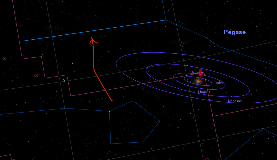
Cham wrote:I have several comment to say about ElChristou's palette. But before, what's this ?...
Is this related to my render.cpp? seems a problem with stars catalogue...
The constellations are a bit more transparent in my render to better see the stars behind the lines. In this case seems there are 2 lines overlapping, resulting in a single brighter line...


