Orbits and Labels colors

The place to discuss creating, porting and modifying Celestia's source code.
Avatar
t00fri
Developer
Posts: 8772
Joined: 29.03.2002
Age: 22
With us: 22 years 7 months
Location: Hamburg, Germany

Post #61by t00fri » 17.06.2007, 19:40

How about decreasing 6.0f -> 2.0f here

Code: Select all

float distr = 2.0f * (labelThresholdMag - appMagEff)/labelThresholdMag;


Bye Fridger
Image

Avatar
Topic author
Cham M
Posts: 4324
Joined: 14.01.2004
Age: 60
With us: 20 years 10 months
Location: Montreal

Post #62by Cham » 17.06.2007, 19:42

Fridger,

I've found that using the value -7.5f gives some better result (I tried -6.0f, -7.0f, -7.5f and of course -8.0f). However, I still think the fading steps (fading range) are a bit too small. The fading process should last just a bit longer. It's too abrupt.

I did not tried your last suggestion yet.
"Well! I've often seen a cat without a grin", thought Alice; "but a grin without a cat! It's the most curious thing I ever saw in all my life!"

Avatar
t00fri
Developer
Posts: 8772
Joined: 29.03.2002
Age: 22
With us: 22 years 7 months
Location: Hamburg, Germany

Post #63by t00fri » 17.06.2007, 19:47

Cham wrote:Fridger,

I've found that using the value -7.5f gives some better result (I tried -6.0f, -7.0f, -7.5f and of course -8.0f). However, I still think the fading steps (fading range) are a bit too small. The fading process should last just a bit longer. It's too abrupt.

I did not tried your last suggestion yet.


My last suggestion INCREASES the fading step!

Bye Fridger
Image

Avatar
Topic author
Cham M
Posts: 4324
Joined: 14.01.2004
Age: 60
With us: 20 years 10 months
Location: Montreal

Post #64by Cham » 17.06.2007, 19:52

Fridger,

I think I'm very close. It's almost ideal now (just few more tweakings to do). Here's my modifications :

Code: Select all

 float appMagEff = 6.0f;
    switch (labelMask)
        {
            case Renderer::NebulaLabels:
                c = Color(0.85f, 0.35f, 0.29f);
                appMagEff = astro::absToAppMag(-7.5f, (float) distanceToDSO);
                break;
              case Renderer::OpenClusterLabels:
               c = Color(0.38f, 0.71f, 0.58f);
               appMagEff = astro::absToAppMag(-6.0f, (float) distanceToDSO);
                break;
           case Renderer::GalaxyLabels:
           default:
                c = Color(0.1f, 0.85f, 0.85f);
                appMagEff = appMag;
                break;                  
        }                         
          if(appMagEff < labelThresholdMag)
          {
              //cout<<labelThresholdMag<<endl;
           // introduce distance dependent label transparency.
           float distr = 4.0f * (labelThresholdMag - appMagEff)/labelThresholdMag;
           if (distr > 1.0f)
               distr = 1.0f;


I used -7.5f for the nebulas, -6f (to be tweaked ?) for the clusters, and 4f for the fading steps.
"Well! I've often seen a cat without a grin", thought Alice; "but a grin without a cat! It's the most curious thing I ever saw in all my life!"

Avatar
Topic author
Cham M
Posts: 4324
Joined: 14.01.2004
Age: 60
With us: 20 years 10 months
Location: Montreal

Post #65by Cham » 17.06.2007, 19:57

Yep, I'm almost certain the parameters I used above are ideal. No more crowdedness. The fading preocess is beautifull, everything is clearly visible and the spatial distribution (depth illusion) is very good too. What do you think ?
"Well! I've often seen a cat without a grin", thought Alice; "but a grin without a cat! It's the most curious thing I ever saw in all my life!"

Avatar
t00fri
Developer
Posts: 8772
Joined: 29.03.2002
Age: 22
With us: 22 years 7 months
Location: Hamburg, Germany

Post #66by t00fri » 17.06.2007, 19:58

Note that if you make the appMagEff function different for Nebulae and Clusters, they appear/fade at DIFFERENT distances...

i.e. they obey different visibility rules.

Bye Fridger
Image

Avatar
Topic author
Cham M
Posts: 4324
Joined: 14.01.2004
Age: 60
With us: 20 years 10 months
Location: Montreal

Post #67by Cham » 17.06.2007, 20:04

t00fri wrote:Note that if you make the appMagEff function different for Nebulae and Clusters, they appear/fade at DIFFERENT distances...

i.e. they obey different visibility rules.


Of course ! That's what I wanted, since there are more clusters (larger crowdedness) than nebulas (at least, with the databases I'm using).

The -6f value used for the clusters may be tweaked a bit. I don't mind much about it, since it's actually very good. A value a bit larger (-7f) could be very good too, I believe.
"Well! I've often seen a cat without a grin", thought Alice; "but a grin without a cat! It's the most curious thing I ever saw in all my life!"

Avatar
t00fri
Developer
Posts: 8772
Joined: 29.03.2002
Age: 22
With us: 22 years 7 months
Location: Hamburg, Germany

Post #68by t00fri » 17.06.2007, 20:05

Your settings look GOOD.


Have a look with the galaxies: with 6.0f -> 4.0f the fading step is also slower for galaxies. If you prefer the previous settings, I can easily make a respective code change that preserves the galaxy settings.


Bye Fridger
Image

Avatar
Topic author
Cham M
Posts: 4324
Joined: 14.01.2004
Age: 60
With us: 20 years 10 months
Location: Montreal

Post #69by Cham » 17.06.2007, 20:13

I think it's perfect, even for the galaxies ! :D

Having them fading a bit slower is great too.

Fridger, I think we have done it. We only have to wait for Chris comments. Do you agree ?

And what about the asteroids and comets ?
"Well! I've often seen a cat without a grin", thought Alice; "but a grin without a cat! It's the most curious thing I ever saw in all my life!"

Avatar
t00fri
Developer
Posts: 8772
Joined: 29.03.2002
Age: 22
With us: 22 years 7 months
Location: Hamburg, Germany

Post #70by t00fri » 17.06.2007, 20:13

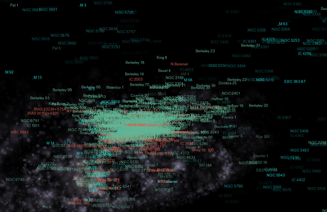
Last not least, COLORS again.

I think that the green color for the clusters is too close to the galaxy color, if that is darkened in the fading regime!! I would suggest to make the green more bluish, perhaps. Also did you check the color harmony with the grid color?
Bye Fridger
Image

Avatar
Topic author
Cham M
Posts: 4324
Joined: 14.01.2004
Age: 60
With us: 20 years 10 months
Location: Montreal

Post #71by Cham » 17.06.2007, 20:17

t00fri wrote:Last not least, COLORS again.

I think that the green color for the clusters is too close to the galaxy color, if that is darkened in the fading regime!! I would suggest to make the green more bluish, perhaps. Also did you check the color harmony with the grid color?


Yes, I checked against the grid. I think it's ok. Making the clusters labels a bit bluer would close them to the galaxies labels (not good). Making them greener would close them to the location labels. And take note that, at the scale which let us see the clusters labels, there isn't much galaxies labels visible.

EDIT : Here's an example : (slider put to the max). There is no confusion possible here. Or if you prefer, I could make the clusters labels a bit greener ?

Image
"Well! I've often seen a cat without a grin", thought Alice; "but a grin without a cat! It's the most curious thing I ever saw in all my life!"

ElChristou
Developer
Posts: 3776
Joined: 04.02.2005
With us: 19 years 9 months

Post #72by ElChristou » 17.06.2007, 20:25

All this seems very nice but...

What would be really cool would be all labels and orbits colors harmonized with the current selection's color (to not break the palette on screen)...

All those purple, red, blue, yellow, green and other labels and orbits just fight each others and I cannot stand anymore my screen (it break the harmony of my Feng-Shui interior)... :x
Image

Avatar
Topic author
Cham M
Posts: 4324
Joined: 14.01.2004
Age: 60
With us: 20 years 10 months
Location: Montreal

Post #73by Cham » 17.06.2007, 20:27

ElChristou wrote:All this seems very nice but...

What would be really cool would be all labels and orbits colors harmonized with the current selection's color (to not break the palette on screen)...

All those purple, red, blue, yellow, green and other labels and orbits just fight each others and I cannot stand anymore my screen (it break the harmony of my Feng-Shui interior)... :x


Sorry, I don't understand what you mean...
"Well! I've often seen a cat without a grin", thought Alice; "but a grin without a cat! It's the most curious thing I ever saw in all my life!"

Avatar
t00fri
Developer
Posts: 8772
Joined: 29.03.2002
Age: 22
With us: 22 years 7 months
Location: Hamburg, Germany

Post #74by t00fri » 17.06.2007, 20:28

Cham wrote:
t00fri wrote:Last not least, COLORS again.

I think that the green color for the clusters is too close to the galaxy color, if that is darkened in the fading regime!! I would suggest to make the green more bluish, perhaps. Also did you check the color harmony with the grid color?

Yes, I checked against the grid. I think it's ok. Making the clusters labels a bit bluer would close them to the galaxies labels (not good). Making them greener would close them to the location labels. And take note that, at the scale which let us see the clusters labels, there isn't much galaxies labels visible.

EDIT : Here's an example : (slider put to the max). There is no confusion possible here. Or if you prefer, I could make the clusters labels a bit greener ?


I also tried another direction: I made the green bluer to start and then added some red. This gives a green-gray shade, which fits nicely to the red of the nebulae labels!

Finally I reduced the overall luminosity somewhat.

Have a look:

c = Color(0.416f, 0.568f, 0.544f);

Bye Fridger
Last edited by t00fri on 17.06.2007, 20:29, edited 1 time in total.
Image

ElChristou
Developer
Posts: 3776
Joined: 04.02.2005
With us: 19 years 9 months

Post #75by ElChristou » 17.06.2007, 20:29

Cham wrote:
ElChristou wrote:All this seems very nice but...

What would be really cool would be all labels and orbits colors harmonized with the current selection's color (to not break the palette on screen)...

All those purple, red, blue, yellow, green and other labels and orbits just fight each others and I cannot stand anymore my screen (it break the harmony of my Feng-Shui interior)... :x

Sorry, I don't understand what you mean...


Really? :lol:
Joke of course! :oops:

Sorry, good job mates! Tx!!
Image

Avatar
Topic author
Cham M
Posts: 4324
Joined: 14.01.2004
Age: 60
With us: 20 years 10 months
Location: Montreal

Post #76by Cham » 17.06.2007, 20:30

I just changed the cluster labels to Color(0.37f, 0.71f, 0.53f). It's nice.

I'll try your color in few min.
"Well! I've often seen a cat without a grin", thought Alice; "but a grin without a cat! It's the most curious thing I ever saw in all my life!"

Avatar
t00fri
Developer
Posts: 8772
Joined: 29.03.2002
Age: 22
With us: 22 years 7 months
Location: Hamburg, Germany

Post #77by t00fri » 17.06.2007, 20:33

Actually ...my Feng-Shui also signals on and off that it would prefer a somewhat "quieter" color harmony.

Of course we know it's hard, BUT...


Christophe, how about joining this proven collaboration for some further joint color trials?

Bye Fridger
Image

Avatar
Topic author
Cham M
Posts: 4324
Joined: 14.01.2004
Age: 60
With us: 20 years 10 months
Location: Montreal

Post #78by Cham » 17.06.2007, 20:36

Fridger, I just tried your color. It's nice but it's looking a bit "dead". I think I prefer my last suggestion :

Code: Select all

Color(0.37f, 0.71f, 0.53f)


By the way, ElChristou gave me an idea (I can't tell if it's hard to code, though) :

Is it possible to highlight the selected label in vivid red, like the selection marker ?
"Well! I've often seen a cat without a grin", thought Alice; "but a grin without a cat! It's the most curious thing I ever saw in all my life!"

ElChristou
Developer
Posts: 3776
Joined: 04.02.2005
With us: 19 years 9 months

Post #79by ElChristou » 17.06.2007, 20:40

t00fri wrote:...Christophe, how about joining this proven collaboration for some further joint color trials?


I've just waking up from a "p'tite sieste" after a canard ?  l'orange at my father's home... cognac to help the digestion... hard...

In a few hours I'll try a full set but indeed it's not so simple...
Image

Avatar
t00fri
Developer
Posts: 8772
Joined: 29.03.2002
Age: 22
With us: 22 years 7 months
Location: Hamburg, Germany

Post #80by t00fri » 17.06.2007, 20:42

Cham wrote:Fridger, I just tried your color. It's nice but it's looking a bit "dead". I think I prefer my last suggestion :

Code: Select all

Color(0.37f, 0.71f, 0.53f)


By the way, ElChristou gave me an idea (I can't tell if it's hard to code, though) :

Is it possible to highlight the selected label in vivid red, like the selection marker ?


I think we definitely need some "quieter" colors. It looks simply too colorful. At least for "Old Europeans", perhaps ;-)

How about Christophe's vote. Here is my quieter suggestion for Nebulae (red) and clusters (green-gray)

Image

Bye Fridger
Last edited by t00fri on 17.06.2007, 20:44, edited 1 time in total.
Image


Return to “Development”