OSX users, opinion Please!

The place to discuss creating, porting and modifying Celestia's source code.
Topic author
ElChristou
Developer
Posts: 3776
Joined: 04.02.2005
With us: 19 years 9 months

OSX users, opinion Please!

Post #1by ElChristou » 14.05.2007, 14:53

Hello everybody,

Dirkiptt is ending a brand new Eclipse Finder for our platform, I'm helping testing and tuning the UI, so the reason of this thread is to ask your opinion about the eventuality of merging all windows in a tabed one.

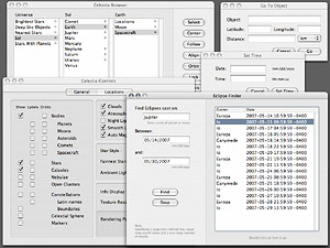
Actually we have this (you can see the actual state of the Eclipse Finder and a revised Browser):

(Click to enlarge)

Image

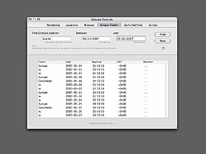
All those windows don't fit anymore on a 1024 screen, so we are thinking in:


(Click to enlarge)

Image

...

Opinion?

(Note I add a "Scripts" tab to use with the next dev of a script browser...)
Image

bh
Posts: 1547
Joined: 17.12.2002
With us: 21 years 11 months
Location: Oxford, England

Post #2by bh » 14.05.2007, 15:06

That's way better than having to browse through all those separate windows... super (thumbs up).
regards...bh.

rthorvald
Posts: 1223
Joined: 20.10.2003
With us: 21 years 1 month
Location: Norway

Re: OSX users, opinion Please!

Post #3by rthorvald » 14.05.2007, 15:18

ElChristou wrote:Dirkiptt is ending a brand new Eclipse Finder for our platform, I'm helping testing and tuning the UI, so the reason of this thread is to ask your opinion about the eventuality of merging all windows in a tabed one.


No contest... The tabbed window is the optimal solution!
But isn??t it a little un-macintosh to have the preferences window grouped with the browsers/finders window?

- rthorvald
Image

Avatar
Cham M
Posts: 4324
Joined: 14.01.2004
Age: 60
With us: 20 years 10 months
Location: Montreal

Post #4by Cham » 14.05.2007, 15:52

And what about the keyboard shortcuts ? I still want to be able to bring the preferences using the actual shortcuts, without having to browse the tabs in that window. Same for the browser and the eclipse finder.
"Well! I've often seen a cat without a grin", thought Alice; "but a grin without a cat! It's the most curious thing I ever saw in all my life!"
Topic author
ElChristou
Developer
Posts: 3776
Joined: 04.02.2005
With us: 19 years 9 months

Re: OSX users, opinion Please!

Post #5by ElChristou » 14.05.2007, 16:18

rthorvald wrote:..But isn??t it a little un-macintosh to have the preferences window grouped with the browsers/finders window?...

:? don't know... personally I use almost all panes during a session, what is called Prefs in Celestia IMO are not really prefs because prefs are supposed to be set one time in most software, then remain untouch. In Celestia it's not the case...

More opinion on this point?

Cham wrote:And what about the keyboard shortcuts ? I still want to be able to bring the preferences using the actual shortcuts, without having to browse the tabs in that window. Same for the browser and the eclipse finder.


This is a question for Dirkpitt, the ideal would be that the shortcuts call the right tab... don't know if it's possible...
Image

Avatar
Cham M
Posts: 4324
Joined: 14.01.2004
Age: 60
With us: 20 years 10 months
Location: Montreal

Post #6by Cham » 14.05.2007, 16:24

After some thinking about the tab window, I finally disagree. I think it's a bad idea : it will make the interface inconsistent. The actual windows are perfect the way they are. Unifying them all in a tab window will gives some weird interface aspects : the time/date tab will be almost empty : large window (with a growing corner !) just for few date fields !? And what about the preferences tab with a growing corner ? It's inconsistent, unless each tab change dynamically (which I would find annoying, anyway).

Please, leave the windows the way they are. They are all associated to some very specific (and very different) functionalities. They don't have to be unified, especially since we can already call each of them using a simple keyboard shortcut.
"Well! I've often seen a cat without a grin", thought Alice; "but a grin without a cat! It's the most curious thing I ever saw in all my life!"

rthorvald
Posts: 1223
Joined: 20.10.2003
With us: 21 years 1 month
Location: Norway

Post #7by rthorvald » 14.05.2007, 16:35

Cham wrote:Please, leave the windows the way they are. They are all associated to some very specific (and very different) functionalities. They don't have to be unified, especially since we can already call each of them using a simple keyboard shortcut.


I disagree. It is much tidier to collect them into a tabbed win. Dynamically change the size is an aesthetical bonus, though not neccecary.

However, if you want to take the trouble, to cater to everybody, maybe make the different panes to be "tear-off" - like the palettes in Photoshop. Not that i would need that.

As for the prefs window, ElChristou has a point. I did not think it through. The config file is the real prefs...

- rthorvald
Image

neo albireo
Posts: 68
Joined: 03.02.2005
With us: 19 years 9 months
Location: Switzerland

Post #8by neo albireo » 14.05.2007, 16:35

My first opinion was: Tabs!!!! I love tabed browsing in Safari or Firefox and like one window only in general.

However, when I use Celestia on two screens (one for video beamer presentation and one on my Mac Book Pro for controls - therefore invisible to the public) it would be good to have the possibility to open several control windows simultaneously. I would therefore rather suggest to concentrate on making the single windows small.

Won't the UI be changed anyway to a cross-platform solution?

Avatar
Cham M
Posts: 4324
Joined: 14.01.2004
Age: 60
With us: 20 years 10 months
Location: Montreal

Post #9by Cham » 14.05.2007, 17:34

rthorvald wrote:I disagree. It is much tidier to collect them into a tabbed win. Dynamically change the size is an aesthetical bonus, though not neccecary.


rthorvald,

think about the date/time tabbed window : a large empty white rectangle with a resize corner, with only two (three ?) fields !? This is VERY ugly. And think about the "preferences" (options) rectangle with a useless resize corner. This makes the whole thing ugly. Do you really need all those windows in a single one ? I'm using Celestia VERY often, at home and in the classroom, on various PCs (portable with a wall projector, desktop with a cathodic screen, desktop with a large wall projector, etc), and I was NEVER annoyed by all the small windows that I have to use (frequently). Having an unified tabbed window may make my life a little bit more complicated, since I'll have to select the right tab each time I want to go in some panel, unless there's a keyboard shortcut for each tab. I don't have to do this with the small windows with their keyboard shortcuts.

This is another example that hell is covered with good intentions. :evil:

EDIT : And there's another important thing to say : In the classroom, we (teachers and students) are using much more frequently the date/time panel. We often need to see the background main window with the small time panel on front, just to have a visual feedback. Having an unified large window will destroy this usefullness of the small window. You guys don't teach astronomy in a classroom, don't you ?
"Well! I've often seen a cat without a grin", thought Alice; "but a grin without a cat! It's the most curious thing I ever saw in all my life!"

bh
Posts: 1547
Joined: 17.12.2002
With us: 21 years 11 months
Location: Oxford, England

Post #10by bh » 14.05.2007, 18:13

mmm... seems to be hitting some nerves there.
regards...bh.

Topic author
ElChristou
Developer
Posts: 3776
Joined: 04.02.2005
With us: 19 years 9 months

Post #11by ElChristou » 14.05.2007, 21:02

Neo albireo, the main problem is that in English, there is room to keep all those windows quite reduced, but not in other languages like French, Spanish or Japanese for example, it's also why the tabbed unique windows become usefull.

About tabs versus shortcuts; if the shortcuts call the right tab, the result is the same than calling the actual windows, so if it's the case, this is not an argument.

Concerning the "tears-off" windows, this is also a question for Dirkpitt...

neo albireo wrote:...Won't the UI be changed anyway to a cross-platform solution?

Yep, but it's not for tomorrow, so as new stuff are coming from Dirkpitt, let's enjoy our beautifull osX UI before loosing it completely!

Cham wrote:EDIT : And there's another important thing to say : In the classroom, we (teachers and students) are using much more frequently the date/time panel. We often need to see the background main window with the small time panel on front, just to have a visual feedback. Having an unified large window will destroy this usefullness of the small window. You guys don't teach astronomy in a classroom, don't you ?


For that you have the Edu version, much more usefull than any other windows... :wink:
(or do you think we all guys are doing this for nothing? :wink:)
(j'suis vache hein? :wink:)
Image

Topic author
ElChristou
Developer
Posts: 3776
Joined: 04.02.2005
With us: 19 years 9 months

Post #12by ElChristou » 14.05.2007, 21:09

Cham wrote:...think about the date/time tabbed window : a large empty white rectangle with a resize corner, with only two (three ?) fields !? This is VERY ugly. And think about the "preferences" (options) rectangle with a useless resize corner....


Yep this annoying, but what about a few flowers (and a rabbit perhaps?) to animate this large empty white rectangle? :x

Concerning the resize angle, don't worry, the solution is simple, no more resize angle!

:D
Image

Avatar
dirkpitt
Developer
Posts: 674
Joined: 24.10.2004
With us: 20 years 1 month

Post #13by dirkpitt » 14.05.2007, 23:40

rthorvald wrote:However, if you want to take the trouble, to cater to everybody, maybe make the different panes to be "tear-off"


Tear-offs sounded great too....until I remembered that the old Macromedia got sued by Adobe for violating Adobe's Tear-Off Tabs(tm) patent. :oops:

Avatar
Cham M
Posts: 4324
Joined: 14.01.2004
Age: 60
With us: 20 years 10 months
Location: Montreal

Post #14by Cham » 14.05.2007, 23:56

ElChristou wrote:Concerning the resize angle, don't worry, the solution is simple, no more resize angle!

:D

We still need the resize corner for some of those windows (browser and eclipse finder). Scroll bars alone aren't enough (especially on large screens). That's why I'm saying this unification of windows is a bad idea. Some windows don't need to be unified with the others (time/date, for example), especially considering their function.

ElChristou wrote:(or do you think we all guys are doing this for nothing? :wink:)


Well, yes, useless work do happens from time to time. :roll:
"Well! I've often seen a cat without a grin", thought Alice; "but a grin without a cat! It's the most curious thing I ever saw in all my life!"

Topic author
ElChristou
Developer
Posts: 3776
Joined: 04.02.2005
With us: 19 years 9 months

Post #15by ElChristou » 15.05.2007, 00:36

Cham wrote:
ElChristou wrote:(or do you think we all guys are doing this for nothing? :wink:)

Well, yes, useless work do happens from time to time. :roll:


Ok,ok, useless for you... btw, you haven't tested it yet, right? :x
Image

Topic author
ElChristou
Developer
Posts: 3776
Joined: 04.02.2005
With us: 19 years 9 months

Post #16by ElChristou » 15.05.2007, 02:17

Indeed till now the only valid point to not use the tabbed windows concern the browser; clearly expanding it on all the screen is useful...

No more opinion?
Image

Avatar
Cham M
Posts: 4324
Joined: 14.01.2004
Age: 60
With us: 20 years 10 months
Location: Montreal

Post #17by Cham » 15.05.2007, 02:29

ElChristou wrote:Indeed till now the only valid point to not use the tabbed windows concern the browser; clearly expanding it on all the screen is useful...


The eclipses results list too.

The eclipses and browser could be unified, since they are related to about the same type of information (lists of data) and both needs a resize box.

The time/date panel is much more usefull (in the classroom, at least), and should be left as another window (small, not much fields in it, and no resize corner, no scroll bars, backround image still visisble, etc).

While you are at it, why not unifying all other windows ? Go to ... , OpenGL info, etc ?

IMO, you should try unify the Go to... window and the time and date window (same kind of fields, etc), but not with the browser types of windows (eclipses, etc...).

Anyway, I really don't see the point about unifying windows (there is no real benefit, since we call them all with the keyboard. That's the whole point of having separate windows for special functionalities).
"Well! I've often seen a cat without a grin", thought Alice; "but a grin without a cat! It's the most curious thing I ever saw in all my life!"

Avatar
dirkpitt
Developer
Posts: 674
Joined: 24.10.2004
With us: 20 years 1 month

Post #18by dirkpitt » 15.05.2007, 03:45

Cham wrote:...think about the date/time tabbed window : a large empty white rectangle with a resize corner, with only two (three ?) fields !? This is VERY ugly. And think about the "preferences" (options) rectangle with a useless resize corner....


Switching between tabs could cause the window to resize so that the empty space isn't there. The OS X System Preferences app demonstrates this.

I personally don't like the idea of the preferences window being permanently grouped along with other palettes like Set Time (this is one of my major gripes about the Linux version). However, if the windows could be freely undocked and/or rearranged by the user, this would be ok - if the user finds that preferences + set time works for him/her, why not allow it? I'm not insisting on tear-off tabs, just some good way to group windows to save space.

Topic author
ElChristou
Developer
Posts: 3776
Joined: 04.02.2005
With us: 19 years 9 months

Post #19by ElChristou » 15.05.2007, 10:53

dirkpitt wrote:Switching between tabs could cause the window to resize so that the empty space isn't there. The OS X System Preferences app demonstrates this.


Much too exotic, no?

The point, Cham, is not to please you or me or any person in particular, the point is to find a better UI in general. Having 6 windows (perhaps 7 a bit later) is becoming really too much for a 1024 screen.

Following Cham's suggestion we could have:

-Browser/Eclipse Finder
-SetTime/GoTo
-Rendering/Locations (is Rendering better than General?)

Seems to me a good compromise... Should we go for this?

(If the Script Browser see the light, I suppose it should go with Rendering/Locations because it's not really a data browser... (or not?))
Image

Avatar
Cham M
Posts: 4324
Joined: 14.01.2004
Age: 60
With us: 20 years 10 months
Location: Montreal

Post #20by Cham » 15.05.2007, 11:00

ElChristou wrote:the point is to find a better UI in general. Having 6 windows (perhaps 7 a bit later) is becoming really too much for a 1024 screen.


Well, in Celestia, I NEVER get many of these windows on screen at the same time. I'm popping-in just one window at once (calling the window with the keyboard shortcut). That's why I say the unification is useless. How can you end with, say, two windows at the same time on the foreground ?
"Well! I've often seen a cat without a grin", thought Alice; "but a grin without a cat! It's the most curious thing I ever saw in all my life!"


Return to “Development”