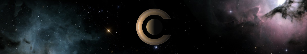
selden wrote:Unfortunately, having a reddish nebula like the Triffid in the background makes it appear that Saturn is on fire -- not exactly a desirable astronomical image
Well, Celestia is a hot app, isn't ?

selden wrote:Unfortunately, having a reddish nebula like the Triffid in the background makes it appear that Saturn is on fire -- not exactly a desirable astronomical image

Hydrogen fire!selden wrote:...makes it appear that Saturn is on fire...
Cham wrote:selden wrote:Unfortunately, having a reddish nebula like the Triffid in the background makes it appear that Saturn is on fire -- not exactly a desirable astronomical image
Well, Celestia is a hot app, isn't ?
Johaen wrote:The one problem I have with the current splash is that it's always on top of all the windows. When I click on a window behind it, I can control that window, but the splash screen is still on top. With my new PC it's not so much of an issue, but my old PC took sometimes close to a minute to start up Celestia, and having that splash screen ontop of all the other windows was sometimes annoying. Just my 2 cents
selden wrote:Until the problem is fixed, you might consider eliminating the splash screen entirely: rename or delete Celestia/splash.png
Christophe wrote:... or start Celestia with the -s switch.
Johaen wrote:What's that?Christophe wrote:... or start Celestia with the -s switch.
Code: Select all
"C:\Program Files\Celestia\celestia.exe" -s 
I agree.Cham wrote:I don't agree at all with the use of the fonts with serif. The only caracters set I like, in the message above, is the last (Trebuchet), but without the texture inside and the emboss style.
(...)
Also, FOR CONSISTENCY, the font used should be close in style to the font used by Celestia to show the information.
I just can't understand why you guys are insisting with fonts with serifs. It's simply looking amatteur ! it's so obvious to me and to some friends of mine which are working in the graphical design field as experienced professionals.
chris wrote:I think a new splash screen would be great . . . Though I already fear the endless heated discussion that graphic design decisions seem to provoke


