1.5.0 changes

Discussion forum for Celestia developers; topics may only be started by members of the developers group, but anyone can post replies.
Avatar
dirkpitt
Developer
Posts: 674
Joined: 24.10.2004
With us: 20 years

Post #61by dirkpitt » 19.09.2006, 12:48

ElChristou wrote:
Cham wrote:
chris wrote:* Mac: cursor now changes on draggable view boundaries

Hmmm, I don't have this on my Mac. Is it really on CVS ?

Of course, when you split the view, the cursor change when you pass over the white line (boundarie)...

Yes, it's there, along with the following feature that I added especially for Cham :wink: :

dirkpitt wrote:Maybe I should add something to the splash screen saying "DEBUG VERSION" when compiling as debug.

Avatar
Cham M
Posts: 4324
Joined: 14.01.2004
Age: 60
With us: 20 years 10 months
Location: Montreal

Post #62by Cham » 19.09.2006, 13:50

Oh! Ok, I didn't noticed that one.

But what about the cursor itself ? On the PC, it's a cross when the cursor is placed inside the window. Would it be good on th Mac ?
"Well! I've often seen a cat without a grin", thought Alice; "but a grin without a cat! It's the most curious thing I ever saw in all my life!"

ElChristou
Developer
Posts: 3776
Joined: 04.02.2005
With us: 19 years 9 months

Post #63by ElChristou » 19.09.2006, 16:33

Cham wrote:But what about the cursor itself ? On the PC, it's a cross when the cursor is placed inside the window. Would it be good on th Mac ?


Don't really know... any opinions from osX users?
Image

julesstoop
Posts: 408
Joined: 27.03.2002
With us: 22 years 7 months
Location: Leiden, The Netherlands

Post #64by julesstoop » 19.09.2006, 18:54

I don't mind the simple arrow cursor as is.
Maybe only in full screen mode it should change to a cross hair?
Lapinism matters!
http://settuno.com/

rthorvald
Posts: 1223
Joined: 20.10.2003
With us: 21 years 1 month
Location: Norway

Post #65by rthorvald » 19.09.2006, 19:25

Cham wrote:But what about the cursor itself ? On the PC, it's a cross when the cursor is placed inside the window. Would it be good on th Mac ?

That is counter to the OS??normal behaviour. What other windows in Mac apps changes the cursor on focus?

-rthorvald
Image

Avatar
selden
Developer
Posts: 10192
Joined: 04.09.2002
With us: 22 years 2 months
Location: NY, USA

Post #66by selden » 19.09.2006, 19:33

In principle, I would expect any program that needs precision selection would use a cross-hair cursor.

The Windows version of Celestia gives you a choice of cursors. Maybe it can be implemented in the other versions, too?

This is in celestia.cfg:

Code: Select all

# Cursor
# ------
# This parameter allows you to select from three cursors, but currently
# only in the Windows version of Celestia ...
#  * White crosshair ("crosshair") --> default cursor
#  * Inverting crosshair ("inverting crosshair")
#  * Standard Windows arrow ("arrow")
#
# The inverting crosshair can be a better choice because it's more
# visible on bright backgrounds. However, should you decide to try this
# cursor, TEST IT CLOSELY. Not all graphics chipsets support an inverting
# cursor, which will cause Windows to fall back to software emulation.
# The emulated cursor interacts with OpenGL applications in unfortunate
# ways, forcing a lot of extra redrawing and cutting by half the frame
# rate on a GeForce2-equipped laptop. So, if you change this, check your
# FPS rates to make sure you haven't kicked Windows into software
# emulation mode.
#------------------------------------------------------------------------
  FavoritesFile    "favorites.cel"
  DestinationFile  "guide.cel"
  Cursor           "crosshair"


Selden

Avatar
dirkpitt
Developer
Posts: 674
Joined: 24.10.2004
With us: 20 years

Post #67by dirkpitt » 19.09.2006, 22:27

rthorvald wrote:
Cham wrote:But what about the cursor itself ? On the PC, it's a cross when the cursor is placed inside the window. Would it be good on th Mac ?
That is counter to the OS??normal behaviour. What other windows in Mac apps changes the cursor on focus?


Photoshop gives you the option. Personally I'm not sure how much the cross-hair cursor helps me, and because it's so thin it can be hard to see.

ElChristou
Developer
Posts: 3776
Joined: 04.02.2005
With us: 19 years 9 months

Post #68by ElChristou » 19.09.2006, 23:13

If I'm not wrong the cross on Windows is black with a white edge all around; if such a cross must be implemented on osX, we sould try to have a similar negative effect like in PS (black cross becoming white on a black background)...
Image

Avatar
Cham M
Posts: 4324
Joined: 14.01.2004
Age: 60
With us: 20 years 10 months
Location: Montreal

Post #69by Cham » 20.09.2006, 00:52

I have seen many Mac apps which are using a cross (and other shapes too). I just can't recall which apps, except drawing apps (of course) and word processor (the insert cursor) !

Using the PC version of Celestia in my astronomy courses, I'm begining to feel its utility to click on a far away object. My students are often having some difficulties to click-select an object when it's not visible but only its name (without using the entry field at bottom of screen, of course). Clicking on the bottom-left part of a name is hard, because the normal arrrow-cursor is hidding part of the name while trying to click on it. The cross may be helpfull here. I think it could be a good idea to implement that cross cursor for OS X and let the user choose by editing his config file. However, this is really secondary, and developpers should invest their time on more important matters (like a scripts menu in the Edit menu).
"Well! I've often seen a cat without a grin", thought Alice; "but a grin without a cat! It's the most curious thing I ever saw in all my life!"

Avatar
dirkpitt
Developer
Posts: 674
Joined: 24.10.2004
With us: 20 years

Post #70by dirkpitt » 20.09.2006, 03:46

Cham wrote:I think it could be a good idea to implement that cross cursor for OS X and let the user choose by editing his config file. However, this is really secondary, and developers should invest their time on more important matters (like a scripts menu in the Edit menu).


I agree that alternate cursors ought to be implemented, for feature parity with other platforms if nothing else. There's no consensus yet on whether a Script menu ought to be a feature or not.

ElChristou
Developer
Posts: 3776
Joined: 04.02.2005
With us: 19 years 9 months

Post #71by ElChristou » 20.09.2006, 11:26

dirkpitt wrote:I agree that alternate cursors ought to be implemented, for feature parity with other platforms if nothing else. There's no consensus yet on whether a Script menu ought to be a feature or not.


Then in the meantime, lets go for cursor :wink:
Image

doctrellor
Posts: 35
Joined: 25.03.2004
With us: 20 years 7 months
Location: California

Post #72by doctrellor » 21.09.2006, 00:10

So with 1.5x

what about Titan's two cloud layers & the haze layers at 200 km, and the Methane clouds at 10km

would we still have to create 2 "sphere's" and have each one with thier own atmosphere

Or can we have multiple cloud sets on each planet this time?

ElChristou
Developer
Posts: 3776
Joined: 04.02.2005
With us: 19 years 9 months

Post #73by ElChristou » 24.09.2006, 14:38

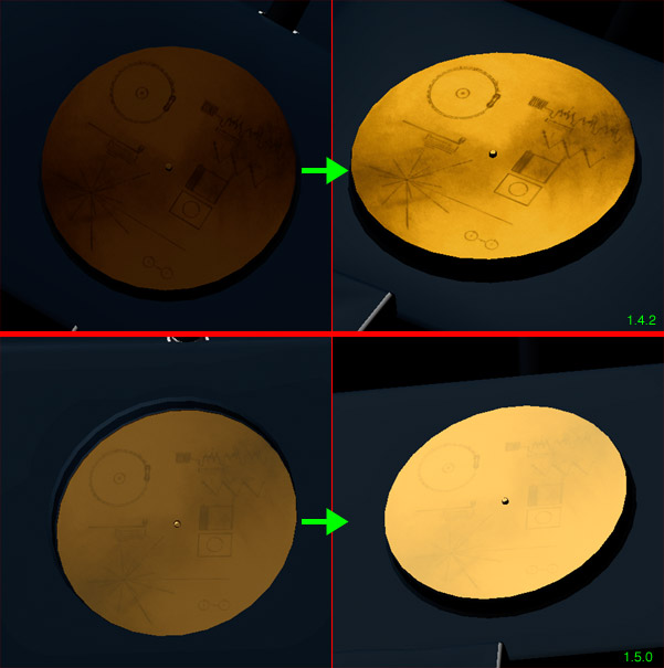
About specularity on models in 1.5.0 versus 1.4.2:

I'm doing some polishing on the Voyager model and have an issue with the texture of the golden record, see the picts:
Image

Playing with the point of view, one can have a not so bad gold effect in 1.4.2 but the same setting give a dull and quite bad result in 1.5.0 :?

The nice point in 1.4.2 is that the spec react much more on brighter tone and not so much on dark ones, unfortunatly this seems to be lost with the new code... :x
Image

Avatar
Hungry4info
Posts: 1133
Joined: 11.09.2005
With us: 19 years 2 months
Location: Indiana, United States

Post #74by Hungry4info » 24.09.2006, 20:09

What's up with the flare going away and the star getting *dimmer* as you get closer? That doesn't happen in real life. If anything, the sun should get *brighter*.

Is there anyway this could be adjusted?

Topic author
chris
Site Admin
Posts: 4211
Joined: 28.01.2002
With us: 22 years 9 months
Location: Seattle, Washington, USA

Post #75by chris » 24.09.2006, 21:15

Hungry4info wrote:What's up with the flare going away and the star getting *dimmer* as you get closer? That doesn't happen in real life. If anything, the sun should get *brighter*.

Is there anyway this could be adjusted?


The glare effect on stars isn't yet working in 1.5.0. It's a known problem and I'm working on it.

--Chris

Topic author
chris
Site Admin
Posts: 4211
Joined: 28.01.2002
With us: 22 years 9 months
Location: Seattle, Washington, USA

Post #76by chris » 24.09.2006, 21:25

ElChristou wrote:About specularity on models in 1.5.0 versus 1.4.2:

I'm doing some polishing on the Voyager model and have an issue with the texture of the golden record, see the picts:

Image

Playing with the point of view, one can have a not so bad gold effect in 1.4.2 but the same setting give a dull and quite bad result in 1.5.0 :?

The nice point in 1.4.2 is that the spec react much more on brighter tone and not so much on dark ones, unfortunatly this seems to be lost with the new code... :x


I changed the way specular highlights are computed for meshes in 1.5.0. It used to be this:

color = (diffuse_color + specular_color) * texture_color

And I changed it to this:

color = (diffuse_color * texture_color) + specular_color

The latter works much better in most cases, and it's what Celestia has always used for planets. The specular highlight on Earth's oceans would look bad if the specular color was multiplied by the texture color--the highlight would take on the blue color of the ocean!

However, as you've noticed, problems arise for textured metallic objects where the texture isn't due to a coat of paint. I'll come up with some solution for you . . . Either a 'metallic' option for materials, or some workaround that doesn't involve changing the code at all. What modeling tool are you using?

I should finally point out that the problem you're seeing does not apply to untextured metallic surfaces.

--Chris

Avatar
Cham M
Posts: 4324
Joined: 14.01.2004
Age: 60
With us: 20 years 10 months
Location: Montreal

Post #77by Cham » 24.09.2006, 21:38

Chris,

if you change again the model rendering code, I hope my actual models will still be working like now, if they don't have any specular reflection problems !? For the moment, all my models are working great with 1.5.0, and I don't want to edit them all again to adapt to another new code change in rendering, like what I had to do from 1.4.2 to 1.5.0. It's really a pain in the a** !

Specular reflection can be tweeked within the modeler with very satysfying results for most models, with or without textures. In some cases, plastic and metallic aspect may be hard to do. But if you change something in the code to help some models, I hope it wont affect ALL the other models too !
"Well! I've often seen a cat without a grin", thought Alice; "but a grin without a cat! It's the most curious thing I ever saw in all my life!"

Topic author
chris
Site Admin
Posts: 4211
Joined: 28.01.2002
With us: 22 years 9 months
Location: Seattle, Washington, USA

Post #78by chris » 24.09.2006, 21:53

Cham wrote:Chris,

if you change again the model rendering code, I hope my actual models will still be working like now, if they don't have any specular reflection problems !? For the moment, all my models are working great with 1.5.0, and I don't want to edit them all again to adapt to another new code change in rendering, like what I had to do from 1.4.2 to 1.5.0. It's really a pain in the a** !

Specular reflection can be tweeked within the modeler with very satysfying results for most models, with or without textures. In some cases, plastic and metallic aspect may be hard to do. But if you change something in the code to help some models, I hope it wont affect ALL the other models too !


No, I won't do anything like changing the appearance of all specular highlights. As you've noticed, for most surfaces Celestia 1.5.0 does a much better job with specular highlights than 1.4.1 did. It's just a few cases that need some special accomodation, such as the one that ElChristou pointed out: a metallic surface modulated by a texture. I'll either add a metallic attribute to the cmod material definition or come up with a workaround for this particular case (if there is one) Supporting overlays in cmod files might do the job.

--Chris

Avatar
Cham M
Posts: 4324
Joined: 14.01.2004
Age: 60
With us: 20 years 10 months
Location: Montreal

Post #79by Cham » 24.09.2006, 22:01

Yes, the actual rendering code is a FANTASTIC step in the right direction, from 1.4.1. It's really MUCH better now. And for metallic surfaces modulated by a texture, I can also achieve some VERY GOOD gold surfaces. Just look for example at this picture, already shown elswhere on this topic (another page) :

Image
"Well! I've often seen a cat without a grin", thought Alice; "but a grin without a cat! It's the most curious thing I ever saw in all my life!"

ElChristou
Developer
Posts: 3776
Joined: 04.02.2005
With us: 19 years 9 months

Post #80by ElChristou » 25.09.2006, 02:18

chris wrote:...What modeling tool are you using?

Not sure this can help in anything, but I use Amapi Pro 7.5 as modeler then export/import in Cheetah 3D to smooth/map and modify the spec...

chris wrote:I should finally point out that the problem you're seeing does not apply to untextured metallic surfaces.

True.

Tx to have a look at this, many textured models will gain in realism if you find a trick... :D

Cham wrote:Yes, the actual rendering code is a FANTASTIC step in the right direction, from 1.4.1. It's really MUCH better now. And for metallic surfaces modulated by a texture, I can also achieve some VERY GOOD gold surfaces. Just look for example at this picture, already shown elswhere on this topic (another page) :


Don't worry about this topic; if Chris can find a solution to this problem, the metallic textures will be even better than now...
Image


Return to “Ideas & News”