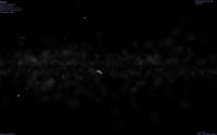
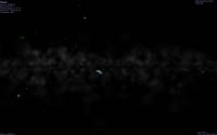
My screen is 1680 X 1050.
What is your video card ? NVidia ? I have an ATI, maybe this can explain the difference ?
I was using a 50?° FOV, to show the extent of that line. I'm normally using 35 to 45?°, of course.
Joint Galaxy Template Design Effort
Last edited by Cham on 20.09.2006, 23:28, edited 1 time in total.
"Well! I've often seen a cat without a grin", thought Alice; "but a grin without a cat! It's the most curious thing I ever saw in all my life!"
Ahaa ! This makes a huge difference ! The line is still there, but much subtle. It's more acceptable now, but I think it still can be improved a little bit. Here are some (1680 X 1050) pictures from the same point (FOV of about 41?°)
Previous version of CVS (before you sent me the galaxy.cpp code) :

Same view, from the new compilation (new galaxy.cpp code) :

Previous version of CVS (before you sent me the galaxy.cpp code) :

Same view, from the new compilation (new galaxy.cpp code) :

"Well! I've often seen a cat without a grin", thought Alice; "but a grin without a cat! It's the most curious thing I ever saw in all my life!"
I personally can also clearly see the dark line Cham is speaking of, both in the older code and your most recent code t00fri. I also find it odd.
I think the issue is thus...
The real image you were comparing to before does have a "dark" band across the center of the galaxy. However, in my estimation, that dark band seems to be an array of objects blocking out light from the very bright galactic center. The black band we are seeing in your Celestia images, t00fri, rather than being caused by the blockage of light from the galactic center is caused by the absence of anything being there. Though I agree that in your comparison shots of galaxies from afar, the black band does seem almost appropriate, when seen from within a galaxy it is not.
I think to reproduce the real black band appropriately will require some significant revisions to galaxies. Basically we'd have to move from using these transparent particle systems, to something that actually output light and simulated that appropriately.
System:
Asus A8N-SLI Premium nForce4 SLI
AMD Athlon 64 X2 4200+
2xeVGA GeForce 7800 GTX 256MB
2gb Dual Channel DDR (400) 3200
Asus A8N-SLI Premium nForce4 SLI
AMD Athlon 64 X2 4200+
2xeVGA GeForce 7800 GTX 256MB
2gb Dual Channel DDR (400) 3200
-
ElChristou
- Developer
- Posts: 3776
- Joined: 04.02.2005
- With us: 19 years 9 months
Vincent wrote:...It would be also very interesting to get the filamentous aspect of the inter-arm material...
Vince it's exactly the purpose of the dark grid.
Concerning the inter-arms (and looking at your pictures) I though in this multi layers technic to approach the "feeling" of the hundreds of available photos of galaxies; many galaxies are almost like a huge disk of dust with arms almost invisible... the actual design must match as many objects as possible, it's only a generic template.
Off course, we will perhaps have in the futur, some more improved renderings, but for now we must do with what we have. I (and Fridger much more) have spend looots of hours testing and editing those templates, they are not perfect (I know that
Concerning your template, IMHO we lose this "feeling" of global dust...
PS: One cool thing would be to give the png for download to a test in live...
-
Vincent
- Developer
- Posts: 1356
- Joined: 07.01.2005
- With us: 19 years 10 months
- Location: Nancy, France
ElChristou,
Your work is really close to what I was hoping to get on my screen while I was impatiently waiting for the new code and the new templates.
Please believe me, we're only talking about details here.


I made a second try which is a compromise between your version and my first one.
Here are the differences between your version and mine :
- With your templates, the dust is too dense and luminous, but also too crude.
That comes from the grid you're using and that is built with a succesion of grey/transparent 1 pixel squares.
> I tried to get a thiner and most homogeneous dust, as seen in the photos above. That's why I have applied a blur effect on the grid.
- With your templates, the dust shows the same density everywhere whereas we can clearly see some darkers areas in the photos above.
> That's why I've also modified the black mask to get some darker areas between the arms.
Here is the result :
- with ElChristou's template :

- with my second template :

And of course, after hours and hours of work, when I showed the result to other people, they were always pointing issues about little details...
But this often allowed me to have a different view on my work and to add the final touch that was missing...
Finally, here's my second try template, if you're still interested in testing it...
http://vincent.gian.club.fr/celestia/MW_Vincent_2.zip
Your work is really close to what I was hoping to get on my screen while I was impatiently waiting for the new code and the new templates.
Please believe me, we're only talking about details here.
I don't agree with you on that point. The majority of photos available show quite dense and luminous arms that are clearly visible :ElChristou wrote:Concerning the inter-arms (and looking at your pictures) I though in this multi layers technic to approach the "feeling" of the hundreds of available photos of galaxies; many galaxies are almost like a huge disk of dust with arms almost invisible...


I made a second try which is a compromise between your version and my first one.
Here are the differences between your version and mine :
- With your templates, the dust is too dense and luminous, but also too crude.
That comes from the grid you're using and that is built with a succesion of grey/transparent 1 pixel squares.
> I tried to get a thiner and most homogeneous dust, as seen in the photos above. That's why I have applied a blur effect on the grid.
- With your templates, the dust shows the same density everywhere whereas we can clearly see some darkers areas in the photos above.
> That's why I've also modified the black mask to get some darker areas between the arms.
Here is the result :
- with ElChristou's template :

- with my second template :

Hey, I know that. I've worked myself on big projects about music and video, spending a lot of time to make fine tunings.ElChristou wrote:I (and Fridger much more) have spend looots of hours testing and editing those templates, they are not perfect (I know that) it's why everybody is welcome to propose new ones, but the exercise is not as easy as it seems.
And of course, after hours and hours of work, when I showed the result to other people, they were always pointing issues about little details...
But this often allowed me to have a different view on my work and to add the final touch that was missing...
That's what I did :ElChristou wrote:PS: One cool thing would be to give the png for download to a test in live...
Vincent wrote:And here's a zip file including the MilkyWay.png template and a .psd file with all the layers :
http://vincent.gian.club.fr/celestia/MilkyWay_V.zip
Finally, here's my second try template, if you're still interested in testing it...
http://vincent.gian.club.fr/celestia/MW_Vincent_2.zip
@+
Vincent
Celestia Qt4 SVN / Celestia 1.6.1 + Lua Edu Tools v1.2
GeForce 8600 GT 1024MB / AMD Athlon 64 Dual Core / 4Go DDR2 / XP SP3
Vincent
Celestia Qt4 SVN / Celestia 1.6.1 + Lua Edu Tools v1.2
GeForce 8600 GT 1024MB / AMD Athlon 64 Dual Core / 4Go DDR2 / XP SP3
-
ElChristou
- Developer
- Posts: 3776
- Joined: 04.02.2005
- With us: 19 years 9 months
Vincent wrote:...I don't agree with you on that point. The majority of photos available show quite dense and luminous arms that are clearly visible :
I'm sorry to be quite busy to seach and point again on photos, but the actual template is a quite good compromise in density; now, if you fix your attention on the arms (thing I was doing myself a few months ago), you tend to make them too present. If you focus on the global light curve, you will see the inter-arms dust is a crucial element of the global "feeling"...
Vincent wrote:- With your templates, the dust is too dense and luminous, but also too crude.
That comes from the grid you're using and that is built with a succesion of grey/transparent 1 pixel squares.
> I tried to get a thiner and most homogeneous dust, as seen in the photos above. That's why I have applied a blur effect on the grid.
The luminosity of the dust can be modified by changing the luminosity of the grid; the per pixel system gives you a minimum of control over the process; again, once the result is fine, a little blur or else can be a good point. Let's say the multi layer technic is a good (the only I met) way to make this work by a controled sequence...
Vincent wrote:- With your templates, the dust shows the same density everywhere whereas we can clearly see some darkers areas in the photos above.
> That's why I've also modified the black mask to get some darker areas between the arms.
Right, here a bit more tuning can be done, just question to spend a few more hours on this; just a note: I noticed that if for example you fine tune the arms (bright pixels) (-> the result in Celestia is just ok), then modify too much the brightness of any zone, a kind of balance is done by the code resulting in an eventual destruction of your previous fine tuning on the arms... If you don't want to lose too much time, you must work by global steps: draft, tuning general brightness, tuning details.
Vincent wrote:...Hey, I know that. I've worked myself on big projects about music and video, spending a lot of time to make fine tunings.
And of course, after hours and hours of work, when I showed the result to other people, they were always pointing issues about little details...
But this often allowed me to have a different view on my work and to add the final touch that was missing...
Right, this is important, it's why such a thread exist... I'd like to see more people here... but...
Vincent wrote:That's what I did :ElChristou wrote:PS: One cool thing would be to give the png for download to a test in live...Finally, here's my second try template, if you're still interested in testing it...Vincent wrote:And here's a zip file including the MilkyWay.png template and a .psd file with all the layers :
http://vincent.gian.club.fr/celestia/MilkyWay_V.zip
http://vincent.gian.club.fr/celestia/MW_Vincent_2.zip
Ooops!!
Concerning your last template, the dust is not bad, but to my taste the arms are too well define... I'd like to see more "noise" in their stucture...


