Spiral Galaxy Template set for CVS

Discussion forum for Celestia developers; topics may only be started by members of the developers group, but anyone can post replies.
Avatar
Cham M
Posts: 4324
Joined: 14.01.2004
Age: 60
With us: 20 years 11 months
Location: Montreal

Post #21by Cham » 14.09.2006, 16:26

t00fri wrote:As to the transparency code, I am surprised, since it works for ElChristou. Since Dirkpitt is without computer for one week, the implementation of the new galaxy stuff into the macosx/ in CVS is still lacking. I did not touch that dir since I cannot test what I am doing there. All the rest should work, however. The modification is only in render.cpp.


Sorry Fridger, I edited my post a little bit. The code is actually working, but the transparency effect isn't strong enough. The lables should get some more transparency with increasing distance.
"Well! I've often seen a cat without a grin", thought Alice; "but a grin without a cat! It's the most curious thing I ever saw in all my life!"

Avatar
Topic author
t00fri
Developer
Posts: 8772
Joined: 29.03.2002
Age: 22
With us: 22 years 8 months
Location: Hamburg, Germany

Post #22by t00fri » 14.09.2006, 16:42

Cham wrote:
t00fri wrote:As to the transparency code, I am surprised, since it works for ElChristou. Since Dirkpitt is without computer for one week, the implementation of the new galaxy stuff into the macosx/ in CVS is still lacking. I did not touch that dir since I cannot test what I am doing there. All the rest should work, however. The modification is only in render.cpp.

Sorry Fridger, I edited my post a little bit. The code is actually working, but the transparency effect isn't strong enough. The lables should get some more transparency with increasing distance.


That depends on the monitors used, unfortunately. I have asked ElChristou whether it's fine as it is and he liked it. It's fine for me. If I make them dimmer at larger distances the labels are getting hard to read.

Also under all circumstances: you got to activate "automag" if you want to have fun with galaxies and their labels.

Of course, if I get more complaints about label transparency settings, it absolutely trivial to adjust. Finally there should be a GUI slider for this, of course. I first have to find out from people whether they want this feature at all. If yes, I can add it for stars and asteroids as well. Then we can contemplate a slider GUI.

Bye Fridger
Image

Avatar
Cham M
Posts: 4324
Joined: 14.01.2004
Age: 60
With us: 20 years 11 months
Location: Montreal

Post #23by Cham » 14.09.2006, 16:55

Fridger,

the problem with the transparency effect is this : apparently, there are only two styles : semi-transparent, and opaque labels. I don't see any other variations at all. Is that it ? If so, there should be at least another one (more transparent).

On my Apple 20" LCD screen (which is a VERY good monitor), the semi-transparent labels are not very different than the opaque labels. I'm sure that more transparent labels should also be visible on any monitor.

EDIT : and YES, we definitely needs something similar (transparency effect) for asteroids and comets. Probably for stars too.
"Well! I've often seen a cat without a grin", thought Alice; "but a grin without a cat! It's the most curious thing I ever saw in all my life!"

ElChristou
Developer
Posts: 3776
Joined: 04.02.2005
With us: 19 years 10 months

Post #24by ElChristou » 14.09.2006, 17:22

Cham, augment your mag and you'll see more labels (more transparent ones)... At mag 7 the visible labels are not much and all are quite similar.

Perso I'd like to see a bit more labels at mag 7 (default)...
Image

Avatar
Cham M
Posts: 4324
Joined: 14.01.2004
Age: 60
With us: 20 years 11 months
Location: Montreal

Post #25by Cham » 14.09.2006, 17:56

ElChr,

I have already played with all the settings, automagn, magn, etc...

There seems to be only two label styles noticeable : opaque and semi-transparent without any gradations.
"Well! I've often seen a cat without a grin", thought Alice; "but a grin without a cat! It's the most curious thing I ever saw in all my life!"

ajtribick
Developer
Posts: 1855
Joined: 11.08.2003
With us: 21 years 4 months

Post #26by ajtribick » 14.09.2006, 18:10

Just a question here - is the direction of "winding" of the spiral arms implemented in the deepsky.dsc file, or was this not present in the source catalogue?

Avatar
Topic author
t00fri
Developer
Posts: 8772
Joined: 29.03.2002
Age: 22
With us: 22 years 8 months
Location: Hamburg, Germany

Post #27by t00fri » 14.09.2006, 18:19

chaos syndrome wrote:Just a question here - is the direction of "winding" of the spiral arms implemented in the deepsky.dsc file, or was this not present in the source catalogue?


Unfortunately, here we are at a loss from the "automatic" point of view. There is NO catalog entry that might tell us. We have chosen the sense of winding such as to fit most possible familiar objects. In principle one might add custom ones for objects where the winding of the arms is the wrong way around...

Bye Fridger
Image

Avatar
Topic author
t00fri
Developer
Posts: 8772
Joined: 29.03.2002
Age: 22
With us: 22 years 8 months
Location: Hamburg, Germany

Post #28by t00fri » 14.09.2006, 18:23

Cham wrote:Fridger,

the problem with the transparency effect is this : apparently, there are only two styles : semi-transparent, and opaque labels. I don't see any other variations at all. Is that it ? If so, there should be at least another one (more transparent).

On my Apple 20" LCD screen (which is a VERY good monitor), the semi-transparent labels are not very different than the opaque labels. I'm sure that more transparent labels should also be visible on any monitor.

EDIT : and YES, we definitely needs something similar (transparency effect) for asteroids and comets. Probably for stars too.


Cham,

here I don't understand a word of what you wrote. Are you talking about Mac specific issues? Then Dirkpitt best looks after this.

I implemented a continuous label transparency value directly proportional to the galaxy's distance. That also what my FX card displays.

Are you using AUTOMAG??

My settings are :

Automag: on
Automagnitude limit at 45 degrees: 7.0


As a good test field choose: M91. Center on it. You will see a huge amount of galaxies poping up when you decrease the FoV!

Here is how this region looks with my monitor. You can see that I get quite a range of transparencies for the labels.

Image


Bye Fridger
Image

Avatar
Cham M
Posts: 4324
Joined: 14.01.2004
Age: 60
With us: 20 years 11 months
Location: Montreal

Post #29by Cham » 14.09.2006, 18:48

Fridger,

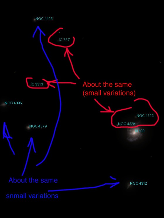
actually, your image just illustrates my point. On this picture, there aren't any "very transparent" labels. They are all looking the same, out of two classes : medium semi-transparent and clear opaque labels. There is no labels which are, say, very "weak" or very transparent (if the object was very far away).

Image
"Well! I've often seen a cat without a grin", thought Alice; "but a grin without a cat! It's the most curious thing I ever saw in all my life!"
Avatar
Topic author
t00fri
Developer
Posts: 8772
Joined: 29.03.2002
Age: 22
With us: 22 years 8 months
Location: Hamburg, Germany

Post #30by t00fri » 14.09.2006, 19:11

Cham,

I don't agree: ngc 4312, ngc 4396 and M100 are brighter than the rest in your blue group.

Please don't forget the range of brightness/transparency of monitors is VERY limited. If the present range is not sufficient for you and others do agree, then I just take the code out again. I made sure that I cannot add significantly more trnasparency given that the labels have to remain READABLE.

Bye Fridger
Image

ElChristou
Developer
Posts: 3776
Joined: 04.02.2005
With us: 19 years 10 months

Post #31by ElChristou » 14.09.2006, 19:15

I suppose the contrast between the closest and farest object could be increase, but one can be able to read the farest so it cannot be too dark...
Image

Avatar
selden
Developer
Posts: 10192
Joined: 04.09.2002
With us: 22 years 3 months
Location: NY, USA

Post #32by selden » 14.09.2006, 19:21

Don't forget the issue that ElChristou brought up in another thread: Celestia does not include a color profile feature.

Monitors must be calibrated. Even the best need frequent adjustments to ensure that their brightness, contrast and color shading stay the same.

A contributing factor here may be the fact that Macintosh systems do *not* use the same gamma correction as Windows or Linux systems. I am quite sure that the two of you are *not* seeing the same brightnesses on your screens.
Selden

Avatar
Topic author
t00fri
Developer
Posts: 8772
Joined: 29.03.2002
Age: 22
With us: 22 years 8 months
Location: Hamburg, Germany

Post #33by t00fri » 14.09.2006, 19:43

selden wrote:Don't forget the issue that ElChristou brought up in another thread: Celestia does not include a color profile feature.

Monitors must be calibrated. Even the best need frequent adjustments to ensure that their brightness, contrast and color shading stay the same.

A contributing factor here may be the fact that Macintosh systems do *not* use the same gamma correction as Windows or Linux systems. I am quite sure that the two of you are *not* seeing the same brightnesses on your screens.


I completely agree, Selden.

Of course these GUI effects should ideally be adjustable via a slider. But...

Bye Fridger
Image

Avatar
Cham M
Posts: 4324
Joined: 14.01.2004
Age: 60
With us: 20 years 11 months
Location: Montreal

Post #34by Cham » 14.09.2006, 21:14

t00fri wrote:Cham,

I don't agree: ngc 4312, ngc 4396 and M100 are brighter than the rest in your blue group.

Please don't forget the range of brightness/transparency of monitors is VERY limited. If the present range is not sufficient for you and others do agree, then I just take the code out again. I made sure that I cannot add significantly more trnasparency given that the labels have to remain READABLE.

Bye Fridger


Your code is using a mix of two things, and that's what is making the confusion : pop-in/out, and transparencies fading (which isn't strong enough IMO). Only the transparencies fading should be enough.

What I'm suggesting here, is to remove that "popping in-out" effect. The labels should just smoothly fade in and out instead, depending of the user's position. Very dark (transparent) labels are associated to very far away objects. They just don't show on screen (or very unreadable dark) and that's normal, unless the user change his position and/or his FOV. No abrupt popping-in needed.

Sorry, my English is pretty rough, today.
"Well! I've often seen a cat without a grin", thought Alice; "but a grin without a cat! It's the most curious thing I ever saw in all my life!"

Avatar
Topic author
t00fri
Developer
Posts: 8772
Joined: 29.03.2002
Age: 22
With us: 22 years 8 months
Location: Hamburg, Germany

Post #35by t00fri » 14.09.2006, 21:29

Cham wrote:...
Your code is using a mix of two things, and that's what is making the confusion : pop-in/out, and transparencies fading (which isn't strong enough IMO). Only the transparencies fading should be enough.

What I'm suggesting here, is to remove that "popping in-out" effect. The labels should just smoothly fade in and out instead, depending of the user's position. Very dark (transparent) labels are associated to very far away objects. They just don't show on screen (or very unreadable dark) and that's normal, unless the user change his position and/or his FOV. No abrupt popping-in needed.

Sorry, my English is pretty rough, today.


Cham,

of course my code is using a mix of the two mechanisms: FOR VERY GOOD REASONS!

From your proposal it just becomes obvious that you are lacking experience in this game.

Here is what you get, if I follow precisely what you suggested! Now only the opacity fades continuously to zero. The result is just a smear of a huge number of UNREADABLE labels. It's also easy to understand. Think about it....

Image

Sorry, I got to return to other more important stuff. Otherwise I am losing too much time.

Bye Fridger
Image

Avatar
Cham M
Posts: 4324
Joined: 14.01.2004
Age: 60
With us: 20 years 11 months
Location: Montreal

Post #36by Cham » 14.09.2006, 21:57

At least, this way, we really feel the spatial distribution of galaxies. And we feel a 3D effect here.
"Well! I've often seen a cat without a grin", thought Alice; "but a grin without a cat! It's the most curious thing I ever saw in all my life!"

Avatar
Topic author
t00fri
Developer
Posts: 8772
Joined: 29.03.2002
Age: 22
With us: 22 years 8 months
Location: Hamburg, Germany

Post #37by t00fri » 14.09.2006, 22:10

Cham wrote:At least, this way, we really feel the spatial distribution of galaxies. And we feel a 3D effect here.


Come on! That's really not the issue here ;-)

With 10000+ galaxy labels that's a mess. The first mechanism (cutting off magnitudes above a threshold apparent magnitude) works as an effective automag: it keeps the number of visible galaxy labels/(screen area) about constant with decreasing FoV. Otherwise there will be chaos on the screen. The same argument is even more important for stars, where we use the identical "dynamical label" mechanism.
Image

ElChristou
Developer
Posts: 3776
Joined: 04.02.2005
With us: 19 years 10 months

Post #38by ElChristou » 14.09.2006, 23:20

I agree with Fridger, the two methods are important but again I'd like to see a few more labels at mag 7... :wink:
Image

Avatar
Cham M
Posts: 4324
Joined: 14.01.2004
Age: 60
With us: 20 years 11 months
Location: Montreal

Post #39by Cham » 15.09.2006, 01:02

I just want more transparent labels gradations for higher distances (darker labels), so we can better feel the spatial distribution, that's all.
"Well! I've often seen a cat without a grin", thought Alice; "but a grin without a cat! It's the most curious thing I ever saw in all my life!"

ElChristou
Developer
Posts: 3776
Joined: 04.02.2005
With us: 19 years 10 months

Post #40by ElChristou » 15.09.2006, 01:15

I suppose tha markers could be used to give the spatial distribution and a real 3D effect; for the labels, IMO they are just fine but indeed I'd like to see a few more labels at default mag (7) :wink: :wink:
Image


Return to “Ideas & News”