Here is a tutorial for newcomers about layer manipulation in Photoshop (by analogy also in Gimp).
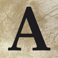
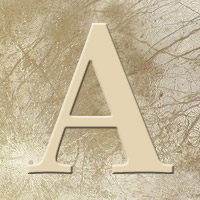
I will show here some tips and give some directions for a good use of the layer style and the Blending settings?€¦ the most important is to know that results are unlimited, and the best thing to do, is to experiment all possibilities on some sort of title file; here I have used as background a piece of Europa texture, and in layer1 (in text editing mode) a letter A (palatino bold, 200 pt). Those tips are at basis for typography artwort but by extension, all this is very utile in the creating process of maps for fictional planets.
First I will show some example of Blending modes then example of Layer styles, and to conclude some combination of those examples.
BLENDING MODE SETTINGS:
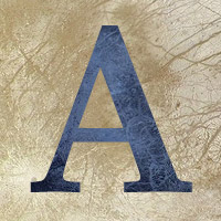
Normal - opacity 100%
With a dark text, only some settings are interesting:
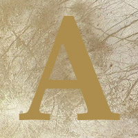
Overlay - opacity 100%
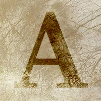
One of my favorite setting, it give some good way of integration with the background?€¦
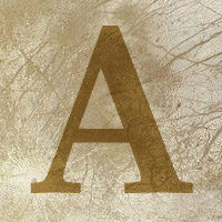
Soft light - opacity 100%
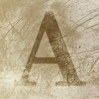
Note the similarity with Overlay, but in fact this one can be very different when combined with others effects?€¦
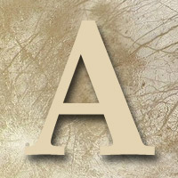
All light effects fusion are useful but depending of the layers, one may give better result than others?€¦ you will have to test every settings?€¦
Let?€™s change the color of the letter : black > white and:
Difference - 100%
This is just a negative (in reality only with white), also very useful?€¦
Let?€™s return to a normal mode and change on more time the color of the text:
Then:
Multiply -100%
This is the last very important Blending mode of this tutorial, also very useful.
LAYER STYLES :
Each style has his own Blending settings?€¦ another time playing with Blending mode is very important to have an interesting result.
Drop shadow - opacity 75% - distance 8 - Spread 0 - Size 9
The Blending mode for Drop shadow is by default Multiply, and for most application this is the best setting.
I use the Spread setting only in a few situations, so generally it will stay to 0.
The Quality settings are not useful for beginners.
Inner shadow - opacity 75% - distance 5 - Spread 0 - Size 5
To do an engraved effect.
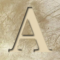
Outer glow - 0pacity 75% - Noise 0 - Technique: Softer - Spread 25 - Size 20 - Range 75% - Jitter 0%

Bevel and Emboss
This one needs a special treatment because 2 of his settings are quite interesting:
Style: Inner bevel ?€“ Depth 200% - Size 1- Soften 0
Style: Pillow Emboss - Depth 650% - Size 4 - Soften 1

[color=orange]I usually drop the opacity of the shadow mode setting to less than 60?€¦
The Bevel and Emboss style is very common in graphic design so I use it carefully with small values, to avoid ?€?d?©j? vu?€

