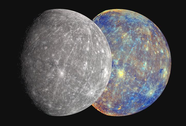
Revamping Steve Albers' 4k Mercury texture...

Tips for creating and manipulating planet textures for Celestia.
Avatar
Topic author
t00fri
Developer
Posts: 8772
Joined: 29.03.2002
Age: 22
With us: 22 years 7 months
Location: Hamburg, Germany

Re: Revamping Steve Albers' 4k Mercury texture...

Post #21by t00fri » 03.05.2009, 19:53

scalbers wrote:
...
I agree also (with RVS) that it's worth considering the pros and cons of Ugordan's recent color versions of Messenger flybys.

Steve

Steve,

since you "agree also (with RVS)" as to a closer look at Ugordan's coloration of Mercury, please let me know

-- who is Ugordan? He calls himself a (Croatian) "Cyborg engineer" ;-) Is he a scientist in disguise? What are his achievements so far at the imaging front? I note that on his site many references to original work are missing, which doesn't look very "scientific" though ...

-- did you clearly understand what the essential point of this NASA study was (I did!)?
(it was concisely described in the caption of PIA11364!)

Image

My coloration for Mercury was of course taken from image 22. Just note that overlaying images 12 and 21 one gets at 50% transparency level (symbolically):

12 * 21 = 22 ;-)

Fridger

PS: my revamped Mercury texture has been optimally sharpened by means of a sophisticated GIMP (wavelet sharpening) plugin.
Image

Avatar
jogad
Posts: 458
Joined: 17.09.2008
With us: 16 years 2 months
Location: Paris France

Re: Revamping Steve Albers' 4k Mercury texture...

Post #22by jogad » 03.05.2009, 21:03

Hello,

t00fri wrote:PS: my revamped Mercury texture has been optimally sharpened by means of a sophisticated GIMP (wavelet sharpening) plugin.


Yes. It seems that it is the jpg format that cause this blurry aspect.

I saved my texture in dds format and here is the result without additional sharpening. This is the northern hemisphere. The difference is spectacular at the north pole. (At this place, it is real data)

Image
Image

PS: I wanted to attach my texture for testing but it is to big and that doesn't work :(

scalbers
Posts: 138
Joined: 30.01.2005
With us: 19 years 9 months

Re: Revamping Steve Albers' 4k Mercury texture...

Post #23by scalbers » 03.05.2009, 21:39

t00fri wrote:
scalbers wrote:
...
I agree also (with RVS) that it's worth considering the pros and cons of Ugordan's recent color versions of Messenger flybys.

Steve

Steve,

since you "agree also (with RVS)" as to a closer look at Ugordan's coloration of Mercury, please let me know

-- who is Ugordan? He calls himself a (Croatian) "Cyborg engineer" ;-) Is he a scientist in disguise? What are his achievements so far at the imaging front? I note that on his site many references to original work are missing, which doesn't look very "scientific" though ...

-- did you clearly understand what the essential point of this NASA study was (I did!)?
(it was concisely described in the caption of PIA11364!)


My coloration for Mercury was of course taken from image 22. Just note that overlaying images 12 and 21 one gets at 50% transparency level (symbolically):

12 * 21 = 22 ;-)

Fridger

PS: my revamped Mercury texture has been optimally sharpened by means of a sophisticated GIMP (wavelet sharpening) plugin.

Fridger,

Ugordan stands for Gordan Ugarkovic. He posts quite a bit at unmannedspaceflight.com (where I do as well). He's done a lot of good color work with (for example) Cassini Saturn PDS images. He's often cited in places like The Planetary Society. I actually did ask him about whether his earlier Mercury versions were too brown in color though I'd assume the availability of the PDS Messenger data is now allowing him to make better calibrated images. I'll have to find that discussion, though I think he was citing Earth-based color measurements.

I guess I'm a bit unclear on following the wording in PIA11364, though I could surmise it would be important as to whether you keep the original color saturation after doing any contrast stretching.

The UMSF post is #138 in this thread that might be worth some further discussion. Perhaps I'll add in a little comment.

http://www.unmannedspaceflight.com/inde ... ntry139789

Steve

Avatar
Topic author
t00fri
Developer
Posts: 8772
Joined: 29.03.2002
Age: 22
With us: 22 years 7 months
Location: Hamburg, Germany

Re: Revamping Steve Albers' 4k Mercury texture...

Post #24by t00fri » 04.05.2009, 09:26

Steve,

scalbers wrote:Fridger,

Ugordan stands for Gordan Ugarkovic. He posts quite a bit at unmannedspaceflight.com (where I do as well). He's done a lot of good color work with (for example) Cassini Saturn PDS images.
Thanks, I was aware of this much before, since I also had done some previous research in the net.

What I really wanted to know about Ugordan concerned his professional skills and whether he was associated with some official imaging team in some way. In his personal profile, http://www.flickr.com/people/ugordan/ he writes about himself:
ugordan wrote:I'm a guy who does programming for a living, have a college degree in computer science, but in free time I like to fool around with image processing.
So no doubt he's skilled with computer graphics, but he's definitely NOT a scientist with a solid respective training and an insider knowledge about imaging uncertainties comparable to the official teams!

I actually did ask him about whether his earlier Mercury versions were too brown in color though I'd assume the availability of the PDS Messenger data is now allowing him to make better calibrated images.
Ugordan has indeed produced a host of color composites from the public PDS archive image files (filtered gayscale data), a project that he justifies from the rather low publication rate of color images by the official teams... (personally I think their reservations are due to the remaining uncertainties in achieving the correct true colors, rather than lack of time as Ugordan argued)

If from all of Ugordan's published color imaging you extract the ones tagged "Mercury" you'll get already quite a spectrum of different levels of brown tones...;-) His latest one is the brownest.

And that is the one that you guys think has a point of being preferrable to the above best estimate by the official NASA team?? Well, I disagree. Here is why:

  • While his images certainly look neat, as a professional physicist, I am badly missing any discussions by him about remaining systematic uncertainties within his color composition procedure! If I am supposed to believe anything, I need a much more precise statement about his calibration procedure, which is always tricky. Also it takes knowledge of the individual filter characteristics (not just the peak wavelenghts, but also the shapes!)
  • I guess I'm a bit unclear on following the wording in PIA11364,
    My crucial point is that the scientific NASA study above did precisely what Ugordan missed out:

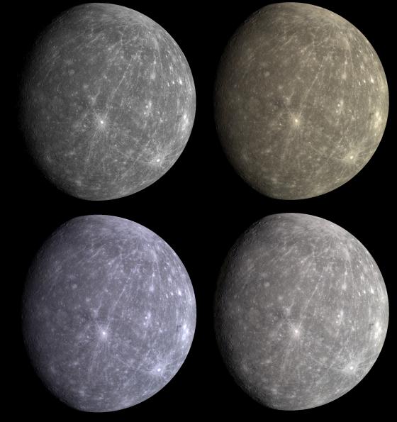
    PIA11364 is nothing but a study to estimate the best true color (image 22= bottom right that I used) along with giving a range of remaining systematic color uncertainty (images 21 = bottom left and 12 = top right!). The team did the uncertainty estimate like any physicist would have done it: one examines the results of two extreme (color composition) possibilities that are still sensible physicswise! The best choice is then some sort of average between the two extreme options. As you could have checked easily yourself : indeed 21 * 12 = 22 at 50% transparency as I wrote earlier. I could go into much more detail about the NASA study, but who would want to read such technical stuff about the overlap effects of filter shapes in color space etc?

    According to my understanding, the caption of PIA11364 expressed the proceedure by the NASA team quite clearly.

  • Note that with my arguments, I examined which Mercury colour analysis appears preferrable, not necessarily meaning "closer to reality"! If Ugordan is lucky, his Mercury color might well one day turn out to be a bit closer to reality than the present one by NASA. But due to his lacking scientific methodology as to inherent systematic color uncertainties we simply cannot tell the chances!

    Hence Ugordan leaves us with a pleasing colored Mercury image, but without any estimate of how probable the given coloration really is...

Since at Celestia development we prefer to refer to official and transparent scientific data sources, for me (and also for ChrisL, see his post above) there is no doubt about which Mercury colors to prefer.

A remaining important task for Celestia is to achieve the correct magnitudes (brightness) for all solar system bodies. From ChrisL I learned that you have offered some respective FORTRAN calibration code to us. Many thanks from me as well!

Fridger
Image

ugordan
Posts: 5
Joined: 04.05.2009
With us: 15 years 6 months

Re: Revamping Steve Albers' 4k Mercury texture...

Post #25by ugordan » 04.05.2009, 13:23

Since my work is being discussed here, I might as well chime in.

t00fri wrote:Steve,
But this was not what I really wanted to know about Ugordan. In his personal profile, http://www.flickr.com/people/ugordan/ he writes about himself:
ugordan wrote:I'm a guy who does programming for a living, have a college degree in computer science, but in free time I like to fool around with image processing.
So no doubt he's skilled with computer graphics, but he's definitely NOT a scientist with a solid respective training and an insider knowledge about imaging uncertainties comparable to the official teams!
I actually use that insider knowledge in my processing as I wrote my own calibration software for both Cassini and MESSENGER, based on calibration documentation and software released to the public via the PDS by the respective imaging teams. It's not some ad-hoc messing around like playing around with raw jpegs from MER or Cassini missions would be.

If from all of Ugordan's published color imaging you extract the ones tagged "Mercury" you'll get already quite a spectrum of different levels of brown tones...;-) His latest one is the brownest.
There is a single reason to this being the case - variations in gamma function applied. The most recent composite I posted has the linear reflectance data just shoved into the sRGB 8 bit values. This was a common practice with pretty much all spacecraft imagery I've seen to date, be it NASA/JPL/APL, whatever. The reason is it gives much stronger contrasts and colors for these inherently low contrast worlds. The sRGB colorspace standard assumes a gamma of 2.2 applied so the digital numbers of 8 bit RGB values takes care of the nonlinear characteristic of computer (and TV) screens. The thing is this makes contrasts lower, colors subdued and it brings out any background noise in the camera.

The other one which I posted here: http://www.flickr.com/photos/ugordan/2682440417/ shows a correct gamma representation. Read the image advisory on the reasoning behind it. Note in particular the terminator line and how it appears much more natural and well-defined (look at the crescent Moon with the naked eye for comparison), instead of just fading out into darkness. The other composites are somewhere inbetween, including one attempt to capture the color saturation of gamma-correct and contrast of non-gamma correct versions.

  • While his images certainly look neat, as a professional physicist, I am badly missing any discussions by him about remaining systematic uncertainties within his color composition procedure! If I am supposed to believe anything, I need a much more precise statement about his calibration procedure, which is always tricky. Also it takes knowledge of the individual filter characteristics (not just the peak wavelenghts, but also the shapes!)
  • I guess I'm a bit unclear on following the wording in PIA11364,
    My crucial point is that the scientific NASA study above did precisely what Ugordan missed out:

    PIA11364 is nothing but a study to estimate the best true color (image 22= bottom right that I used) along with giving a range of remaining systematic color uncertainty (images 21 = bottom left and 12 = top right!). The team did the uncertainty estimate like any physicist would have done it: one examines the results of two extreme (color composition) possibilities that are still sensible physicswise! The best choice is then some sort of average between the two extreme options. As you could have checked easily yourself : indeed 21 * 12 = 22 at 50% transparency as I wrote earlier. I could go into much more detail about the NASA study, but who would want to read such technical stuff about the overlap effects of filter shapes in color space etc?

    According to my understanding, the caption of PIA11364 expressed the proceedure by the NASA team quite clearly.
You're reading too much into the image advisory there. There is very little physically correct about the bottom-left image since the 3 channels were stretched independently of each other, read carefully what they stated. This would be similar to you taking an image of a red rose and then boosting the blue channel in Photoshop so the rose looks purple. It's no longer natural color, it's enhanced color. Only the top right image is physically correct in that it preserves the relative brightnesses the three color channels have - the planet has a monotone red spectral slope and this image shows it. The image on the bottom right can be regarded as an honest representation of what the planet would look like after you stared it for a while and your eye accomodated to the lower green and blue light levels. I imagine it would start looking gray after a while. That's what they did, they normalized all thee channels to the same average brightness - sort of a white balancing method the eye would automatically do. The trick is, if you then put up a blank sheet of white paper in front you'd see the Mercury "gray" and white paper white were not the same color - that the eye just accomodated to the average color and it could actually make the paper look blue in comparison. Incidentally, the top right image is the method I used so the colors are fairly similar, the difference probably arising from the fact I use their ground lab calibration data, while they might use their inflight calibration results of Venus.

The truth of the matter is - there is no scientific and accurate true color. It's always been and will be a kind of a black art, especially if you consider that most objects in the solar system are too bright for computer screens to accurately display, which also causes color shifting in the eye. In fact, your 50% transparency thing is just that - resorting to some more black magic. Speaking of the Cassini color images, I still maintain it's due to very low priority on their part, not being unable to produce accurate/honest representations. If you took a look at some of their earlier color work, you'd see they didn't maintain consistent colors either, Saturn's rings being blue, etc.

  • Note that with my arguments, I examined which Mercury colour analysis appears preferrable, not necessarily meaning "closer to reality"! If he's lucky, Ugordan's Mercury color might well one day turn out to be closer to reality than the present one by NASA. But due to his lacking scientific methodology as to inherent systematic color uncertainties we simply cannot tell the chances!

    Hence Ugordan leaves us with a pleasing colored Mercury image, but without any estimate of how probable the given coloration really is...
  • My aspirations were merely to produce a reasonable depiction of what the planet might look like - both Mercury as well as Venus of which I've seen way too many false color images. I sticked to the no-gamma, garish colors because people seem to like them better than more accurate representations, but when I state it's a "natural/true color image" it means I did no channel manipulations. The three color filters MESSENGER has are reasonably close to sRGB color wavelengths and Mercury's spectra is real monotone so filter bandpasses are irrelevant in this case. Before MESSENGER we had no good color information for either Venus or Mercury.

    Sorry for the long post, I hope this clears up a few things. My personal preference would be to have Mercury tinted only slightly brownish-copperish, not garish but certainly more colorful than a grayscale map.

    BobHegwood
    Posts: 1803
    Joined: 12.10.2007
    With us: 17 years 1 month

    Re: Revamping Steve Albers' 4k Mercury texture...

    Post #26by BobHegwood » 04.05.2009, 13:59

    ugordan wrote:Sorry for the long post, I hope this clears up a few things. My personal preference would be to have Mercury tinted only slightly brownish-copperish, not garish but certainly more colorful than a grayscale map.

    Thanks *very* much for posting this explanation here. While I understand almost
    nothing about the topic itself, I'm very glad that you took the time to respond
    here. We'll see what the Good Doctor has to say, but I, personally, just wanted to
    thank you for this tedious work. :wink:

    Again, many thanks, Brain-Dead Bob
    Brain-Dead Geezer Bob is now using...
    Windows Vista Home Premium, 64-bit on a
    Gateway Pentium Dual-Core CPU E5200, 2.5GHz
    7 GB RAM, 500 GB hard disk, Nvidia GeForce 7100
    Nvidia nForce 630i, 1680x1050 screen, Latest SVN

    Avatar
    Topic author
    t00fri
    Developer
    Posts: 8772
    Joined: 29.03.2002
    Age: 22
    With us: 22 years 7 months
    Location: Hamburg, Germany

    Re: Revamping Steve Albers' 4k Mercury texture...

    Post #27by t00fri » 04.05.2009, 15:46

    Hi, Ugordan, welcome!

    ugordan wrote:Since my work is being discussed here, I might as well chime in.

    Excellent!
    t00fri wrote:Steve,
    But this was not what I really wanted to know about Ugordan. In his personal profile, http://www.flickr.com/people/ugordan/ he writes about himself:
    ugordan wrote:I'm a guy who does programming for a living, have a college degree in computer science, but in free time I like to fool around with image processing.
    So no doubt he's skilled with computer graphics, but he's definitely NOT a scientist with a solid respective training and an insider knowledge about imaging uncertainties comparable to the official teams!

    I actually use that insider knowledge in my processing as I wrote my own calibration software for both Cassini and MESSENGER, based on calibration documentation and software released to the public via the PDS by the respective imaging teams. It's not some ad-hoc messing around like playing around with raw jpegs from MER or Cassini missions would be.

    So let me ask you then, what community you are addressing with the kind of imaging you are doing?

    Scientific communities would only be ready to accept such delicate calibration work from outside individuals, if your code was well documented in public and accepted by official mission teams as being basically correct. Do you have such a write-up that I can read as a physicist and longstanding Celestia co-author/developer? Did some teams already use your code?? This is even more relevant, since you are not backed up by an official NASA team, and instead do your work as an idividual.

    If from all of Ugordan's published color imaging you extract the ones tagged "Mercury" you'll get already quite a spectrum of different levels of brown tones...;-) His latest one is the brownest.
    There is a single reason to this being the case - variations in gamma function applied.
    In your last Mercury image you refer however to the preceding one of yours with this interesting sentence:
    Ugordan wrote:Unlike my previous version of the global image that was fudged based on Mercury surface spectra, this one uses calibrated wide-angle camera color data. The old processing should now be rendered obsolete.
    Hence, old versus new doesn't look like a pure gamma effect as you claimed above...There is NO concise discussion HOW you did the calibration in the new image. You discussed nowhere how much you could make your Mercury color different without doing anything physically wrong (i.e. the usual estimate of inherent uncertainties in your procedure)?
    You're reading too much into the image advisory there. There is very little physically correct about the bottom-left image since the 3 channels were stretched independently of each other, read carefully what they stated. This would be similar to you taking an image of a red rose and then boosting the blue channel in Photoshop so the rose looks purple. It's no longer natural color, it's enhanced color. Only the top right image is physically correct in that it preserves the relative brightnesses the three color channels have - the planet has a monotone red spectral slope and this image shows it.

    Either you didn't read carefully my comments about the NASA analysis or you didn't understand well it's purpose. Such uncertainty estimates are a standard procedure in physics. As I explained, the off-diagonal images 21 and 12 merely define the extremal choices one can still adopt in principle for the color composition without doing utter nonsense. Of course, I was NOT arguing about 21 or 12 being particularly correct or false, because this is irrelevant for the error estimate.

    The 21 * 12 = 22 result is certainly no black magic. It just confirms that NASA's preferred color corresponds to 22 in the sense of an average of the two extreme possibilities (21 and 12).

    The image on the bottom right can be regarded as an honest representation of what the planet would look like after you stared it for a while and your eye accomodated to the lower green and blue light levels.

    OK that's why I selected that bottom right image 22 as a coloration template for my above Mercury texture in the official distribution of Celestia 1.6.0. Also NASA clearly prefers this image as their best approximation to "true color": e.g. here, the left-hand image

    Image
    with this caption for the official true color image at LEFT:
    NASA wrote:...
    Three-color images (480 nm, 560 nm, 630 nm) were combined to produce an approximation of Mercury’s true color as might be seen by the human eye (left) (see PIA11364). From this rendition of Mercury it is obvious that color differences on the surface are slight.
    --

    The truth of the matter is - there is no scientific and accurate true color.
    Sure, physicists KNOW that... ;-)

    My aspirations were merely to produce a reasonable depiction of what the planet might look like - both Mercury as well as Venus of which I've seen way too many false color images. I sticked to the no-gamma, garish colors because people seem to like them better than more accurate representations, but when I state it's a "natural/true color image" it means I did no channel manipulations. The three color filters MESSENGER has are reasonably close to sRGB color wavelengths and Mercury's spectra is real monotone so filter bandpasses are irrelevant in this case. Before MESSENGER we had no good color information for either Venus or Mercury.

    AHA! Here you clearly wrote in more detail about the scope and level of "rigor" of your work. I don't have much to add beyond what I wrote already. Still I would be most interested to understand your mentioned calibration procedure/code at a "technical = physics" level...

    My personal preference would be to have Mercury tinted only slightly brownish-copperish, not garish but certainly more colorful than a grayscale map.

    +++++++++++++++++++++++++++++++++++++++++
    Well, I guess then we don't really disagree very much, certainly at most by an amount well within the remaining NASA uncertainties ;-) .
    +++++++++++++++++++++++++++++++++++++++++

    Here is a direct comparison between your most recent preferred Mercury coloration (right)
    http://www.flickr.com/photos/ugordan/26 ... otostream/
    and the official NASA one (left) from above
    Image

    Fridger
    Image

    ugordan
    Posts: 5
    Joined: 04.05.2009
    With us: 15 years 6 months

    Re: Revamping Steve Albers' 4k Mercury texture...

    Post #28by ugordan » 04.05.2009, 17:00

    t00fri wrote:So let me ask you then, what community you are addressing with the kind of imaging you are doing?
    Basically anyone who likes color images of the planets. I'm not targeting scientists nor am I expecting any serious analyses being done on my data. As far as I know, natural color images in this respect are always produced for public affairs purposes and public consumption and not scientific analysis. I'm not aware of true color images, even ones released officially, being used in any serious scientific work. The statement "approximate natural color" often accompanies such releases for a reason. My work is no different. Serious work requires radiance measurements, filter ratios, etc. and "natural" color images are way too overprocessed for that.

    In your last Mercury image you refer however to the preceeding one of yours with this interesting sentence:
    Ugordan wrote:Unlike my previous version of the global image that was fudged based on Mercury surface spectra, this one uses calibrated wide-angle camera color data. The old processing should now be rendered obsolete.
    Hence, old versus new doesn't look like a pure gamma effect as you claimed above...There is NO concise discussion HOW you did the calibration in the new image. You discussed nowhere how much you could make your Mercury color different without doing anything physically wrong (i.e. the usual estimate of inherent uncertainties in your procedure)?
    I should have probably clarified that the two earliest color composites there are not calibrated data, but approximations of officially released false color composites and using the officially published Mercury IR/visible spectra. These are images http://www.flickr.com/photos/ugordan/2231456684/ and http://www.flickr.com/photos/ugordan/2232382633/. The latter is clearly marked as [OBSOLETE], I should probably delete it altogether. The source for the images is described in the first of the two. I guess I left them to serve as a comparison with how different actual, calibrated products appear.

    The rest of the Mercury color composites are R/G/B composites stacked by calibrating raw PDS data wide-angle camera filters E,D,C and using ground derived calibration tables. No fudge jobs. The two composites above were my first order attempts after the flyby to reconstruct a "natural" color image based on the false color image released by the team, which contained red and violet frames I could use.

    Either you didn't read carefully my comments about the NASA analysis or you didn't understand well it's purpose. Such uncertainty estimates are a standard procedure in physics. As I explained, the off-diagonal images 21 and 12 merely define the extremal choices one can still adopt in principle for the color composition without doing utter nonsense. Of course, I was NOT arguing about 21 or 12 being particularly correct or false, because this is irrelevant for the error estimate.

    I re-read the image advisory again and I don't see how the bottom left image is an "opposite" having anything to do with calibration uncertainty. The top right image is a straight-up color composite of filters E,D,C. It's not the extreme case of the bottom left image, it's the actual result which the calibration produces gives out, within the calibration uncertainty for each filter (this is IIRC typically 5% for spacecraft images). As such, there is no single "opposite" case since every of the 3 filters could be miscalibrated from the actual physical brightness by +/- 5%. This alone gives a 3d space of possible color variations, not just one image.

    Frankly, try as I might, I don't see what they were getting at with the lower-left blue Mercury image. The top right image is useful, with it you can measure (merely by looking at the RGB values) that the brightness of the surface in the red wavelength band is X times the brightness of the other one of the two filters, and follows the spectral curve of the planet. That's why I say it's a physical representation of the planet's surface properties. It's got nothing to do with either me or them or you being a physicist. Suggesting that since I am not one that I'm unable to produce a calibrated output that shows this physical relationship through 3 discrete filters is a bit unfair, IMHO. I've done a bit of calibration sanity cross-checking where available with both how Earth turns out and how Venus turns out and I don't think there's a gross error in my calibration procedure. MESSENGER image calibration is, thankfully, much more straightforward than Cassini's.

    Now... turning that physical representation into an actual "natural" color image is where problems begin and things become very subjective. That's territory I'm not going to go into. I can see where they were getting with the lower right image for this reason, but I don't think I would go to such an extreme case of equalizing all the 3 filters brightnesses.

    I'm certainly not attempting to persuade anyone that my color is the color nor do I really care if everyone just ignores everything I've just said on account of me not having an intimate involvement with the mission. All I know is that on the one occasion I got to see the planet with my own naked eye, it didn't look gray but it had a distinct hue to it.

    I should point out that the Messenger team already put out calibrated versions of all the images on PDS in addition to raw images so you can try playing around with them directly and see what colors you come up with. I personally prefer the raw images as they're 1/2 to 1/4 the size of calibrated products to download, YMMV.
    Avatar
    Topic author
    t00fri
    Developer
    Posts: 8772
    Joined: 29.03.2002
    Age: 22
    With us: 22 years 7 months
    Location: Hamburg, Germany

    Re: Revamping Steve Albers' 4k Mercury texture...

    Post #29by t00fri » 04.05.2009, 17:59

    ugordan wrote:I re-read the image advisory again and I don't see how the bottom left image is an "opposite" having anything to do with calibration uncertainty. The top right image is a straight-up color composite of filters E,D,C. It's not the extreme case of the bottom left image, it's the actual result which the calibration produces gives out, within the calibration uncertainty for each filter (this is IIRC typically 5% for spacecraft images). As such, there is no single "opposite" case since every of the 3 filters could be miscalibrated from the actual physical brightness by +/- 5%. This alone gives a 3d space of possible color variations, not just one image.

    Here is another way of investigating the meaning of images 21, 12, and 22:

    After loading 22 into GIMP, decompose it into its R,G,B components. Then apply the brightness/contrast filter on the blue component and add/subtract 20 units of brightness AND contrast, each. Compose the resulting components again into 2 colored images. What you will get is a VERY good approximation to images 21 and 12. Image 21 corresponds to adding brightness/contrast to the blue component of 22, while 12 corresponds to subtracting the SAME amount from the blue component of 22.

    This is nothing new, really, but it's a somewhat different way of expressing the same fact.
    Hence 22 is essentially an average over the blue components of 21 and 12, with the red and green components remaining essentially unaffected.

    Fridger
    Image

    scalbers
    Posts: 138
    Joined: 30.01.2005
    With us: 19 years 9 months

    Re: Revamping Steve Albers' 4k Mercury texture...

    Post #30by scalbers » 16.05.2009, 17:57

    Just catching up on this great discussion. For some reason I'm not getting email updates when I subscribe to this topic.

    Personally I think the more folks there are (both "officially" paid and otherwise) working on the color question, the better. Often the official teams are more interested in "scientific" uses of color information for things like mineral identification and the like and are generally less interested in (or don't have the time for) the aesthetics of what it would look like with your own eyes if you were there. Glad to see this Mercury image release from NASA though as clearly it is some good food for thought.

    In the image comparison a couple of posts above we can see the colors are reasonably similar, while the contrast catches my eye as being different. So perhaps that is part of the strategy, to preserve the color hue and saturation if you want to manipulate the brightness and contrast.

    As a historical note I was an intern working on the Viking Lander Imaging Team in the 1970s and I recall the controversies at the time about whether the Martian sky was blue or not. So we've come a long way...

    P.S. Will be interesting to see magnitudes implemented in Celestia - hopefully the code I'm working on will help towards the effort.
    Last edited by scalbers on 16.05.2009, 18:23, edited 2 times in total.

    Avatar
    Topic author
    t00fri
    Developer
    Posts: 8772
    Joined: 29.03.2002
    Age: 22
    With us: 22 years 7 months
    Location: Hamburg, Germany

    Re: Revamping Steve Albers' 4k Mercury texture...

    Post #31by t00fri » 16.05.2009, 18:08

    scalbers wrote:Just catching up on this great discussion. For some reason I'm not getting email updates when I subscribe to this topic.

    In general I think the more folks there are (both "officially" paid and otherwise) working on the color question, the better.

    Steve,

    yes and NO. The problem with this business is that the more people without scientific training get involved in this delicate issue, the less it becomes transparent what everybody's STANDARDS are!

    Ugordan, for example, claims that he has written his own code for normalizing the raw images. But there is no public and detailed documentation of that code. For me as a scientist this sort of effort is only worth anything, if I (and other experts) get a chance of critically evaluating what he did. I can very well understand the input and the code if I get a chance of looking at it.

    After all we are not disputing whether Mercury's color is blue or green ;-)

    We are talking about subtle shades... and the smaller the differences that are at stake, the more clearly the contributors' standards have to be normalized.

    Otherwise it's all a vaste of time...

    Fridger
    Image

    scalbers
    Posts: 138
    Joined: 30.01.2005
    With us: 19 years 9 months

    Re: Revamping Steve Albers' 4k Mercury texture...

    Post #32by scalbers » 16.05.2009, 18:34

    Fridger - perhaps one's work can be evaluated in part by how consistent it is. Detailed code evaluation would not be required for this. One can simply look at a number of different images created. If the colors appear consistent then it has a better chance of being correct. The human eye is a pretty good "scientific" instrument, particularly when the purpose of this exercise is getting at what the color would look like if you were there.

    It looks like you and 'ugordan' are fairly close on what the best coloration would be. In the ideal world for my mapping purposes it would be nice if such consistently balanced color images were available for all of the Messenger flybys.

    Another approach is to look at photographs taken of the moon and Mercury in the sky in conjunction. That way we can consider the relative color difference of these objects.

    ugordan
    Posts: 5
    Joined: 04.05.2009
    With us: 15 years 6 months

    Re: Revamping Steve Albers' 4k Mercury texture...

    Post #33by ugordan » 18.05.2009, 09:10

    t00fri wrote:Ugordan, for example, claims that he has written his own code for normalizing the raw images.
    I wasn't gonna respond to that, but the tone of that statement made me. Yes, that is exactly what I claim because it's a fact. I did write the software based on none other than the following document: http://pds-imaging.jpl.nasa.gov/data/me ... ALINFO.TXT

    If you suggest I'm unable to process the original raw data through several relatively easy and straightforward equations as outlined in the above document, I'm afraid this discussion about my work is moot. If that's the case I suggest you all completely forget about my work and let's just be done with it. Use the official work since you've made your own rationalizations why it's the best and how averaging two different colored images is somehow scientific in giving the natural color. I'd much rather have that than allusions that I as a programmer am incompetent of compiling a simple calibration pipeline. I'm sorry if I sound too defensive, but I tend to be sensitive about certain things. Don't like my work - fine, just don't question my programming skills when you have no basis for it.

    Calibration isn't exactly rocket science, after all. Yet, if there's one thing I found out in discussions on "true" color in the past it's that everyone will pick their favorite rendition and then find ways to rationalize that choice. Very seldom one changes his/her mind based on other arguments and in the end it's just as well since color is subjective.

    t00fri wrote:But there is no public and detailed documentation of that code. For me as a scientist this sort of effort is only worth anything, if I (and other experts) get a chance of critically evaluating what he did. I can very well understand the input and the code if I get a chance of looking at it.
    Yet there is no public and detailed documentation of the official code the imaging team used either, but you're perfectly able to believe them? Maybe that's just me, but it looks like double standards. Critical questioning should apply to all and imaging team members are human as well and are far from infallible. I've seen evidence of this in Cassini's officially supplied calibration code errata for example.

    I already stated the MESSENGER ground calibration data and inflight calibration data produced by the team varies much more than subtleties between these color representations. That alone dilutes the fact of one absolute and correct calibration. While ground calibration results were affected by certain uncertainties, the in-flight calibration effort was affected by totally different uncertainties, neither is totally correct by itself and neither is very wrong, yet they produce slightly different results.

    Avatar
    Topic author
    t00fri
    Developer
    Posts: 8772
    Joined: 29.03.2002
    Age: 22
    With us: 22 years 7 months
    Location: Hamburg, Germany

    Re: Revamping Steve Albers' 4k Mercury texture...

    Post #34by t00fri » 18.05.2009, 10:40

    ugordan wrote:
    t00fri wrote:Ugordan, for example, claims that he has written his own code for normalizing the raw images.
    I wasn't gonna respond to that, but the tone of that statement made me. Yes, that is exactly what I claim because it's a fact. I did write the software based on none other than the following document: http://pds-imaging.jpl.nasa.gov/data/me ... ALINFO.TXT

    Ugordan,

    please accept my apologies for that formulation, since its meaning differs apparently in conversational English (which is not my native language). To use claim in a scientific context is perfectly normal and meant to generally refer to statements without explicit proof of their correctness.

    It is NOT to express mistrust in what you did however! Please don't take it as an offense, if I don't simply believe you or anybody else in scientific matters. It is part of a founded scientific training NOT to believe in such results without being able to understand or crosscheck what physics input went in, where the uncertainties sit, how big they are etc.

    Believing you is not what matters here, if we are to compare two subtly different shades of brown-gray from NASA and your work!

    If you suggest I'm unable to process the original raw data through several relatively easy and straightforward equations as outlined in the above document, I'm afraid this discussion about my work is moot.
    I certainly trust that you are able to code the respective formulas. But in the present problem coding is the easier part. The hard part is to assert physicswise what the calibration uncertainties are. That's what I need to understand before "believing" the output of your code. Since your results are certainly roughly correct, the whole issue then boils down to questioning the gory details. That's how scientific methodology works and there is nothing whatsoever offensive about it! Coding is your profession, theoretical (astro)Physics is mine.

    There is still another consideration that is relevant: For the Celestia distribution, we normally refer to citations that are officially endorsed by the respective scientific collaboration. This ties our data closely to them along with future update cycles that are also kept track pretty well in their publication media. This procedure helps quite a lot as concerns data transparency.

    Don't like my work - fine, just don't question my programming skills when you have no basis for it.
    See my explanations above. You got this totally wrong... Sorry again for that.

    Fridger
    Image

    ugordan
    Posts: 5
    Joined: 04.05.2009
    With us: 15 years 6 months

    Re: Revamping Steve Albers' 4k Mercury texture...

    Post #35by ugordan » 18.05.2009, 16:10

    t00fri wrote:Believing you is not what matters here, if we are to compare two subtly different shades of brown-gray from NASA and your work!
    For what it's worth, the differences between NASA/APL image 22 and mine that you compared side-by-side pretty much boil down to two things:

    • sRGB gamma correction. I talked about this before and it has to do with presentation of linear, calibrated spacecraft pixel intensity data on a nonlinear monitor screen, which is what the sRGB colorspace assumes. Instead of trying to explain what a gamma function does, take a look at the image I already linked here: http://www.flickr.com/photos/ugordan/2682440417/ and in particular the link in the description showing "example images of the Moon". The NASA image 22 would be similar in contrast (judging by my eye, they either didn't apply any gamma or a very slight one) to the rightmost Cassini image of the Moon, also presented in a linear way.
      Would you agree this is not the normal appearance of the Moon when you look at it with the naked eye? The contrast is too strong and the terminator just fades away. This method is great for analysing minute albedo differences, but is NOT representative of actual brightness relationship a surface has. In particular, Mercury's albedo features are weaker than our Moon's - which the NASA images don't show. The central image above is the same Cassini image as on the right, but with the correct 2.2 gamma applied. The left one is a comparison image of the moon from the ground taken using an ordinary, digital photographic camera - they by default already produce correct sRGB colorspace results.
      That's why my image shows much less contrast than the NASA one. It can be said the eye can discern much higher contrasts than a monitor can show, and it's true, but to a first approximation that level of contrast and albedo is what I think would be visible. Your eye would be able to discern a greater variation in subtle surface features, but they would not have such a bright brightness difference nonetheless.

    • White-balancing. The 22 image assumes your eye adapted to the general color of Mercury so the color kind of fades away after a while. My processing that shows a subtle brownish globe does NOT assume that. It assumes your eye is accustomed to normal white light (say after looking at a blank white sheet of paper) and then you look at the planet. The brownish hue is roughly what I believe the eye would see, before it has time to accomodate to the overall hue. The brownish image above the 22 is roughly the same as my image, but without the gamma correction. If you applied a 2.2 gamma to it, you'd get roughly the same representation color/contrast representation and more of an apples-to-apples comparison.

    t00fri wrote:There is still another consideration that is relevant: For the Celestia distribution, we normally refer to citations that are officially endorsed by the respective scientific collaboration. This ties our data closely to them along with future update cycles that are also kept track pretty well in their publication media. This procedure helps quite a lot as concerns data transparency.
    Fair enough, I can understand that. The only question that really remains is do you wish to portray how Mercury would look if it were the only object out there, with nothing your eye would have to compare its hue with after it accomodated, or if you wish to portray a non white-balanced view, sort of a first glance view. The remaining, probably less important question is whether you like to enhance the contrast of the surface features or you prefer blander, but more representative appearances. The sad truth is, most of the objects in our solar system come nowhere near the dynamic range our Earth has with dark oceans and land masses and contrasted with bright clouds. We're accustomed to such contrasts and like to depict other worlds the same way, but that doesn't mean they really look like that. For example, I almost never process my Saturn/Jupiter images and their moons in a gamma-correct way because they would look too bland. Noone would really look at that after seeing the colorful Cassini official team images (and no, they don't apply 2.2 gamma either!). It's a matter of contrast - too low a gamma and you lose the faint stuff in the image, too high a gamma and all your color is washed out.

    chris
    Site Admin
    Posts: 4211
    Joined: 28.01.2002
    With us: 22 years 9 months
    Location: Seattle, Washington, USA

    Re: Revamping Steve Albers' 4k Mercury texture...

    Post #36by chris » 18.05.2009, 17:04

    I think that it's important that we don't overstate the amount of rigor currently in Celestia's lighting and shading pipeline. Celestia makes a lot of compromises in order to get things to look right on a standard computer monitor, and the photometric functions that used for planetary surfaces are very approximate. Of course, we should still strive to use accurate and well-documented source images for planet surfaces, but let's not pretend that we've got it all sorted out.

    To take one example, we still need to switch to using sRGB for textures. Shading calculations are performed in a linear color space. For a Lambertian surface (which we're still using for Mercury, even though Lommel-Seeliger is a much closer match), the calculation looks like this:

    pixel = texel*(N dot L)

    where N is the surface normal and L is the light direction. However, we should be using sRGB textures for better dynamic range (some of them may already be sRGB, though we've never established the standard for Celestia textures as either linear or sRGB.) The frame buffer should also be sRGB--perhaps configurable, but modern GPUs have convenient features for sRGB. The more correct calculation is:

    pixel = toSRGB(fromSRGB(texel)*(N dot L))

    I think that we've been unfairly harsh to ugordan given that he's accounted for many aspects of calibration that we haven't begun to address yet in Celestia.

    --Chris

    Avatar
    Topic author
    t00fri
    Developer
    Posts: 8772
    Joined: 29.03.2002
    Age: 22
    With us: 22 years 7 months
    Location: Hamburg, Germany

    Re: Revamping Steve Albers' 4k Mercury texture...

    Post #37by t00fri » 18.05.2009, 17:50

    Chris,
    chris wrote:Of course, we should still strive to use accurate and well-documented source images for planet surfaces, but let's not pretend that we've got it all sorted out.
    As far as I can tell, noone has ever pretended this. What I have been arguing is that in view of various uncertainties and Ugordan's undisclosed calibration code, it seems to be the safer bet to go for the official NASA coloration. No more no less...

    chris wrote:I think that we've been unfairly harsh to ugordan given that he's accounted for many aspects of calibration that we haven't begun to address yet in Celestia.

    --Chris
    I doubt that YOU are able to judge physicswise how solid that calibration work is on the basis of the little information that is presently available. Other people are neither, since that code is not public...

    I am certainly not saying that I believe Ugordan's work is no good. Hence I have absolutely no intention to be harsh, as you put it. But until I get a chance of judging it myself in detail, I simply can neither say it's good or bad. But I do know there are quite a few subtle physics issues along with tricky uncertainties involved. If I get a chance, I do have the training of judging things from a professional point of view. While you may not be interested in the result, I am....

    You may well be perfectly content with the present status for Celestia, but I still think there is something to be learned and improved for Celestia.Sci. That's what I am after...

    Another related issue that comes up: is Ugordan's calibration code Open Source or not? What's the license? If not, then it can't be relevant for Celestia. If it is Open Source, then I should be able to look at it...

    Fridger
    Image

    chris
    Site Admin
    Posts: 4211
    Joined: 28.01.2002
    With us: 22 years 9 months
    Location: Seattle, Washington, USA

    Re: Revamping Steve Albers' 4k Mercury texture...

    Post #38by chris » 18.05.2009, 18:10

    t00fri wrote:Chris,

    I simply doubt that YOU are able to judge physicswise how solid that calibration work is on the basis of the little information that is presently available.

    I am certainly not saying that I believe Ugordan's work is no good. Hence I have absolutely no intention to be harsh, as you put it. But until I get a chance of judging it myself in detail, I simply can neither say it's good or bad. But I do know there are quite a few subtle physics issues along with tricky uncertainties involved. If I get a chance, I do have the training of judging things from a professional point of view. While you may not be interested in the result, I am....

    As do I--you're not the only one with image processing experience around here or knowledge about the issues involved in producing realistic renderings of planets.

    You may well be perfectly content with the present status for Celestia, but I still think there is something to be learned and improved for Celestia.Sci. That's what I am after...

    When did I claim that I was satisfied? I mentioned a few things that we could do better, and I thought it was clear that I felt we should and will do something about them.

    --Chris

    Avatar
    Topic author
    t00fri
    Developer
    Posts: 8772
    Joined: 29.03.2002
    Age: 22
    With us: 22 years 7 months
    Location: Hamburg, Germany

    Re: Revamping Steve Albers' 4k Mercury texture...

    Post #39by t00fri » 18.05.2009, 18:15

    chris wrote:
    As do I--you're not the only one with image processing experience around here or knowledge about the issues involved in producing realistic renderings of planets.
    I know... but I just reacted on that previous mail of yours, which to my foreign soul sounded like "keep it cool man" ;-)

    Fridger
    Image

    ugordan
    Posts: 5
    Joined: 04.05.2009
    With us: 15 years 6 months

    Re: Revamping Steve Albers' 4k Mercury texture...

    Post #40by ugordan » 18.05.2009, 18:37

    t00fri wrote:What I have been arguing is that in view of various uncertainties and Ugordan's undisclosed calibration code, it seems to be the safer bet to go for the official NASA coloration.
    OK, let's play your game. Which of the three different NASA colorations would that be and give me your scientific reasoning behind it? Averaging blue channels in GIMP doesn't cut it (and I've already covered why that doesn't make any sense) any more than anything I've so far done. In fact, I have so far explained in much greater detail some of the intricacies of my processing and the resulting nuances between different composites than you about your choice of image 22 as referent.

    t00fri wrote:Another related issue that comes up: is Ugordan's calibration code Open Source or not? What's the license? If not, then it can't be relevant for Celestia. If it is Open Source, then I should be able to look at it...
    Of all the comments I wrote above, explaining my reasoning and underlying assumptions, this is all you have to say? Completely ignore them and instead inquire about my source code? May I question the line of reasoning where my code should be public domain in order for my work to be "eligible" for anything? If someone were to produce a map from my global images, would he have to provide his mapping software source code also? Where does that begin and where does it end? Does the same requirement hold for NASA and if not, why? Does the fact my code isn't Open Source somehow invalidate all work I've done, both with Cassini and MESSENGER data?

    Rest assured, all of my work is meant for everyone to see, is in public domain the same way as NASA imagery is. I don't want or intend to assume any greater rights over the work as it's based off of raw data which is itself in the public domain. If anyone ever decided to use the work for anything else (other than making profit for himself), all I ask for is a credit line. The fact my code isn't publicly available doesn't change that fact.

    Seeing as how all my reasoning on actual processing and why it turns out the way it does seems to have fallen on deaf ears, I'll think I'll retire from this discussion now. I'll be looking forward to seeing the actual realistic Mercury map when it's done.


    Return to “Textures”