Page 1 of 2
A new map of Pluto
Posted: 12.09.2005, 15:19
by ajtribick
Hubble reveals a new map of Pluto
Looks a bit psychedelic if you ask me...
Posted: 13.09.2005, 08:15
by Michael Kilderry
Is there a picture of this new Pluto map on the page? I can't seem to find one.

Posted: 13.09.2005, 11:34
by brunetto_64
Posted: 13.09.2005, 13:19
by d.m.falk
Methane ice is pink.
d.m.f.
Posted: 13.09.2005, 14:22
by t00fri
d.m.falk wrote:Methane ice is pink.
d.m.f.
right. See e.g. Triton:
http://photojournal.jpl.nasa.gov/jpeg/PIA00340.jpg
Bye Fridger
Posted: 13.09.2005, 14:55
by Dollan
I don't suppose that there are images to this anywhere else? I can't seem to find any via Google (except older images), and the BBC site seems to have removed the image (file not found error).
...John...
Posted: 13.09.2005, 15:47
by lostfisherman
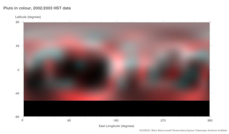
I saved it from the BBC. Here it is unaltered.

Posted: 13.09.2005, 15:54
by Dollan
Great, thanks!
...John...
Posted: 13.09.2005, 18:42
by walk_in_shadows
Damn...looks like a really shitty digital photo.lol...actually..it technically is.lmao

Posted: 13.09.2005, 19:32
by Dollan
Considering that even ten years ago we knew nothing about the surface of Pluto, this is a pretty remarkable map.
...John...
Posted: 14.09.2005, 03:57
by bdm
Evidently Pluto is like the Force - it has a light side and a dark side.
Posted: 14.09.2005, 04:46
by d.m.falk
As I said before in a previous thread, Pluto is remarkably Triton-like, being a rocky world with regions of methane and water ice. However, one shouldn't assume all Kuiper worlds to be characteristicly similar- Some are stark grey, wile others are snowballs... And then you have Sedna, the reddest world in the Solar system, with no trace of ice, water, methane or otherwise, in its spectrograph.
If I live another 10 years, I will relish the images coming back from New Horizons. Pluto will be a fascinating world, once we are there.

Now... If we could get to Sedna in my lifetime....
d.m.f.
Posted: 14.09.2005, 23:48
by Juan Marino
Code: Select all
AltSurface "Marc Buie Texture" "sol/pluto"
{
   Texture "pluto3yk.jpg"
}
Posted: 15.09.2005, 03:46
by Juan Marino
Posted: 15.09.2005, 03:47
by PlutonianEmpire
Juan Marino wrote:Code: Select all
AltSurface "Marc Buie Texture" "sol/pluto"
{
   Texture "pluto3yk.jpg"
}
Pah! Why use jpegs when you can go png'ing?

Gimme a bit and i'll post MY textures!


Posted: 15.09.2005, 04:11
by Juan Marino
Posted: 15.09.2005, 04:54
by PlutonianEmpire
D'OH! I mistyped. I got

instead of

. My apologies.
Also, when I said i'd post my texture, wanted to edit a bit so it would appear smoother, and less "blocky".

Anyhoo, i viewed the pluto texture, and i noticed something many people probably missed:
A pole-to-pole crease or line on the planet, because the map is different on each side.

EDIT: also, when i said "gimme a bit", i was talking about TIME, not material. So, I must also apologize for any confusion as well.
Posted: 15.09.2005, 06:38
by Juan Marino
PlutonianEmpire wrote:A pole-to-pole crease or line on the planet, because the map is different on each side.
...yes, also i think that the map is different on each side due to a different color tonality or saturation,
....or really this map is smaller that 360?° degrees:


Posted: 15.09.2005, 07:02
by d.m.falk
Note also that the south polar region needs to be fudged- It's otherwise unobservable from Earth at this time.
d.m.f.
Posted: 15.09.2005, 09:49
by t00fri
Let me emphasize that the new Hubble data are NOT better in resolution than what I have used for the Celesltia default Pluto and Charon, based on Marc Buie's photometric data gathered during six years of mutual occultations (Lowell obs.).
What is mainly new is the direct colour and material information, as well as the improved resolution coming from Hubble observations per se. Before it was much worse than the photometric occultation data.
In any case one has to superimpose the previous photometric data with the new Hubble data. This will also improve the quality.
Finally that line where the texture ends touch, occurs almost always and can be eliminated with standard image manipulation techniques. The best approch is to offset the texture by width/2 and then use smudge tools or similar. At the end of the smoothing one returns to the initial positioning of the texture.
I would suggest to overlay the two textures (after proper rescaling of course) in /multiplicative/ or /overlay/ mode which will act highly contrast enhancing...
Bye Fridger


