Page 1 of 13
Orbits and Labels colors
Posted: 14.06.2007, 00:37
by Cham
I was asking since some times ago to have a better color scheme for all the orbits and labels in Celestia. Currently, the colors used are inconsistent and confusing : the comets are using the same label color (or so) as for the galaxies. The asteroids, the comets and the spacecrafts are using the same color (or so) for their respective orbits and labels. The planets and moons labels are of the same color (green), which is about the same as for the sites shown on planets and moons. There isn't any coherent relation between a label and its associated orbit (in the cases of planets, moons, asteroids, comets and spacecraft), so it's all confused. Thus, I decided to give a try to some minimalistic coding (duh!).
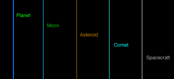
I've located the color code in the "render.cpp" file, beginning at lines 1105 and 6291. Here's a "chart" of the actual colors used in Celestia 1.5.0 :

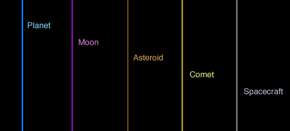
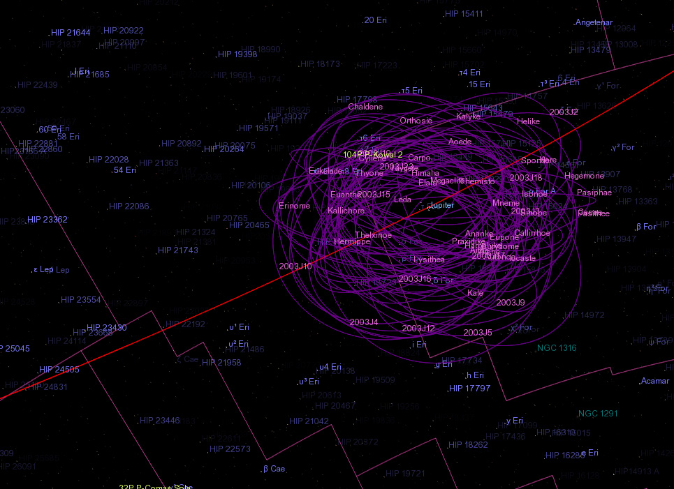
Here's the chart I used for my test compilation :

Take note that the actual colors rendered in Celestia may appear a bit different than what is shown on these compressed JPEG pictures. The planet and spacecraft labels still need some fine tuning, as they are a bit too alike, and the planets labels are too much like the stars labels.
Here are the actual color numbers currently used in Celestia 1.5.0 :
Code: Select all
Actual colors :

Orbits :
      Planet: 0.0, 0.4, 1.0

      Moon: 0.0, 0.4, 0.5

      Asteroid: 0.35, 0.2, 0.0

      Comet: 0.0, 0.5, 0.5

      Spacecraft: 0.4, 0.4, 0.4

      Stellar: 0.5, 0.5, 0.8


Labels :
      Planet: 0.0, 1.0, 0.0

      Moon: 0.0, 0.65, 0.0

      Asteroid: 0.7, 0.4, 0.0

      Comet: 0.0, 1.0, 1.0

      Spacecraft: 0.6, 0.6, 0.6
And here are the colors I used in my test build :
Code: Select all
Modified colors :

Orbits :
      Planet: 0.0, 0.4, 1.0

      Moon: 0.43, 0.0, 0.55

      Asteroid: 0.35, 0.2, 0.0

      Comet: 0.57, 0.55, 0.14

      Spacecraft: 0.4, 0.4, 0.4

      Stellar: 0.5, 0.5, 0.8


Labels :
      Planet: 0.58, 0.69, 1.0

      Moon: 0.91, 0.44, 0.84

      Asteroid: 0.84, 0.62, 0.28

      Comet: 0.87, 1.0, 1.43

      Spacecraft: 0.66, 0.75, 0.83
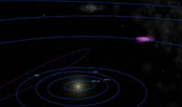
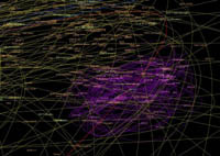
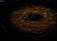
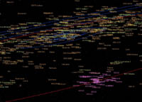
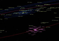
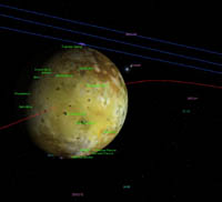
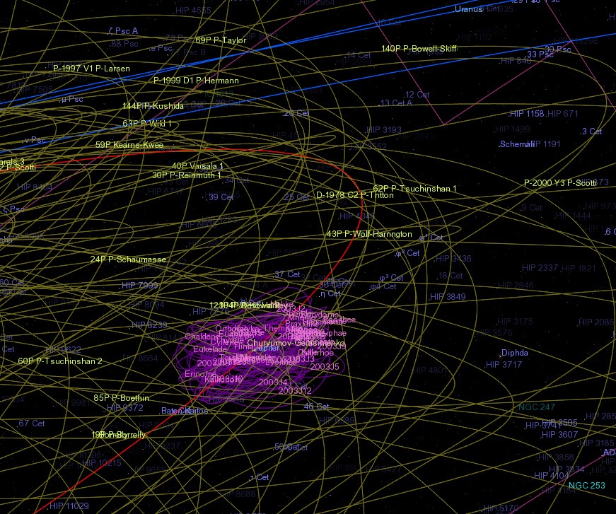
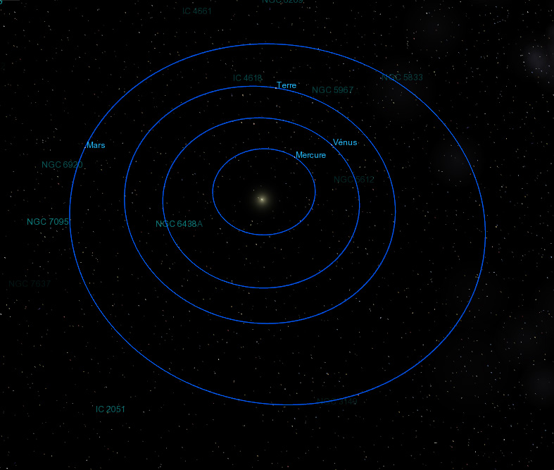
Here are some screen captures of the new colors in Celestia (take note that the real colors shown on screen in Celestia may differ a bit from the colors shown here, on JPEG pictures). Click the icons to enlarge :


For the moment, the only colors that still need some correction are the planet and spacecraft labels (to much like the color used for the stars). I may fine-tune the comets orbit color too (it's a bit too vivid).
Posted: 14.06.2007, 01:06
by ElChristou
Have you tested boundaries vs moons?
Posted: 14.06.2007, 01:27
by Cham
ElChristou wrote:Have you tested boundaries vs moons?
I don't see any problem with the boundaries :

I also fine-tuned the comets orbits (darker yellow) :

I now only have to fine-tune the planet labels, which are too close to the stars labels.
It's already looking much more consistent in Celestia, now.
Posted: 14.06.2007, 01:43
by chris
Cham,
I don't know if I care for magenta moon orbits and labels, but I definitely think you're on the right track by consistently using related colors for the labels and orbits of an object type. Saturated orbits/less saturated labels looks good . . . Have you tried the reverse? My hunch is that that may look the best, but I'm not sure. I wonder what Edward Tufte would have to say about all this?

--Chris
Posted: 14.06.2007, 01:48
by tech2000
I like this color scheme, it looks great, easy to determin orbittype.
And in combination with Fridgers star label code for all objects. ie. stars, plantes, moons, astroids... and so on...
Bye,
Anders
Posted: 14.06.2007, 01:50
by Cham
Chris,
I don't think that reversing the orbit vs label colors would give a good result. Usually, it's preferable to have some subtle and darker tones for the larger parts (orbits) on a black background, since they are more obstrusive. The user wants to identify the object itself (label) faster on the screen, so it needs some lighter color.
Having said this, the asteroids and comets really need a trensparency effect, dependant on distance and size, like what we already have for the stars and galaxies.
Posted: 14.06.2007, 02:02
by ElChristou
The ideal for orbits would be a gradient, brighter near observer, darker in the far... just like Fridger's labels, it will increase the spacial geometry of the system (better 3D feelling)...
Posted: 14.06.2007, 02:04
by Cham
ElChristou wrote:The ideal for orbits would be a gradient, brighter near obsever, darker in the far... just like Fridger's Labels, it will increase the spacial geometry of the system (better 3D feelling)...
Oooo yes, of course ! But I suspect that would be VERY hard to code and may affect the frame rate.
Posted: 14.06.2007, 02:09
by ElChristou
Cham wrote:ElChristou wrote:The ideal for orbits would be a gradient, brighter near obsever, darker in the far... just like Fridger's Labels, it will increase the spacial geometry of the system (better 3D feelling)...
Oooo yes, of course ! But I suspect that would be VERY hard to code and may affect the frame rate.
Of course, here the coders should talk. Perhaps by playing with transparency? (more transparent in the far=darker)
Posted: 14.06.2007, 02:42
by tech2000
ElChristou wrote:Cham wrote:ElChristou wrote:The ideal for orbits would be a gradient, brighter near obsever, darker in the far... just like Fridger's Labels, it will increase the spacial geometry of the system (better 3D feelling)...
Oooo yes, of course ! But I suspect that would be VERY hard to code and may affect the frame rate.
Of course, here the coders should talk. Perhaps by playing with transparency? (more transparent in the far=darker)
Yeah, now we're talking...
This would be something...
Chaito, Anders
Posted: 14.06.2007, 03:26
by Cham
I may have found a good compromise for the planet labels. There isn't any confusion with the stars and the galaxies labels anymore :

Do you think the planet labels are vivid enough ?
Posted: 14.06.2007, 08:08
by t00fri
Cham wrote:ElChristou wrote:The ideal for orbits would be a gradient, brighter near obsever, darker in the far... just like Fridger's Labels, it will increase the spacial geometry of the system (better 3D feelling)...
Oooo yes, of course ! But I suspect that would be VERY hard to code and may affect the frame rate.
I am not so sure...might be fun to have a look.
Posted: 14.06.2007, 08:31
by ANDREA
Cham wrote: I may have found a good compromise for the planet labels. There isn't any confusion with the stars and the galaxies labels anymore :....Do you think the planet labels are vivid enough ?
Cham, I like your new colour coding for orbits and labels, it gives the immediate understanding of what we are looking at.

BTW, having you modified the code, is there any hope to have another change, allowing ALL orbits and labels to be visible up to a distance from Sun of, say, thrice the Pluto distance?
If you remember, Buggs and I stopped the evolution of the Ptolemaic, Tychonic and Copernican Solar System just for this reason: the labels disappear when distance from Sun changes too much, and this makes impossible to have a clear idea of these Solar Systems complexity and difference from the real one.
Any possibility?
I remember you this thread:
http://www.celestiaproject.net/forum/viewtopic ... 69&start=0and this one:
http://www.celestiaproject.net/forum/viewtopic ... tem+labels(Fridger, do you remember this?
toofri wrote:As I mentioned to you privately, the best would probably be to allow for an ON|OFF flag for dynamical label display in celestia.cfg
Any possibility, please?)

Thank you.
Bye
Andrea

Posted: 14.06.2007, 11:41
by ElChristou
t00fri wrote:Cham wrote:ElChristou wrote:The ideal for orbits would be a gradient, brighter near obsever, darker in the far... just like Fridger's Labels, it will increase the spacial geometry of the system (better 3D feelling)...
Oooo yes, of course ! But I suspect that would be VERY hard to code and may affect the frame rate.
I am not so sure...might be fun to have a look.
Oh yes, please!


Posted: 14.06.2007, 12:22
by ElChristou
BTW, for osX users, here is a version of the app with Cham's last colors:
http://nho.ohn.free.fr/celestia/Celestia.app.zip
Feedback is welcome.
Posted: 14.06.2007, 17:33
by chris
Cham wrote:ElChristou wrote:The ideal for orbits would be a gradient, brighter near obsever, darker in the far... just like Fridger's Labels, it will increase the spacial geometry of the system (better 3D feelling)...
Oooo yes, of course ! But I suspect that would be VERY hard to code and may affect the frame rate.
It's quite trivial to code this . . . But, I'm not sure that it's really desirable. Over what range should the orbits fade? The radius of Neptune's orbit, ideal for views of the outer solar system? But then what about objects like Sedna, or the distant companion in a binary system? An alternative would be to set the orbit fade distance based on the size of the orbit itself. I think that this would lead to visual confusion, however, as different orbits would fade at various distances.
There are some possible complications in the trivial implementation of orbit fading. Orbits can be rendered multiple times per frame at a variety of distances--this is required for correct depth sorting of orbits with other objects. Limited interpolation precision in graphics hardware might introduce visible discontinuities between orbit segments rendered at different distances. If this is indeed a problem, it would have to be resolved by computing the orbit brightness per-pixel in a shader.
--Chris
Posted: 14.06.2007, 17:51
by ElChristou
chris wrote:It's quite trivial to code this . . . But, I'm not sure that it's really desirable. Over what range should the orbits fade?...
I suppose it should be related to the distance to observer. Now for the range it's question of testing I suppose... In all case, the fading should not be total, let's say after a certain point, the orbit is drawn at 10% of the original color but not less...
Posted: 14.06.2007, 19:12
by t00fri
Cham,
I do like your colors. The only remaining "dissonance" appears to be due to the "grass green" location labels. This green looks bad with my galaxy labels etc. The location labels should have a more pastel shade...
Bye Fridger
Posted: 14.06.2007, 19:16
by Cham
Fridger,
I agree. But I'm yet unable to locate the location labels in the code, and I also need to find the nebulas labels (NOT the galaxies), and Chris isn't responding to my PM !

I don't want to touch the stars and galaxies labels : they are PERFECT. I need to tweak the location labels (vivid green), the nebulas and globular clusters labels, since they are using the same color as for the galaxies.
Posted: 14.06.2007, 19:17
by t00fri
ElChristou wrote:chris wrote:It's quite trivial to code this . . . But, I'm not sure that it's really desirable. Over what range should the orbits fade?...
I suppose it should be related to the distance to observer. Now for the range it's question of testing I suppose... In all case, the fading should not be total, let's say after a certain point, the orbit is drawn at 10% of the original color but not less...
I suggest, we first get the frame dependence of the orbits right before worrying about fading orbit displays. In some frames, the present orbit displays really hurt me whenever I look at them

See my extensive discussions elswhere.
And how about doing one job really well before moving to the next one

...I know, the principle of "small steps" ...
Bye Fridger
