The splash screen font sucks !

The place to discuss creating, porting and modifying Celestia's source code.
rthorvald
Posts: 1223
Joined: 20.10.2003
With us: 20 years 8 months
Location: Norway

Post #81by rthorvald » 05.12.2006, 23:09

Cham wrote:The problem with this splash screen is its extreme contrast to what Celestia actually do, graphically. Celestia looks like a MODERN application, with a MODERN interface


Our disagreement here is obviously to whether this design is modern or not. You feel it is old-fashioned because it depicts something old...?

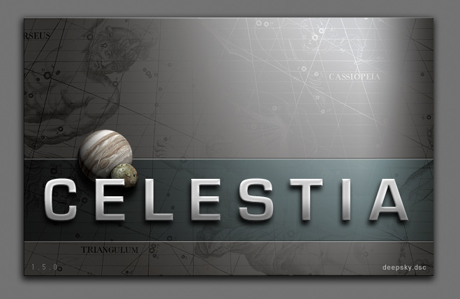
I deliberately flavoured it "modern" by creating a layout that was bright, clean and simple - and contrasted the title font with a sans-serif, modern web font. This might possibly not carry over well into a small splash screen, but the Flamsteed map is certainly not old-fashioned simply because it is old: it can only be old-fashioned if the context and presentation of it is.

Modern is not equal to sans-serif fonts, either: they have been around for a hundred years. People design beautiful serif fonts today. The "scifi" look isn??t modern in itself either, it is just a tech style that has become common - i don??t see why space equals tech.

- rthorvald
Image

chris
Site Admin
Posts: 4211
Joined: 28.01.2002
With us: 22 years 5 months
Location: Seattle, Washington, USA

Post #82by chris » 05.12.2006, 23:10

rthorvald wrote:Personally, i like very much ElChristou??s unoffical Fridger version:
Image


I also like this one very much. It would be even better if the 3D effect on the font was reduced a bit (which you suggested too.)

--Chris

ElChristou
Developer
Posts: 3776
Joined: 04.02.2005
With us: 19 years 4 months

Post #83by ElChristou » 05.12.2006, 23:22

chris wrote:I also like this one very much. It would be even better if the 3D effect on the font was reduced a bit (which you suggested too.)

--Chris


Ok Cham, you won't like the idea... but (sorry) what about try this one for 1.6? I can easely propose some variations with fonts and less 3D effect for Chris...

EDIT: BTW, this one was for Fridger's giant screen, I got the version for 1024 which is smaller but I still think 1024 must be the reference for the official splash...
Image

Avatar
t00fri
Developer
Posts: 8772
Joined: 29.03.2002
Age: 22
With us: 22 years 3 months
Location: Hamburg, Germany

Post #84by t00fri » 05.12.2006, 23:30

Since quite a number of months I have 2 spash images in my splash folder and Celestia-KDE picks one of them each time randomly.

I realize that with each new start, I am looking forward to see one particular splash: ElChristou's "Fridger" splash.

My main reason for liking it is that it does not already show me the Universe before Celestia has even started. Not yet another view of a couple of "Christmas balls" ;-) It creates some "promise" of the Universe only. I think this is clever!

I also like the similarity to the "official" Celestia style.

Finally, I like this "old-fashioned" touch. It "smells" a bit of "leather" and hints at an old map, suggesting quality altogether.

Just to repeat myself: The Jupiter texture should be replaced by the appropriate true-color image show by Cassini.

Bye Fridger
Image

Toti
Developer
Posts: 338
Joined: 10.02.2004
With us: 20 years 4 months

Post #85by Toti » 05.12.2006, 23:50

the star map detail adds a historical perspective i find exiting, and anyway, a classic serif font is not old-fashioned at all - classical design never is, if well done, it is more timeless than anything else.
Indeed, but some fonts just have some unavoidable "cultural resonance" with space themes, probably motivated by cinema (see e.g. Kubrick or Scott's use of typography in their respective scifi films). While I tend to prefer everything that's classic (and thus perennial) over modern style, I feel that overall, sanserif fonts just fit better to the program's look.

I originally chose that font for the web design because it resonated nicely with the map...
(...)
Exept that i *like* that the splash has references to the official website: it is a nice touch of branding.

Yes, this was a wise artistic decision.

I use that silver splash (along with the "official" one) since ElChristou posted it in the dev-list. All elements harmonize beautifully: it would be great to have that for 1.5 final.

chris
Site Admin
Posts: 4211
Joined: 28.01.2002
With us: 22 years 5 months
Location: Seattle, Washington, USA

Post #86by chris » 06.12.2006, 00:23

Toti wrote:I use that silver splash (along with the "official" one) since ElChristou posted it in the dev-list. All elements harmonize beautifully: it would be great to have that for 1.5 final.


This is much less contentious than I thought it would be :)

And continuing this uncharacteristically harmonious discussion, I agree with Fridger that the splash would be even better with the paler, less contrasty Cassini-based Jupiter texture.

--Chris

RocketMan@JSC
Posts: 43
Joined: 29.01.2005
With us: 19 years 5 months

Post #87by RocketMan@JSC » 06.12.2006, 01:51

What also may be cool is use the negative of this splash background: Image

...and then fade the right portion (which already is faded) into a real cool looking view from Celestia with constellations and orbits being rendered--maybe something around Saturn with Cassini in the near field.

Kinda like old to new.

ElecMoHwk
Posts: 33
Joined: 02.12.2006
With us: 17 years 7 months
Location: JPL

Post #88by ElecMoHwk » 06.12.2006, 09:56

I am using this Fridger version as well by Elchristou. I'm quickly becoming a voracious Elchristou fan!!

One thing I'd love to see in a new version of Celestia, would be a way to possibly "randomize" splash screens. For instance a folder full of PNG files (splash_*.png for example) would be the choices of what it could bring up. This way for those of us that are having trouble deciding, we could have it just bring up a new one each time :)

But even if that isn't a possibility, I will be happy with the Fridger version until I can come up with a few newer ones of my own design that I want to play with.

I will post anything I make here so that you guys can tear it apart and make me feel absolutely worthless as a graphic artist :) Don't worry!

Avatar
t00fri
Developer
Posts: 8772
Joined: 29.03.2002
Age: 22
With us: 22 years 3 months
Location: Hamburg, Germany

Post #89by t00fri » 06.12.2006, 10:20

ElecMoHwk wrote:I am using this Fridger version as well by Elchristou. I'm quickly becoming a voracious Elchristou fan!!

One thing I'd love to see in a new version of Celestia, would be a way to possibly "randomize" splash screens. For instance a folder full of PNG files (splash_*.png for example) would be the choices of what it could bring up. This way for those of us that are having trouble deciding, we could have it just bring up a new one each time :)

But even if that isn't a possibility, I will be happy with the Fridger version until I can come up with a few newer ones of my own design that I want to play with.

I will post anything I make here so that you guys can tear it apart and make me feel absolutely worthless as a graphic artist :) Don't worry!


Well well ...

you are just using a "backward" operating system ;-)

The Linux-KDE version of Celestia, for example, features since a long time a splash folder with randomized content display.

Bye Fridger
Image

ElChristou
Developer
Posts: 3776
Joined: 04.02.2005
With us: 19 years 4 months

Post #90by ElChristou » 06.12.2006, 10:40

RocketMan@JSC wrote:What also may be cool is use the negative of this splash background:

...and then fade the right portion (which already is faded) into a real cool looking view from Celestia with constellations and orbits being rendered--maybe something around Saturn with Cassini in the near field.

Kinda like old to new.


This will be for 1.6... :wink:

As some people were pleased with serif font during the last months, let's go now for a sans serif; what about this one? (@Chris: the 3D effect is still here, can easely be removed)

Image

@Cham: if this isn't enough modern for you!!

BTW, Jupiter/Io has been desaturated to match the global tone; opinion?
Image

RocketMan@JSC
Posts: 43
Joined: 29.01.2005
With us: 19 years 5 months

Post #91by RocketMan@JSC » 06.12.2006, 12:01

IMHO, the background in this graphic on the right side is way too washed out.

ElChristou
Developer
Posts: 3776
Joined: 04.02.2005
With us: 19 years 4 months

Post #92by ElChristou » 06.12.2006, 13:28

RocketMan@JSC wrote:IMHO, the background in this graphic on the right side is way too washed out.


This is just to give the shiny metallic touch... without such effect the splash lose quite of it's interest...
Image

Avatar
t00fri
Developer
Posts: 8772
Joined: 29.03.2002
Age: 22
With us: 22 years 3 months
Location: Hamburg, Germany

Post #93by t00fri » 06.12.2006, 13:40

Christophe,

here is a pretty hires image of the Cassini Jupiter photo (true color) embedded in a French-speaking (Belgian) environment ;-)

http://www.ulb.ac.be/sciences/astro/cd/ ... assini.jpg

Since the Juppi tone is much more bluish (clouds) than your original one, I would prefer to use it's natural colors. You might desaturate them perhaps a bit. It should fit pretty well and will act as a "creme fraiche topping" (sorry, being too lazy for accents ;-)) on the metallic text.

I find that font a little too "rectangular" in the shape of it's letters.

Bye Fridger
Image

Avatar
Topic author
Cham M
Posts: 4324
Joined: 14.01.2004
Age: 59
With us: 20 years 5 months
Location: Montreal

Post #94by Cham » 06.12.2006, 15:23

ElChristou,

The font is MUCH better, now. However, I much prefer the previous background image (the current version in 1.4.1).
"Well! I've often seen a cat without a grin", thought Alice; "but a grin without a cat! It's the most curious thing I ever saw in all my life!"

ElChristou
Developer
Posts: 3776
Joined: 04.02.2005
With us: 19 years 4 months

Post #95by ElChristou » 06.12.2006, 15:31

t00fri wrote:Christophe,

here is a pretty hires image of the Cassini Jupiter photo (true color) embedded in a French-speaking (Belgian) environment ;-)

http://www.ulb.ac.be/sciences/astro/cd/ ... assini.jpg

Since the Juppi tone is much more bluish (clouds) than your original one, I would prefer to use it's natural colors. You might desaturate them perhaps a bit. It should fit pretty well and will act as a "creme fraiche topping" (sorry, being too lazy for accents ;-)) on the metallic text.

I find that font a little too "rectangular" in the shape of it's letters.

Bye Fridger


Is this a real photo? looks like a Celestia rendering! :wink:

In fact I'm a bit limited by the number of fonts actually intallated in my system... I'll try some more variants but this one change a bit for the habitual ones..
Image

ElChristou
Developer
Posts: 3776
Joined: 04.02.2005
With us: 19 years 4 months

Post #96by ElChristou » 06.12.2006, 15:35

Cham wrote:ElChristou,

The font is MUCH better, now. However, I much prefer the previous background image (the current version in 1.4.1).


Guys I will never satisfy everybody so as I don't have much time to go for a complete new one, so if you are (almost) all agree, let's use this background for 1.6, then we will change again for 1.7...

(Now everybody is free to do other proposal of course!)
Image

Avatar
t00fri
Developer
Posts: 8772
Joined: 29.03.2002
Age: 22
With us: 22 years 3 months
Location: Hamburg, Germany

Post #97by t00fri » 06.12.2006, 15:49

ElChristou wrote:
t00fri wrote:Christophe,

here is a pretty hires image of the Cassini Jupiter photo (true color) embedded in a French-speaking (Belgian) environment ;-)

http://www.ulb.ac.be/sciences/astro/cd/ ... assini.jpg

Since the Juppi tone is much more bluish (clouds) than your original one, I would prefer to use it's natural colors. You might desaturate them perhaps a bit. It should fit pretty well and will act as a "creme fraiche topping" (sorry, being too lazy for accents ;-)) on the metallic text.

I find that font a little too "rectangular" in the shape of it's letters.

Bye Fridger

Is this a real photo? looks like a Celestia rendering! :wink:

In fact I'm a bit limited by the number of fonts actually intallated in my system... I'll try some more variants but this one change a bit for the habitual ones..


Of course,

but for you specially ;-) I looked up the .tif version. So that's absolutely the best there is. It's TRUE color.

http://photojournal.jpl.nasa.gov/tiff/PIA02873.tif

Bye Fridger
Image

Avatar
t00fri
Developer
Posts: 8772
Joined: 29.03.2002
Age: 22
With us: 22 years 3 months
Location: Hamburg, Germany

Post #98by t00fri » 06.12.2006, 15:51

ElChristou wrote:
t00fri wrote:Christophe,

here is a pretty hires image of the Cassini Jupiter photo (true color) embedded in a French-speaking (Belgian) environment ;-)

http://www.ulb.ac.be/sciences/astro/cd/ ... assini.jpg

Since the Juppi tone is much more bluish (clouds) than your original one, I would prefer to use it's natural colors. You might desaturate them perhaps a bit. It should fit pretty well and will act as a "creme fraiche topping" (sorry, being too lazy for accents ;-)) on the metallic text.

I find that font a little too "rectangular" in the shape of it's letters.

Bye Fridger

Is this a real photo? looks like a Celestia rendering! :wink:

In fact I'm a bit limited by the number of fonts actually intallated in my system... I'll try some more variants but this one change a bit for the habitual ones..


Of course,

but for you specially ;-) I looked up the .tif version. So that's absolutely the best there is. It's TRUE color.

http://photojournal.jpl.nasa.gov/tiff/PIA02873.tif

The jpeg version is here

http://photojournal.jpl.nasa.gov/jpeg/PIA02873.jpg

I thought you liked the french text with the above copy ;-) . So this is the official nasa photojournal archive.

Bye Fridger
Image

ElChristou
Developer
Posts: 3776
Joined: 04.02.2005
With us: 19 years 4 months

Post #99by ElChristou » 06.12.2006, 15:54

t00fri wrote:...but for you specially ;-) I looked up the .tif version...


What sweet! :wink:
Tx!, I test with the true color a bit desaturated.
Image

ElChristou
Developer
Posts: 3776
Joined: 04.02.2005
With us: 19 years 4 months

Post #100by ElChristou » 06.12.2006, 19:18

Two options with the same font; it's all things I've already proposed but I still think those are not bad...
(No planet at all... opinion? with or without?)

Image
Image


Return to “Development”