Hey glcanon, despite the funny splashes, what is your point exactly? You want to change Celestia's name?
The problem is that the name of the soft is not a topic of discussion...
Just imagine someone enter your home and without preamble begin to argue that's your daughter's name is just ridiculous and you MUST do something to change this... What would you think of the guy? "what an ass%@le", or "this guys is probably right, silly me..."
I think you would be able to discuss such a topic only if you had five years of active dev... Then a probably good way to open the discussion would be to ask first "why" this choice...
The splash screen font sucks !

-
ElChristou
- Developer
- Posts: 3776
- Joined: 04.02.2005
- With us: 20 years 2 months
I would suggest using a recent pic of v838 Monocerotis.
Even better would be the sequence of the "Light Echoes From Red Supergiant Star V838 Monocerotis" and include the four Hubble pictures from 2002 and sequence up to the pics from 2005 and 2006. Okay I happen to be fascinated with this special star. NASA even has a short movie of it's developement from 2002 thru 2006.
glcanon
I like yours it has a more modern look to it without the mix of archaic and modern. I think it might be a little irrelevant like my idea to the whole idea of Celestia. Hey, what's one man's bait is another man's caviar.
rthorvald
I like your new look for v1.5. I think it might work even if it is an insiders bit of fun. I find it catchy and it could definitely draw in the masses. We could even get free publicity on maybe the Art Bell radio program if he is still alive or hasn't been kidnapped by aliens.
I myself like the opening splash in version 1.4.1.0 but whoever said I had any taste. I still think caviar is expensive bait and belongs in the same category as rhino horns and elephant tusks.
Kel
*****
Intel(R) Pentium(R) 4 CPU 3.80GHz (dual processor) w/ 2GB of Ram
NVIDIA GeForce 8800 GTS 640MB GDDR3 PCI Express
NVIDIA Driver v6.14.11.6218
OpenGL v5.1.2600.2180
Creative X-Fi Fatal1ty Professional Series Driver v5.12.8.1201
Microsoft_XP Home Edition Version: 5.1
(Build 2600.xpsp_sp2_gdr.050301-1519 : Service Pack 2
v838 Monocerotis is my home until Eta Carina finally goes supernova.

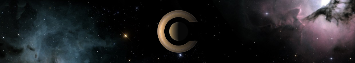
Okay, perhaps I'm a little out of topic, but for what concern the icon? Seem to me quite obvious that the Saturn ring could be used as "C" of Celestia's name. Or not?
But for me it hasn't been until your message!
I really like your Saturn screenshots. But if it is interesting to see your splash screens on this dark forum background, when you use it on a more common colored background as a window (rectangular shaped), it loses a lot of its immersive sight. I decided to reuse an old spash of mine with your ideas. This was my intention at the beginning. For adapting the image on my old frame, i had to make, on my own, a copy, the worst copy (with yours it would be better, surely!). This is not why i posting this message. I want to introduce some others background ideas on edges.
Let me describe my screen shot :
This image is maked up of two group of objects :
a dark background, a spatial shot where you find in the middle (inside a black edge) the saturn view (my sad copy!), and brackets colored, here in blue.
>The brackets have differents meanings :
-They let us imagine a finished circle like a planet and particularly Earth. They are colored in Blue as Earth, the blue planet. The brackets are the beginning point of the next travel in universe that you're going to do with the program. They are Home.
-Part of a circle that let you think to the common view in telescop, the tool your use on Earth. All program is builded thanks to this tool.
-a other meaning : hublot edge on universe symbolized with the dark area
-Brackets are commonly use in computer langages, and in mathematics and physics
-I've rotated Brackets to let us imagine the dynamic view, the freedom of movement in space and why not, the rotation of night sky on Earth. It also means that celestia has to mode planetarium and navigation!
>The dark area
Well I have not a lot comments since I reused your screenshot. However I tried to delete rectangular shape without using a round shaped. I Drawed Saturn view inside a dark edge that you can imagine what is out the frame. The lines on the top an the bottom of the dark area are like etc... and invite you to enlarge the little view of universe.
>All
I think my image presents a new idea : this is the third dimension (like a 3D simulator). You're coming from Earth, symbolized with brackets, your home, where your computer is, and then try to enter in this window in this universe, our universe. You want to go deep in your screen, deep in the Saturn view, you want to enlarge the view, don't you?
Those are only working suggestions

Sorry Imy, do you perhaps confusing me with other Celestians? E.a with Elchris or Cham? Because as "icon" I intend just the (now) not-so-little image where the mouse pointer click to launch a program (it's surely my deficiency in understanding and to explain the things a little best in terms of English language) nor the splash screen; I find that the default icon with his square boundary looks nowadays a tad "old", where the alpha channel rule the graphics of the desktop. With the best regards.
Never at rest.
Massimo
Massimo
Okay, perhaps I'm a little out of topic, but for what concern the icon? Seem to me quite obvious that the Saturn ring could be used as "C" of Celestia's name. Or not?
I'm sorry for misunderstanding ! I feel like you about icon : today we're waiting an uptodate image using transparency with alpha channels, large colors and maybe we can change the icon topic (still considering astronomy obviously!). For instance i think, that you can use a better texture for Jupiter in icon image. But it 's another dependant subject. However, your message have maked me think about this for a second kind of my splash screen.
I've reused an idea of my old frame splash screen : putting in foreground the star of this program : universe itself! I still use your Saturn view and mirroring it and I begin to see that, indeed, Sarturn rings could be seen as a C, a dynamic one which seems to flee quickly to the bottom right corner of my image.
This is a splash screen which is nearer than the last to the ideas of Celestia, i think. This is more sober and simple (in good sense) and I feel like this more elegant, don't you?
I decide to use a particular rectangular shape that easily let you think to a window, a slot which is opening on your desktop, a door to get you to a dreaming world... Now Earth and home are represented directly by your own desktop. Dynamic movement is represented by the rings of Saturn in the bottom right corner.
A new idea : The splash screen become more dark like universe. A quick view let you think that it is black like space. But you can see details, little white points, each one has a great and large history like our solar system... Search and show each one with Celestia !
Does it look like a Hollywood movie picture? We're almost expecting that a voice is going to say : "Go up in a super spatial ship call USS Celestia and be able to visit all universe beyond celerity velocity, fascinating adventures so well !
It's quite less obvious splash screen. It let you imagine what the image don't show with ostentation. .

Last edited by Imy on 12.11.2007, 14:54, edited 1 time in total.
-
BobHegwood
- Posts: 1803
- Joined: 12.10.2007
- With us: 17 years 6 months
You know, I simply can't believe this topic...
Thirteen pages discussing the Celestia fonts and splash screens?
Oh Brother...
Why don't you people take all that creative energy and do something
constructive with it.
That's okay, feel free to send me your hate mail via PM.
(Shaking my head)
Thirteen pages discussing the Celestia fonts and splash screens?
Oh Brother...
Why don't you people take all that creative energy and do something
constructive with it.
That's okay, feel free to send me your hate mail via PM.
(Shaking my head)
Brain-Dead Geezer Bob is now using...
Windows Vista Home Premium, 64-bit on a
Gateway Pentium Dual-Core CPU E5200, 2.5GHz
7 GB RAM, 500 GB hard disk, Nvidia GeForce 7100
Nvidia nForce 630i, 1680x1050 screen, Latest SVN
Windows Vista Home Premium, 64-bit on a
Gateway Pentium Dual-Core CPU E5200, 2.5GHz
7 GB RAM, 500 GB hard disk, Nvidia GeForce 7100
Nvidia nForce 630i, 1680x1050 screen, Latest SVN
-
 Topic authorCham
- Posts: 4324
- Joined: 14.01.2004
- Age: 60
- With us: 21 years 3 months
- Location: Montreal
BobHegwood wrote:You know, I simply can't believe this topic...
Thirteen pages discussing the Celestia fonts and splash screens?
Oh Brother...
And yet, the old splash screen needs a refreshment. For 1.5.0, we need something better. I still suggest to use the same image as before, but just change the font used for the main title (no serif, PLEASE !).
"Well! I've often seen a cat without a grin", thought Alice; "but a grin without a cat! It's the most curious thing I ever saw in all my life!"
-
ElChristou
- Developer
- Posts: 3776
- Joined: 04.02.2005
- With us: 20 years 2 months
-
Topic authorCham
- Posts: 4324
- Joined: 14.01.2004
- Age: 60
- With us: 21 years 3 months
- Location: Montreal
Ok, let me restate the subject of this topic. I created this topic at first for one purpose : to find a new splash screen for Celestia 1.5.0. Anyone is invited to publish his/her personal splash screen. Any suggestion is welcomed here. It's a topic to discuss about the splash screen, the image and font used, composition, design, colors, contrasts, etc. The goal is to share ideas, technics, methods, tricks, etc, and finaly to find the best one to be used in the official version (if there's an agreement ! Ahaa, here's the catch ! ). At the very least, if no agreement is possible, we would have several good (?) splash screens that anyone could use in his/her personal installation, so the exercice isn't that futile after all.
My personal "taste" goes like this : The current splash screen is a good one (perfect composition of Jupiter and two of its moons), but I hate the font used. The title should be without serif, and the color used isn't very appropriate either (it's not just a matter of taste, contrary to what some may be tempted to reply). IMO, the title should reflect the general feel of Celestia itself, its interface, its modern style and feel, etc. It's a matter of consistency. There is no serif in the interface. There is no gold in the text used for the interface. The font used in the splash screen should reflect that aspect. Of course, I'm not asking to use exactly the same font as the one used in the interface. We may use something else, while keeping in mind the "general feel" as a constraint.
I'm expecting that some of you will reply that there isn't any necessity to have "consistency" between the splash screen and the rest of the software, so "any" splash screen will do and it's all a matter of taste after all (I don't agree with this view). Well, would it be better to have a "consistent" splash screen anyway ? To me, the actual splash screen isn't. Some may say that consistency with the forum design (old charts, old sextants, compas and boussoles) should be the way to go. I don't agree. Celestia is a software. Not a forum. There would be a stronger consistency if the splash screen is consistent with the software it represents, instead of the forum that is used to discuss about the software.
Of course, you are free to disagree with my view. I may be wrong anyway, and this is why I started this topic in the first place : to discuss about the splash screen !
"Well! I've often seen a cat without a grin", thought Alice; "but a grin without a cat! It's the most curious thing I ever saw in all my life!"
-
ElChristou
- Developer
- Posts: 3776
- Joined: 04.02.2005
- With us: 20 years 2 months
-
Topic authorCham
- Posts: 4324
- Joined: 14.01.2004
- Age: 60
- With us: 21 years 3 months
- Location: Montreal
ElChristou,
do you still have the original PS document you created, for the splash screen ? I'm not even asking about changing the background itself (Jupiter, Io, etc). It's already perfect. Just the title needs a refreshment.
do you still have the original PS document you created, for the splash screen ? I'm not even asking about changing the background itself (Jupiter, Io, etc). It's already perfect. Just the title needs a refreshment.
"Well! I've often seen a cat without a grin", thought Alice; "but a grin without a cat! It's the most curious thing I ever saw in all my life!"
-
ElChristou
- Developer
- Posts: 3776
- Joined: 04.02.2005
- With us: 20 years 2 months
Cham wrote:ElChristou,
do you still have the original PS document you created, for the splash screen ? I'm not even asking about changing the background itself (Jupiter, Io, etc). It's already perfect. Just the title needs a refreshment.
I have to dig (hope I not lost it on my recent HD crash)... make you know later today...

Since many months, I actually use for 1.5.0cvs a splash that was designed by the user dhromed earlier in this thread

It's my clearcut favorite, I use it daily and just don't get tired of it.
Bye Fridger
It's my clearcut favorite, I use it daily and just don't get tired of it.
Bye Fridger
Last edited by t00fri on 12.11.2007, 20:21, edited 1 time in total.

-
ElChristou
- Developer
- Posts: 3776
- Joined: 04.02.2005
- With us: 20 years 2 months
t00fri wrote:Since many month I actually use for 1.5.0cvs a splash that was designed by the user dhromed earlier in this thread
...
I use it daily and just don't get tired of it.
Bye Fridger
Yep I think we should have something completely different, not the old splash modified...
Now the only restriction is that it shouldn't be too big in relation with a 1024 screen... (still the norm)
Last edited by ElChristou on 12.11.2007, 19:57, edited 1 time in total.
t00fri wrote:Since many month I actually use for 1.5.0cvs a splash that was designed by the user dhromed earlier in this thread
It's my clearcut favorite, I use it daily and just don't get tired of it.
Bye Fridger
I vote for this too.
And I have a proposal so everyone will be satisfied:
every new pre release a new splash. So the splash will identify the celestia version.
No serif tiny font it's also my favourites (mind if the Alien's movie intro would have been a serif!). The background image can be whatever else but add-ons; just space or galaxy or planets. After choosed the "official" splash screen we could (perhaps?) devote a place on Motherlode in which send all the users splash screen's creations. So, to say, as made by the wallpapers sites; in this manner all will be satisfied. My two cents.
Never at rest.
Massimo
Massimo