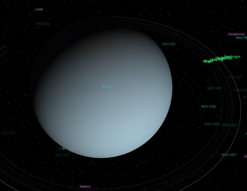
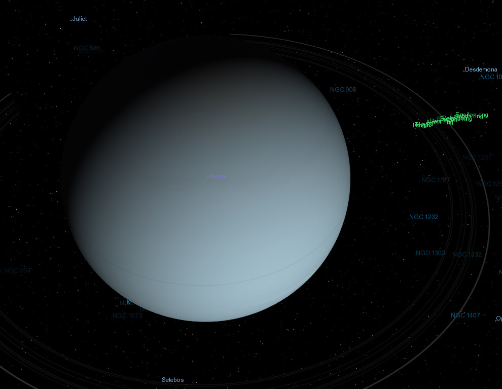
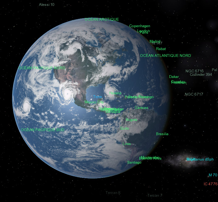
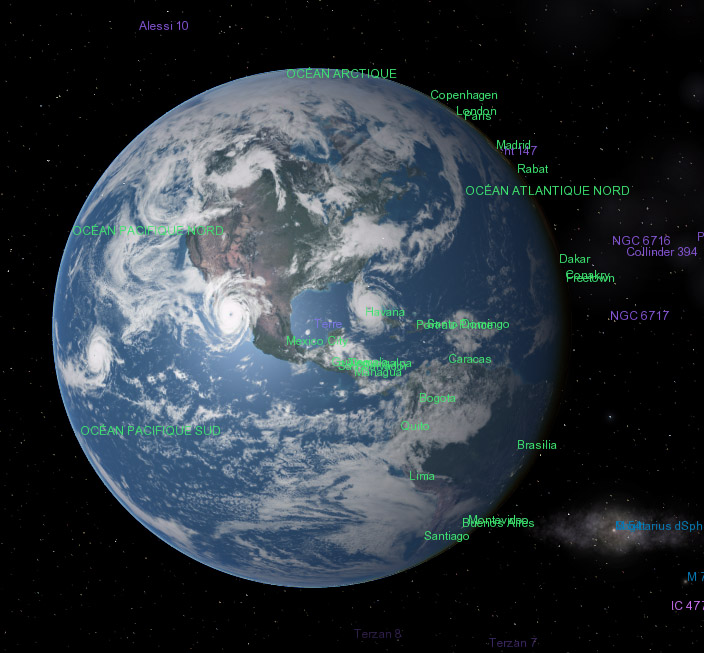
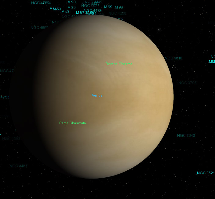
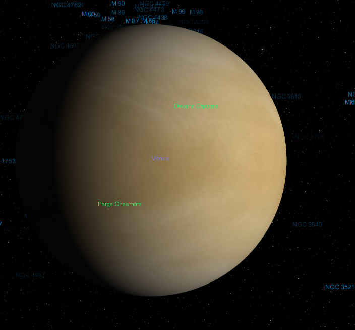
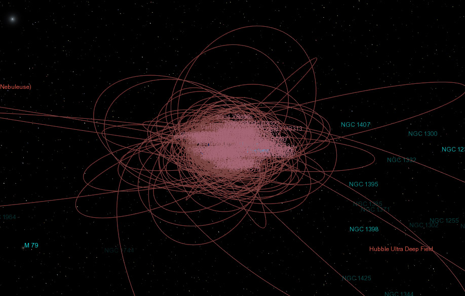
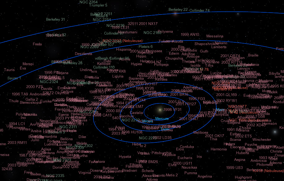
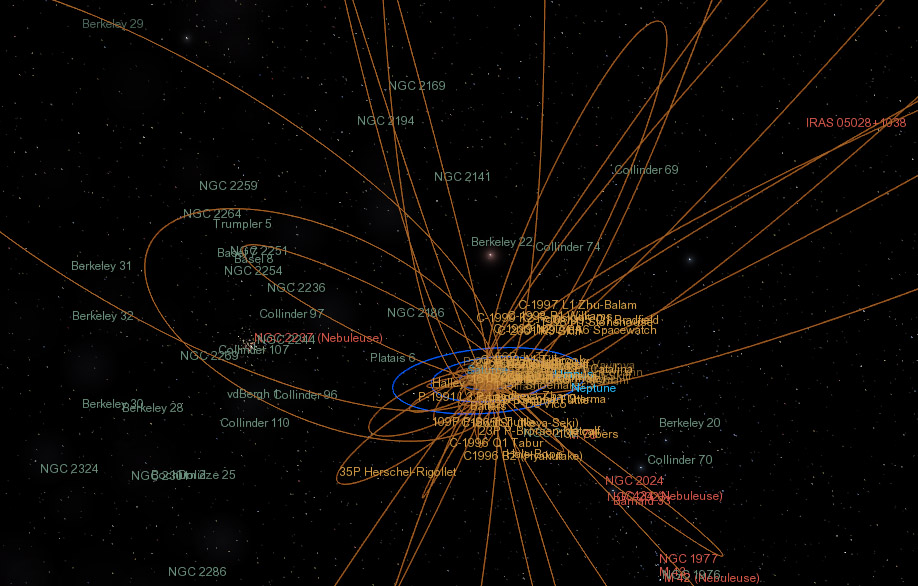
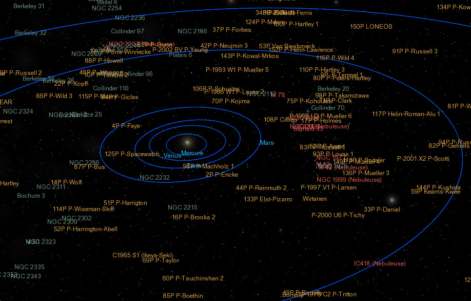
chris wrote:I'll refrain from commenting on the actual color choices and just address a few issues . . .
I'd like your point of view not on the choice of colors but on the smooth colors versus vivid ones topic; your personal taste here is important because in my case I would take this in account for more tuning...
chris wrote:I don't care for the idea of distance based fading of nebula, open cluster, or any other labels. I think that it should always be based on apparent magnitude. It's important to have a simple rule for interpreting the brightness of any label, and that rule should be that the brighter the label, the greater the apparent brightness of the object. Otherwise, there will be situations where an apparently bright object remains unlabeled.
What I like with distance based labels is that it gives you more informations than a magnitude based one. Let's take stars as example:
- you see a bright dot for a far high magnitude star near a darker dot for a near low magnitude star.
Two cases:
- If the labels are magnitude dependent, the bright dot will have a bright label, the dark dot a dark label.
-If the labels are distance dependent, the bright dot will have a dark label, the dark dot a bright one.
First case, we double an existing info, second case we add an info of distance: at first sight the bright dot is a high magnitude star and is further away than the low magnitude one...
This is a reason why I like distance dependent labels. Now, it also have the merit to give a 3D sense to the scene, bright= near, dark= far and this make really sense when you rotate a system or when you fly through it.
When I first emit the ideas of fading labels for galaxies, it was in this optic. In my view, rotating a system (like the whole galaxies catalogue) using a distance dependent labels or markers would really give a 3rd dimension on the screen.
The magnitude dependent label do not give this feeling.
chris wrote:Regarding the use of outlined fonts to ensure that labels are visible against any background . . . I personally think that an outlined font would look rather ugly with the small fonts generally used for labels. Another approach would be to add a subtle shadow behind the text. This would have effect of slightly darkening the background so that the label would always stand out. We could accomplish it by setting the mipmap bias to render a blurry version of the text dark, then rendering normal text on top of that.
I agree an outlined would not be really elegant. Now, it would be nice to have a solution to this working on all render path. Is the above not too complex? An adaptive label would not be more easy to implement?


