Page 7 of 11
Posted: 08.12.2006, 07:09
by chris
rthorvald wrote:... I still regard your first one (Fridgers original) as the best, though.
I prefer that one over any other of these examples, including mine.
I agree, although I like that the font in your latest version has less of a 3D effect. Of the examples with sans serif fonts, I prefer yours. The others use fonts that I think are too bold and heavy.
--Chris
Posted: 08.12.2006, 10:12
by ElChristou
selden wrote:ElChristou wrote:
arrgghh you are kidding, right?

I'm not sure which part you think I might be kidding about -- that it's false advertising or that a lores version could be included with Celestia.
Actually, I'm not kidding about either of those statements. Too many people are jaded by glitzy packaging of products that don't really look like the artwork on their packaging. I think it would be nice if Celestia could actually display the scene shown the splash screen without the user having to do a lot of work. Including just the picture of Orion might be appropriate -- along with a description of where to get the full set of maps.
Sorry to be late, we had a very strong storm over Asuncion, almost 2m of water in low zone, dozens of trees down, 4 dead till now, Power and Internet cut...

***
Back to the topic:
Well I find your comment a bit surprising in the case of a non commercial soft but I understand your point of view; apparently this aspect is not a problem for the majority, so I will (for this time/on this point) let the users decide (no much time to do a new one)...
Guys, a splash is far from be a simple graphical job; one can put in then several messages (in the case of this one, actually some people had the same feeling as I had -> Old map refering to Celestia as an encyclopedia, also a link to the official site)... It would be nice to see some fresh ideas, even if the graphical level is not at the top, it's not a problem, we can keep the idea and do something better with it... so guys, no hesitation!!
Posted: 08.12.2006, 11:19
by buggs_moran
I thought someone made a map of the constellations at one point? Anyway, why not make it part of the distribution, then there's no false advertising.
Posted: 08.12.2006, 12:12
by selden
Buggs,
I explained why not: the complete map collection is too big.

Posted: 08.12.2006, 21:46
by rthorvald
chris wrote:rthorvald wrote:... I still regard your first one (Fridgers original) as the best, though
I agree, although I like that the font in your latest version has less of a 3D effect. Of the examples with sans serif fonts, I prefer yours
Well, we could debate this endlessly... I propose the original. Can??t you pick one, or if not, make a poll with, say, the 5 top picks that has some support in this thread... Really, more than one is _good_. It??s time to choose.
- rthorvald
Posted: 08.12.2006, 21:48
by Cham
rthorvald wrote:It??s time to choose.
- rthorvald
No, we don't have enough candidates. We need more splashes to choose. I'll try to make another one, this weekend.
Posted: 08.12.2006, 21:57
by t00fri
I will eventually go for another custom splash by my old friend ElChristou
. That new "Fridger splash" you may then use in 1.6.0 as a basis for the next splash...
...and so on
Bye Fridger
Posted: 08.12.2006, 22:03
by rthorvald
Cham wrote:rthorvald wrote:It??s time to choose.
- rthorvald
No, we don't have enough candidates. We need more splashes to choose. I'll try to make another one, this weekend.
While i certainly welcome your ideas, would you drag this out if it was an issue in your job... ?
My point is that time does not neccecarily make things better, just slower -- like all comittee work
If there are great ideas not concieved of by now, 1.6 will cater to them...
- rthorvald
Posted: 08.12.2006, 22:15
by selden
Why not make an Addon, or several, containing alternative splash screens? That way everyone can have their own favorites. It's just a PNG image file, after all.
Posted: 08.12.2006, 22:17
by Cham
I have a great idea of splash, in my head. However, it will be pretty hard to do. Grossly, it's this :
Earth shown in part at bottom of the splash screen, night light side on foreground, and a crescent above. The word "Celestia" is visible on top, printed in the "fabric of space" as huge translucent letters, partly hidden by the Earth at the bottom. Translucent rectangles of various subtle colors scattered around, on the foreground ( a bit like the colorfull panel shown at the end of "Close encounter" from Spielberg). A crescent moon (or another object) is visible in the middle, above the Earth, in a "2001 a space Odyssey" style.
Same letters for the Logo.png, with the colorfull translucent rectangles scattered around.
Posted: 08.12.2006, 22:53
by selden
Cham,
What you describe is technically easy.
Almost anyone could do it:
+ Make appropriate screen grabs from Celestia,
+ Draw pictures of 3D lettering and translucent blocks using any paint program. Even Mathematica should be able to generate pictures of both of these.
+ Overlay the resulting pictures on one another.
Making the result artistically acceptable is another matter entirely, as we've seen already.
Posted: 08.12.2006, 23:02
by Cham
Selden,
I know all this. The difficult part are the letters "printed in the fabric of space", the choice of font, the colorfull translucent rectangles (a la "close encounter") and the artistic match of all the scene. It's really not that obvious.
Posted: 09.12.2006, 14:10
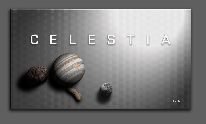
by ElChristou
Another
:
Posted: 09.12.2006, 14:16
by Fightspit
ElChristou wrote:
Same thing ...
Posted: 09.12.2006, 14:41
by ElChristou
Fightspit wrote:ElChristou wrote:
Same thing ...
Yep...
Posted: 09.12.2006, 15:03
by selden
Personally, I would pick an asteroid with a somewhat different shape and color and not put it under Jupiter.
Let's just say that this particular image reminds me too much of certain biological functions.
Posted: 09.12.2006, 15:33
by ElChristou
selden wrote:Personally, I would pick an asteroid with a somewhat different shape and color and not put it under Jupiter.
Let's just say that this particular image reminds me too much of certain biological functions.

indeed...
The variations can be endless, I don't have much time to play with that but what about the idea? (like models on a desk...)
Posted: 13.05.2007, 14:40
by ElChristou
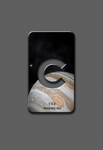
Because I'm still not in mood to model again the losted meshes after yesterday drama... hop my new minimalist splash:
...
Posted: 13.05.2007, 14:57
by t00fri
Wow, I love that sort of clean stuff. Would also make a great icon!
Bye Fridger
Posted: 13.05.2007, 15:05
by ElChristou
t00fri wrote:...Would also make a great icon!...
Yep, I'll do one. Now we just need to rename Celestia to "C"!