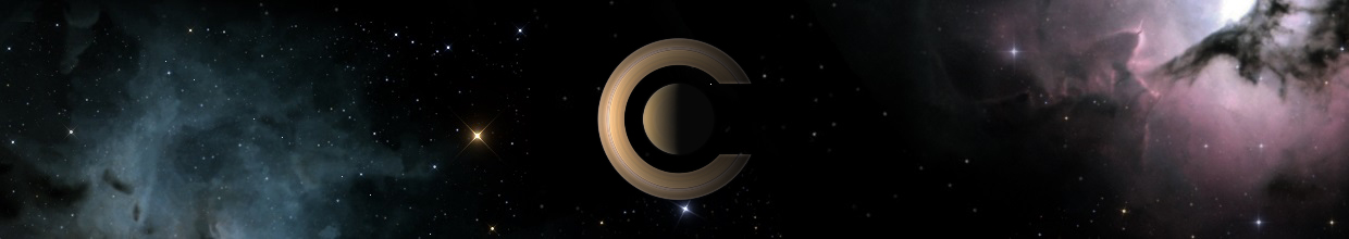
Without planets (or other objects), it just don't make any sense to me. IMO, the splash screen MUST show something, or else, it's useless (better not show any splash screen at all, then! Or maybe just the Word "Celestia" floating over the desktop).
I think the old version was better, except for the font used.
Why not try a picture of objects in wire frame only, as a kind of "pre Celestia" state (since the program is loading ) ? Or ghostly objects materialising on screen ?
The splash screen font sucks !


-
 Topic authorCham
- Posts: 4324
- Joined: 14.01.2004
- Age: 60
- With us: 20 years 10 months
- Location: Montreal
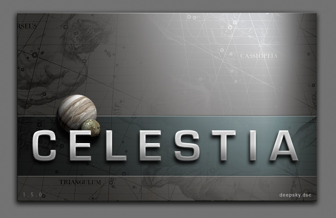
Why stick to Jupiter ? Why not Saturn (the Majesty) ? Or why not the Earth itself, as seen from space ? And why not a galaxy (M31, or M51) ? I'm becoming tired of Jupiter ...
"Well! I've often seen a cat without a grin", thought Alice; "but a grin without a cat! It's the most curious thing I ever saw in all my life!"
Well, I think the old star map is a GREAT characteristic of the splash screen and site. I mean, Celestia in essence, is a more modern star map system.
Am I the only one that sees that?
I like the bottom spash in that X2 jpl Elchristou! If you release that, please send me a copy or post it here so I can grab it and toss it into my config's
Am I the only one that sees that?
I like the bottom spash in that X2 jpl Elchristou! If you release that, please send me a copy or post it here so I can grab it and toss it into my config's
ElChristou wrote:Two options with the same font; it's all things I've already proposed but I still think those are not bad...
(No planet at all... opinion? with or without?)
I think *with* the planet. And, while i personally like Futura better than Eurostile, Futura really is a little quaint... It??s like a 40??s scifi title. It is a great font, but in this setting, somwhat old-fashioned (Cham
- rthorvald

-
Topic authorCham
- Posts: 4324
- Joined: 14.01.2004
- Age: 60
- With us: 20 years 10 months
- Location: Montreal
rthorvald wrote:It??s like a 40??s scifi title. It is a great font, but in this setting, somwhat old-fashioned
True. It' a 40's style of font. It's a nice font, but it could be better.
"Well! I've often seen a cat without a grin", thought Alice; "but a grin without a cat! It's the most curious thing I ever saw in all my life!"
Cham wrote:Why stick to Jupiter ? Why not Saturn (the Majesty) ? Or why not the Earth itself, as seen from space ? And why not a galaxy (M31, or M51) ? I'm becoming tired of Jupiter ...
It's sure that the planet on the splash screen must be linked to the application icon.
Just idea : Why not digitalize all nine planets and let the program itself choosing one in a random selection at the beginning? It could allow the splash screen more dynamic and different (in a part of the image only) at each application start?
-
ElChristou
- Developer
- Posts: 3776
- Joined: 04.02.2005
- With us: 19 years 9 months
For those who want to make a try why other fonts, here is a PSD:
http://nho.ohn.free.fr/celestia/preview/Splash.psd.zip
http://nho.ohn.free.fr/celestia/preview/Splash.psd.zip
-
Christophe
- Developer
- Posts: 944
- Joined: 18.07.2002
- With us: 22 years 4 months
- Location: Lyon (France)
Imy wrote:Just idea : Why not digitalize all nine planets and let the program itself choosing one in a random selection at the beginning? It could allow the splash screen more dynamic and different (in a part of the image only) at each application start?
The splash screen is already chosen randomly in the splash directory (both in the main and user data directories). You can also specify text to be rendered dynamicaly using PNG comments as described in this specification. This is however only supported on KDE.
Christophe
ElChristou wrote:For those who want to make a try why other fonts, here is a PSD
Ok, here is a variant.
I still feel your original has _the_ correct typography, but it seems most people prefer a sans-serif alternative, so here is my suggestion. It is simple, very crisp, and hopefully, conveys a "modern" feel to the program

- rthorvald
-
neo albireo
- Posts: 68
- Joined: 03.02.2005
- With us: 19 years 9 months
- Location: Switzerland
ElChristou wrote:
Without pointing towards somebody specifically, this discussion seems to me like a perfect example for what is called "Too many cooks spoil the broth".
I'll stick with ElChristou's Original quoted above (or an updated version by himself, according to his own ideas), it looks very convincing.
-
ElChristou
- Developer
- Posts: 3776
- Joined: 04.02.2005
- With us: 19 years 9 months
-
Vincent
- Developer
- Posts: 1356
- Joined: 07.01.2005
- With us: 19 years 10 months
- Location: Nancy, France
ElChristou wrote:Runar, what about something between my version (large text) and yours?
Yep, something like that :

@+
Vincent
Celestia Qt4 SVN / Celestia 1.6.1 + Lua Edu Tools v1.2
GeForce 8600 GT 1024MB / AMD Athlon 64 Dual Core / 4Go DDR2 / XP SP3
Vincent
Celestia Qt4 SVN / Celestia 1.6.1 + Lua Edu Tools v1.2
GeForce 8600 GT 1024MB / AMD Athlon 64 Dual Core / 4Go DDR2 / XP SP3
I like Vincent's version.
But it is "false advertising" since those constellation maps aren't included with Celestia. Even finding them can be a challenge, once one realizes that they might actually be available.
It'd be nice if someone could devise very lores versions of the Uranographia maps that could be included. Unfortunately, Jestr's lores version on the Stars page of the Motherlode is over 6MB. I think that is just too large to include in the standard Celestia distribution.
I suppose a reference to them might be enough.
Selden
-
ElChristou
- Developer
- Posts: 3776
- Joined: 04.02.2005
- With us: 19 years 9 months
ElChristou wrote:arrgghh you are kidding, right?
I'm not sure which part you think I might be kidding about -- that it's false advertising or that a lores version could be included with Celestia.
Actually, I'm not kidding about either of those statements. Too many people are jaded by glitzy packaging of products that don't really look like the artwork on their packaging. I think it would be nice if Celestia could actually display the scene shown the splash screen without the user having to do a lot of work. Including just the picture of Orion might be appropriate -- along with a description of where to get the full set of maps.
Selden
-
Topic authorCham
- Posts: 4324
- Joined: 14.01.2004
- Age: 60
- With us: 20 years 10 months
- Location: Montreal
I agree with Selden.
The old style constellations aren't part of Celestia. It doesn't shows what actually Celestia is doing.
And there isn't much to see on that splash. Space is wasted, many parts are "useless". While it's nicely done, eye candy and all, but it's boring !
The old style constellations aren't part of Celestia. It doesn't shows what actually Celestia is doing.
And there isn't much to see on that splash. Space is wasted, many parts are "useless". While it's nicely done, eye candy and all, but it's boring !
"Well! I've often seen a cat without a grin", thought Alice; "but a grin without a cat! It's the most curious thing I ever saw in all my life!"
selden wrote:But it is "false advertising" since those constellation
maps aren't included with Celestia. Even finding them can be a challenge,
once one realizes that they might actually be available
I don??t think this is false advertizing: Celestia is our modern-day
equivalent of this map. It is a descendant, so to speak. In this light, the
splash screen is a very appropriate allegory for the program.
ElChristou wrote:In your last try, IMO there is something wrong in the relation (size)
between "Celestia"/Jupiter/size of the splash...
I actually played quite a bit with that part... But ok;
ElChristou wrote:what about something between my version (large
text) and yours?
... Here is a view of that. I am keeping the italics, though: it makes it look
more dynamic, which is a nice contrast to the background image:

... I still regard your first one (Fridgers original) as the best, though.
I prefer that one over any other of these examples, including mine.
- rthorvald