Anyway. This is a bit of a storm in a teacup isn't it? Why not just keep the current image as it is - if people don't like it they can make their own splash.png images and use them instead on their own installations. At worst, alternative images can be made available on the motherlode for people to download if they don't like the existing one?
The splash screen font sucks !
Um, it looks like those are both sows... 
Anyway. This is a bit of a storm in a teacup isn't it? Why not just keep the current image as it is - if people don't like it they can make their own splash.png images and use them instead on their own installations. At worst, alternative images can be made available on the motherlode for people to download if they don't like the existing one?
Anyway. This is a bit of a storm in a teacup isn't it? Why not just keep the current image as it is - if people don't like it they can make their own splash.png images and use them instead on their own installations. At worst, alternative images can be made available on the motherlode for people to download if they don't like the existing one?
My Celestia page: Spica system, planetary magnitudes script, updated demo.cel, Quad system
-
 Topic authorCham
- Posts: 4324
- Joined: 14.01.2004
- Age: 60
- With us: 20 years 10 months
- Location: Montreal
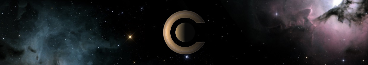
Here's a new splash screen. Try it with an open mind (drag out from your web browser's window). There are some transparent parts, which aren't showing on the forum's black background. Two versions :
Standard size :

Bigger size, for large screens (on mine, it's much more impressive) :

Standard size :
Bigger size, for large screens (on mine, it's much more impressive) :
"Well! I've often seen a cat without a grin", thought Alice; "but a grin without a cat! It's the most curious thing I ever saw in all my life!"
Great work Cham  and now we just find the best style word "Celestia" because it is so basic for me.
Motherboard: Intel D975XBX2
Processor: Intel Core2 E6700 @ 3Ghz
Ram: Corsair 2 x 1GB DDR2 PC6400
Video Card: Nvidia GeForce 8800 GTX 768MB GDDR3 384 bits PCI-Express 16x
HDD: Western Digital Raptor 150GB 10000 rpm
OS: Windows Vista Business 32 bits
Processor: Intel Core2 E6700 @ 3Ghz
Ram: Corsair 2 x 1GB DDR2 PC6400
Video Card: Nvidia GeForce 8800 GTX 768MB GDDR3 384 bits PCI-Express 16x
HDD: Western Digital Raptor 150GB 10000 rpm
OS: Windows Vista Business 32 bits
-
Topic authorCham
- Posts: 4324
- Joined: 14.01.2004
- Age: 60
- With us: 20 years 10 months
- Location: Montreal
Fightspit wrote:Great work Cham
It HAS to be "basic". Think hard about it. The font MUST be simple. Or else, it will fall into "bad taste" and "amatteur" designs (before doing physics, I studied two years in graphical design at the university level, a long time ago).
"Well! I've often seen a cat without a grin", thought Alice; "but a grin without a cat! It's the most curious thing I ever saw in all my life!"
Is-it not beautiful if the word "Celestia" can be colored (not in white) 
Motherboard: Intel D975XBX2
Processor: Intel Core2 E6700 @ 3Ghz
Ram: Corsair 2 x 1GB DDR2 PC6400
Video Card: Nvidia GeForce 8800 GTX 768MB GDDR3 384 bits PCI-Express 16x
HDD: Western Digital Raptor 150GB 10000 rpm
OS: Windows Vista Business 32 bits
Processor: Intel Core2 E6700 @ 3Ghz
Ram: Corsair 2 x 1GB DDR2 PC6400
Video Card: Nvidia GeForce 8800 GTX 768MB GDDR3 384 bits PCI-Express 16x
HDD: Western Digital Raptor 150GB 10000 rpm
OS: Windows Vista Business 32 bits
Cham wrote:Fightspit wrote:Great work Cham
It HAS to be "basic". Think hard about it. The font MUST be simple. Or else, it will fall into "bad taste" and "amatteur" designs (before doing physics, I studied two years in graphical design at the university level, a long time ago).
It's already looking "amateur" with that font. Sans Serif fonts are rarely used in professional circles for a reason - because they look tacky and informal. Sorry Cham, but you're in a minority on this one.
The picture is nice though. The only thing that spoils (other than the font) it is the cloudy stuff spilling off the top of the image - remove that and the picture would work fine.
My Celestia page: Spica system, planetary magnitudes script, updated demo.cel, Quad system
-
Topic authorCham
- Posts: 4324
- Joined: 14.01.2004
- Age: 60
- With us: 20 years 10 months
- Location: Montreal
Fightspit wrote:Is-it not beautiful if the word "Celestia" can be colored (not in white)
Well, yes, it can have a color, or a gradiant. But it doesn't gives the picture the same impact and the scene is losing it's "strength". The black space background imposes a "constraint". Think about Kubrick's movie "2001". Is there any fancy effect in the title ? No. And yet, the overture sequence (main title) is extremelly powerfull.
Malenfant, you are dead wrong here. Being in a "minority" doesn't mean I'm wrong. Serifs are used in PRINTED stuff. It's reallly obvious. Do you see serifs in movies title ? Most of the time, NO ! A splash screen is more like a movie overture, than a printed sheet of paper. Think about Celestia's splash screen as a movie title.
"Well! I've often seen a cat without a grin", thought Alice; "but a grin without a cat! It's the most curious thing I ever saw in all my life!"
Cham wrote:Malenfant, you are dead wrong here. Being in a "minority" doesn't mean I'm wrong.
You're not doing much to persuade people that you're right though. Baseless assertions mean nothing - the fonts you've used so far have IMO been pretty dull and uninspiring compared to the original. Maybe there is a sans serif font out there that would look good here, but I don't think you've not found it yet.
This is entirely down to opinion though. There's no "right" or "wrong" about it, and last time I looked you or anyone else hadn't suddenly become the ultimate arbiter of taste for the community.
Sheriffs are used in PRINTED stuff. It's reallly obvious. Do you see sheriffs in movies title ? Most of the time, NO !
So? I don't see a problem with the existing title font at all - the existing serif font title looks fine to me and works perfectly well. Maybe sans serifs do work better on screen, but that's no reason to totally abandon them.
If you feel that passionate about changing the splash and the text, go ahead and do it on your own installation - but I'm not exactly hearing a raging mob complaining about the existing title in support of you. In fact, you're the only one making an issue out of this. Just because you don't like it doesn't mean that you have the right to force a change on everyone else who doesn't have a problem with it.
Like I said, if people don't like the titles they can change them on their own installations. Meanwhile, everyone else can just continue to use the default one. End of problem.
My Celestia page: Spica system, planetary magnitudes script, updated demo.cel, Quad system
-
ElChristou
- Developer
- Posts: 3776
- Joined: 04.02.2005
- With us: 19 years 9 months
Cham, after using a while your last splash, here is a more detailed critic based on academic analyze of images; the point here are "line of forces".

The main problem is that the many elements of your splash create several lines of forces dividing far too much the scene (too much intersections of those lines)). Principally, the line created by the word "Celestia" and the one created by Saturn's rings are "fighting" too much...
Apart those red lines, one of the black point is the too small angle between those two green force lines on top; this angle should be a bit more important for better visual comfort.
Concerning the blue nebulae on top: the pink arrow shows the attraction of the eye by the pink nebulae, to neutralize this behavior you can push to the left your blue nebulae on top (equilibrium of the scene).
Concerning the font, really it's a endless discussion, just a question of taste. Why not presenting a design with both solutions, then people will choose the one they like more...


-
Topic authorCham
- Posts: 4324
- Joined: 14.01.2004
- Age: 60
- With us: 20 years 10 months
- Location: Montreal
ElChristou,
your analysis is exactly the same I've done, while building the scene ! However, I'm finding the exact oppostie of your conclusion ! Those "forces lines" are what makes the scene interesting and dynamical. Without them, Saturn would simply sit in a static state in the middle of the image, and that would be a bad thing, graphically.
The probe has two aspects : it' getting out of the frame while "sitting" on it (it is "observing" what is "out there"), a bit like that american graffiti : "Killroy was here". Hence the small angle between the two green lines. I don't feel your "incomfort" here. Second, the probe stick (red line) is like a gramophone needle playing on a rotating disk (Saturn's rings), and playing the "celestial music of the spheres".
Of course, the "Celestia" name is like a movie title. The angle between Saturn's rings and the title makes the image dynamical.
"Well! I've often seen a cat without a grin", thought Alice; "but a grin without a cat! It's the most curious thing I ever saw in all my life!"
-
ElChristou
- Developer
- Posts: 3776
- Joined: 04.02.2005
- With us: 19 years 9 months

-
Topic authorCham
- Posts: 4324
- Joined: 14.01.2004
- Age: 60
- With us: 20 years 10 months
- Location: Montreal
ElChristou wrote:[Almost perfect!! just a triangle, a very powerful figure...
You can cut what is below the green line and you have a perfect equilibrium...
And yet, it is completely static. Pyramids are dull pictograms.
This image gives me the idea to go to bed in the middle of the day.
"Well! I've often seen a cat without a grin", thought Alice; "but a grin without a cat! It's the most curious thing I ever saw in all my life!"
-
ElChristou
- Developer
- Posts: 3776
- Joined: 04.02.2005
- With us: 19 years 9 months
Cham wrote:ElChristou wrote:[Almost perfect!! just a triangle, a very powerful figure...
You can cut what is below the green line and you have a perfect equilibrium...
And yet, it is completely static.
True, this is not a dynamical composition...
A dynamical composition need to breack the sistematic symetry, but even in this case an equilibrium must be find; it's not as easy as it seems...
-
Topic authorCham
- Posts: 4324
- Joined: 14.01.2004
- Age: 60
- With us: 20 years 10 months
- Location: Montreal
I think ElChristou's analysis shown above is too "crude" and isn't complete. Here's my own analysis of the splash I've created :

There isn't that much "force lines" crossing, actually, contrary to what ElChristou said. One line have a clear cut (see the blue "cut" on the picture above), especially since that line is very thin. It certainly does not have the same "weight" as the other "force lines" (the title has much more thickness than the probe's boom, for example !). The green lines are crossing at a single point, while the other part isn't aligned and is out of the frame. That part isn't acting the same way as the three green lines.
The red lines are acting like a moving plate (rotating rings), a kind of moving floor on which the probe is dancing. All the "force lines" are creating a dynamical dance here, and that's why I've set up the lines the way they are.
"Well! I've often seen a cat without a grin", thought Alice; "but a grin without a cat! It's the most curious thing I ever saw in all my life!"


-
Starshipwright
- Posts: 78
- Joined: 08.08.2006
- With us: 18 years 3 months
Cham, whatever the design elements, technically I think that your splash screens are very professional looking. Could you start a tutorial thread on how to create a splash screen? Maybe in Add-Ons.
I don't mean to say that only Cham could do this. A tutorial by anyone on how to create a splash screen would be great. I do not remember ever seeing a tutorial on that subject, even checking the old threads.
I think the contents of this thread shows the many differing opinions about spalsh screens and why a tutorial on this subject is a good idea.