Hi,
Some Celestia users, who are also Babylon 5 fans, provided some invaluable assistance in creating the following. If they hadn’t gathered together a great collection of 3D models (and hosted them) I’d probably have halted the website early on, before I ever thought of contacted the other contributors. ; )
Now that the website is finished I’m basically returning the favour, and following their –and the original model builders - lead, by making the whole thing downloadable for anyone to keep – no strings attached.
This seems the most appropriate sub-forum to post this. But if it isn’t, or it’s decided that this is an inappropriate thing to post on these forums, then sorry. Just thought some might be interested in the unique content.
As there’s no easy way to introduce this subtly.
After contacting Ron Thornton, to find out who designed one of the ships on Babylon 5, one thing led to another, and a quick exercise in learning how to code up a web page turned into a unique reference site. (5 years, 15 FX artists and one producer later). Among those contacted included Steve Burg, Everett Burrell, Eric Chauvin and Kevin Kutchaver.
The site isn’t going to stay up forever, It was just a hobby, a one off, so I made it downloadable for anyone to keep – no strings, popups, adverts or anything else attached. Just a lot of frank, revealing, wide ranging and occasionally funny interviews from a bunch of artists with enough Emmys between them to field a couple of football teams (that answer a lot of questions and bust a few myths) and a fair bit of previously unreleased concept art, like this.
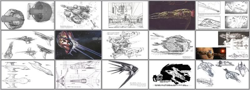
It’s not so much about the show, but the artists, the art and the technology. Steve Burg (who recently designed the Prometheus for the Ridley Scott movie) described what we talked about as the most in-depth examination of his methodology and approach to design ever carried out. Which, considering Steve’s career, came as a bit of a surprise.
This is a link to a facebook page highlighting the site.
http://www.facebook.com/B5Scrolls
If you read the top post you’ll see why I joined FB and set it up that FB page, and why I’m pointing there. It’s far from ideal (a lot of folks aren’t on facebook), but it was the best idea I could think of to let as many know as possible, before the site disappears.
If anyone’s curious, and ain’t on facebook, here’s a link to the website itself.
http://www.themadgoner.com/B5/B5Scrolls/B5Scrolls.htm
Though if you can ‘like’ that Facebook thing, that would be helpful in letting others find the info a month from now.
Cheers
Tom
Babylon 5 - something new about something old.
Re: Babylon 5 - something new about something old.
Tom,
I'm having a significant problem viewing your Web site. I like to use Firefox with a minimum font size of 18. Most of the pages seem to force a fixed viewable area so that only a small part of the page is viewable when large fonts are used.
Selden
Re: Babylon 5 - something new about something old.
First time I coded it up it was only really viewable in IE as I’d never heard of any other browser – (I was that much of a newbie ; )
It does ‘work’ on all browsers now, though the varying standards can be a bit of a pain at times. Taking a guess what your describing maybe connected with the way the site is coded using ‘I-frames’ - it was either that or use file I/O which wasn't going to happen or load up a complete new page every time a button was pressed. Basically, each page of new information is a separate htm file. A large part of the white bit of the scroll is essentially a window which refreshes to load up each of those files whenever an option is selected (while the rest of the page remains static).
Larger fonts, and perhaps zooming in will throw out the formatting as a result. Everything will still be viewable due to scroll bars popping up, I imagine, just not nicely. Guess I’m still enough of a newbie not to have considered all the possible ways of viewing it. ; )
Re: Babylon 5 - something new about something old.
Scroll bars would be nice. Currently there are none visible when using Firefox.
FWIW, I personally prefer very simply designed Web pages. E.g. ones which do not require particular fonts or sizes.
Selden
- John Van Vliet
- Posts: 2944
- Joined: 28.08.2002
- With us: 22 years 2 months
Re: Babylon 5 - something new about something old.
--- edit ---