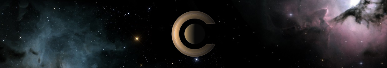
ElChristou wrote:Fridger,
Quit good for the backgrounds...
Now the lettering... well can be much better, no offense, you know it's my job !!
On day I have to do some Splash, mine is just a new small title...
If you can send me the mars image in 1024, or bigger, I can do lots of variation in the title...
Bye.
ElChristou,
well I got to live with the fonts in my Linux system, but there are some more
general aspects that I consider important. Like these:
1) The colors of the fonts should repeat in the colorations of the
images somehow. Also, I want the letters to be BIG. It's about
Celestia, after all...
2) The styles of the fonts are also not accidentally selected. So it was
definitely on purpose to choose a clean Sans Serif (Arial) font for the
Mars + Andromeda splash. The clean "techno" look of that font
contrasts nicely to the lonely atmosphere of that Mars+ Andromeda
image. Moreover, you will note that I used directional lighting effects to
repeat the yellow colors of the lhs Mars craters locally in the font color
on the left! Etc....
Also the style of the font in the first splash (Huygens landing on Titan)
was carefully chosen to express a certain "emotional state" in this
lonely penetration of Titan's atmosphere...I want it to remind us of
the olden pioneering days; thus it should have a slightly "old
fashioned" touch. I basically dislike standard Serife fonts, however...
3) The font in the Jupiter-Europa splash can be replaced by anything
that looks neat, but a metallic touch is perhaps fun. That 3rd splash is
older already, I only intensified the directional lighting a bit,
yesterday.
4) In the two more recent splashes (1 & 2), I chose to just write
'Celestia" without version number. Who knows whether we shall ever
have another one

Bye Fridger