Page 1 of 2

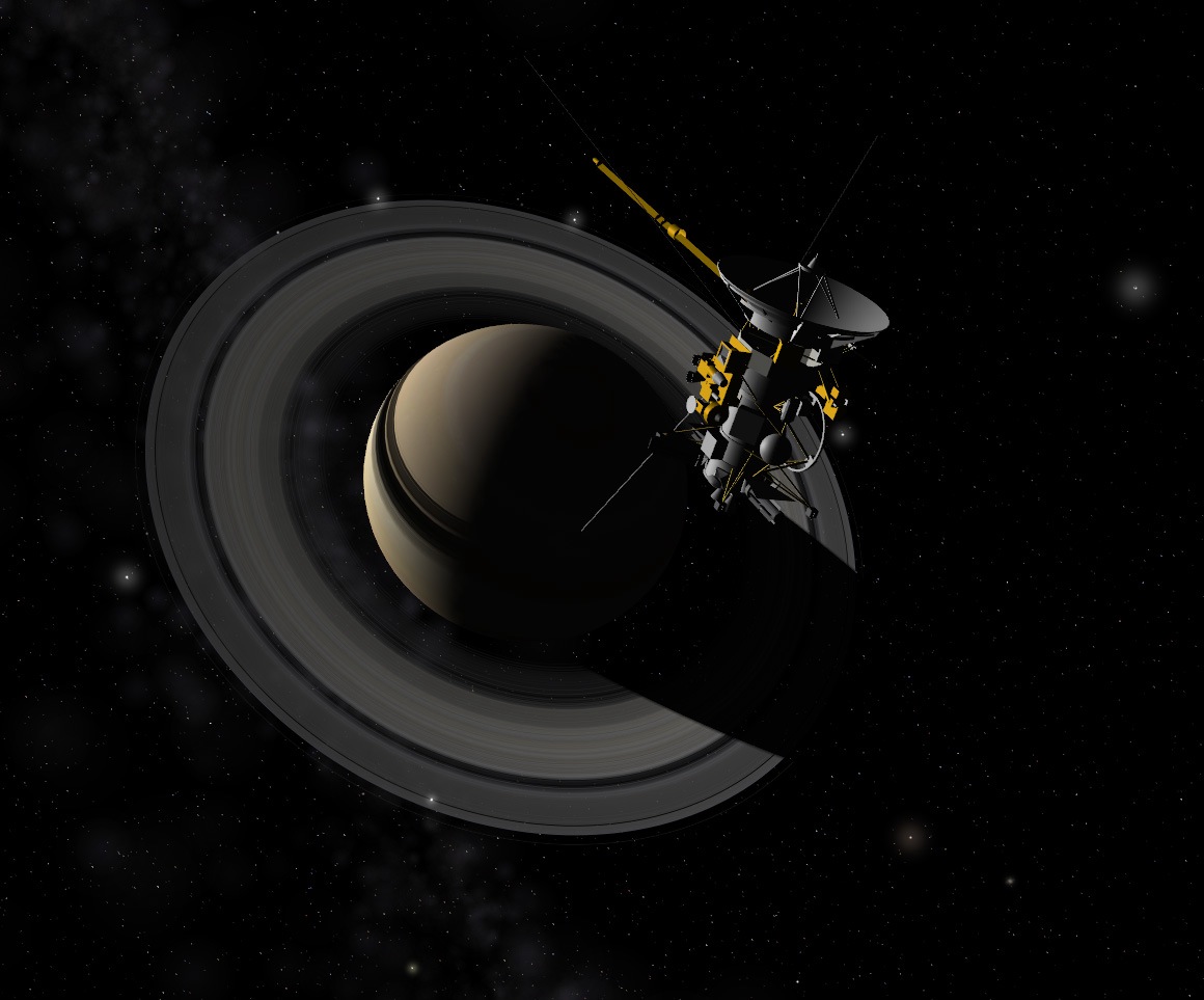
Cassini over the blue top of Saturn

Posted: 04.12.2006, 00:22
by t00fri
Kind of a cute view today:

Cassini flying over the blue top of Saturn. The image
uses Cham's new Cassini model and shows also my
improved MilkyWay view on the right along with Chris' new
fuzzy stars...

Everything part of Celestia-1.5.0pre1 very soon or NOW in
CVS. Only my blue-topped Saturn texture is not to be
found there ;-)

Bye Fridger

(EDIT): As it turned out below, the Cassini model is by
Jestr, and NOT the latest default version by Cham.

Image

Posted: 04.12.2006, 00:36
by selden
That is *not* the model of Cassini that I get when I do a cvs checkout. I'm still getting the old 3ds version, although it's dated December 3rd. I deleted it and did another checkout and still got the old one :(

Posted: 04.12.2006, 00:41
by Cham
That picture is very weird. The rings shadows are all the way around Saturn, and the gray galactic blobs have a clear cut fade out. Also, there are some strange artefacts on the model (on the small sphere).

Selden,

the "new" Cassini model is simply the old one with a better shading. I didn't changed the mesh itself, except patching few small holes here and there, and smoothing a sphere.

Posted: 04.12.2006, 00:45
by Cham
Here's a similar view, on my version (look at the moons, by the way. They are glowing like stars and I don't think this is right) :

Image

Posted: 04.12.2006, 00:50
by t00fri
selden wrote:That is *not* the model of Cassini that I get when I do a cvs checkout. I'm still getting the old 3ds version, although it's dated December 3rd. I deleted it and did another checkout and still got the old one :(


Selden,

you are right. Above, the Cassini model from the add-on by Jestr is shown. It accidentally sneaked in via the extras folder. The one that I updated today is a much more simplistic edition. No idea what's going on. I am not knowledgable with models. Usually no interest. Sorry.

Bye Fridger

Posted: 04.12.2006, 00:53
by t00fri
Cham,

yes, I am aware since a long time about Chris' "glowing moons" . I think I wrote it several times to him in the past....

Bye Fridger

Posted: 04.12.2006, 00:57
by Cham
The only diferences between the original Cassini model and Jestr version are textures. Jestr applied some textures on the original model but the mesh itself is the same (AFAIK). The one I made is simply the original version which I've updated for Celestia 1.5.0, since its shadings were incorrect. I also patched few holes on the mesh, and like I've said, smoothed the small sphere since it was too crude for my taste.

Posted: 04.12.2006, 01:26
by Malenfant
You did see this image taken from over the northern hemisphere, right?

http://ciclops.org/view.php?id=2326

The bluish hues are noticeably absent from the viewing geometry there. It seems that this colouration is a photometric response related to the phase angle.

And I much prefer Cham's image, star-like moons notwithstanding.

Posted: 06.12.2006, 10:08
by t00fri
It is indeed interesting but not too surprising that in this Cassini shot
from Oct 30 2006 of the northern blue top of Saturn the
typical blue color was not observed.

http://ciclops.org/view.php?id=2326

Here are some respective comments by a physicist ;-):
---------------------------------------------------------

From its unique perspective high above the planet, Cassini looks down
upon Saturn's murky northern hemisphere. Note that in this view,
the phase angle was VERY high (150 degrees) such that we largely see
diffuse reflection of the sun's light at Saturn's cloud surface.

There is no doubt that in face-on vision the northern hemisphere is
(presently) blue. Here is a true-color reminder:

http://ciclops.org/view.php?id=753

Diffuse reflection usually includes a color shift due to
partial absorption of the R,G,B color components in the material, here
Saturn's northern clouds.

Image

(The illustration is from here http://www.merck.de/servlet/PB/menu/1403770/index.html)

The observed color shift in diffusely reflected light then teaches us
about the absorptive properties of the material.


As a (trivial) illustration, I made a little experiment with GIMP, taking
the above blue image in direct vision and reduced the blue component
strongly, and green to a lesser extent (<=> simulation of absorption)
. Red remained unaffected. Here is the result, with the resulting color
on the right corresponding about to what is seen in this 150 degree
phase angle shot.

Image

Bye Fridger

Posted: 06.12.2006, 21:56
by zeraeiro
The milkyway looks rather lame. Why not use real data instead?

Posted: 06.12.2006, 22:21
by t00fri
zeraeiro wrote:The milkyway looks rather lame. Why not use real data instead?


What do you mean? Celestia cannot display individual stars beyond a distance of 16 ly. It actually doesn't look lame, if you adjust your monitor correctly.

Bye Fridger

Posted: 27.12.2006, 19:40
by zeraeiro
t00fri wrote:
zeraeiro wrote:The milkyway looks rather lame. Why not use real data instead?

What do you mean? Celestia cannot display individual stars beyond a distance of 16 ly. It actually doesn't look lame, if you adjust your monitor correctly.

Bye Fridger


I was talking about something like several levels. When seeing the milky way in a distance (with all of it in the FOV) maybe render what we know about the arm structure with 3D nebula with some stars embedded.

Posted: 27.12.2006, 20:24
by t00fri
zeraeiro wrote:
t00fri wrote:
zeraeiro wrote:The milkyway looks rather lame. Why not use real data instead?

What do you mean? Celestia cannot display individual stars beyond a distance of 16 ly. It actually doesn't look lame, if you adjust your monitor correctly.

Bye Fridger

I was talking about something like several levels. When seeing the milky way in a distance (with all of it in the FOV) maybe render what we know about the arm structure with 3D nebula with some stars embedded.


In Celestia 1.5.0 ALL knowledge about the arm structure of our galaxy is /concisely/ implemented! As I pointed out already, we cannot display individual stars beyond a distance of 16 ly for reasons of accuracy.

Bye Fridger

Posted: 27.12.2006, 23:58
by zeraeiro
t00fri wrote:
zeraeiro wrote:
t00fri wrote:
zeraeiro wrote:The milkyway looks rather lame. Why not use real data instead?

What do you mean? Celestia cannot display individual stars beyond a distance of 16 ly. It actually doesn't look lame, if you adjust your monitor correctly.

Bye Fridger

I was talking about something like several levels. When seeing the milky way in a distance (with all of it in the FOV) maybe render what we know about the arm structure with 3D nebula with some stars embedded.

In Celestia 1.5.0 ALL knowledge about the arm structure of our galaxy is /concisely/ implemented! As I pointed out already, we cannot display individual stars beyond a distance of 16 ly for reasons of accuracy.

Bye Fridger


Ok, sorry my bad then, I'm new to Celestia and I haven't tried 1.5 yet. But about the arm structure, although I haven't seen it yet in 1.5, maybe it could have some better graphics, not the real ones, but maybe photos from M83 in 3D making it look more real.

Posted: 28.12.2006, 00:11
by selden
Here's what the Milky Way looks like in Celestia v1.5.0pre2. I don't think there's any need to fake it with some other galaxy...

Image

Posted: 28.12.2006, 00:28
by t00fri
I like it, Selden ;-)

Bye Fridger

Posted: 19.01.2007, 15:25
by zeraeiro
Here's what the Milky Way looks like in Celestia v1.5.0pre2. I don't think there's any need to fake it with some other galaxy...


WOW, very nice indeed. I only knew the rendering from 1.4, that's why I asked the previous question.

Posted: 20.01.2007, 02:59
by LordFerret
I like it too, it appears to be far more robust compared to what I see in v1.4.1 :D

While I see you have 'our' location marked, all that's missing in that picture is the label "You are here". :wink:

Posted: 20.01.2007, 10:53
by t00fri
Here is once more my annotated version ouf our present
MilkyWay template.
Image

and here is again my version with the pulsar catalog
(<--Selden's add-on) superimposed, exhibiting this
remarkable agreement with the arms of our template!
Image

Bye Fridger

Posted: 20.01.2007, 17:50
by Cham
Fridger,

why the MW annotation isn't in the CVS version ?