Page 1 of 4

Celestia is (almost) a failure in my classroom ! :-(

Posted: 13.11.2006, 20:22
by Cham
I have a lot to say today, but since I'm (already) tired and a bit depressed, I'll try to keep things simple. And I hope my own students wont read this topic. :x

This semester, I'm teaching "basic" astronomy to 18-20 years old students. For the first time, I'm using Celestia in the classroom and students have some "practical works" to do with the software (a total of 8 "practical works" with Celestia). Most of them have already installed the basic Celestia package on their own home computer, at the beginning of this semester (back in september).

Semester course description (in brief) : introduction to astronomy, our solar system (planets, moons, sun, asteroids, comets), exoplanets, birth, life and death of stars, nebulae, galaxies, the universe at large, and some basics of cosmology. No maths required, except basic conversions from LY to km, AU, kpc, and basic Kepler's laws.

Students must assist to two full hours in the classroom, per week, and one full hour per week in a computer lab to do their "practical works" with Celestia. We are almost at the end of the semester, already.

Well, sadly, the experience is almost a failure ! There are two reasons for this :

Firstly : The computers in the lab (all PC's with Windows XP) are pieces of total junk ! Celestia totally sucks on those %#@&* computers, and I don't have much help from the tech support. Memory is always low, the video card sucks, so the students are very frequently experiencing video card crashes, Celestia unexpectedly quitting, screen resolution going mad, etc. I'm always running between all stations to solve all sorts of computer or Celestia related problems. Many addons don't work as they should, and I discovered many addons inaccuracies. Of course, I don't use any high resolution textures (I installed only basic low res textures). Addons are very simple in general, except few of my own black holes and pulsars. The computers are all COMPAQ "EVO" D510 CMT, Pentium 4, with 512 MB of RAM. WHAT A NICE PIECE OF SCRAP ! :evil: :evil:

Second : The students themselves, after MONTHS of Celestia immersion, are still unable to understand and memorise the few keyboard shortcuts and general Celestia modes of operation ! Each week, I have to answer the same questions about many simple things, like distance evaluation, time evaluation, how to show the planets, and so on.

This whole experience about teaching astronomy with Celestia is beginning to become very frustrating and I'm even asking myself if I'll continue to teach astronomy with Celestia, for the next semester !

The problem isn't Celestia in itself, but the lab of those sucky PC's and the inability of our students to memorise and understand *ANYTHING* !
Posted: 13.11.2006, 20:35
by scaddenp
Since students have no problem with key strokes for their favourite game
harness, its interesting that celestia is a problem. I think its fair to expect that students learn the key strokes for the basics for movement and control. However, key strokes that are more rarely used are a problem. With the wonderful lua stuff addon, perhaps some basic widgets for less common
commands could be added without too much trouble? Especially the various toggles and perhaps shortcuts to light-speed etc. Need a way to clear the controls away too though so that scene can be appreciated in its full glory.

Posted: 13.11.2006, 22:24
by ElChristou
scaddenp wrote:...With the wonderful lua stuff addon, perhaps some basic widgets for less common
commands could be added without too much trouble? Especially the various toggles and perhaps shortcuts to light-speed etc. Need a way to clear the controls away too though so that scene can be appreciated in its full glory.


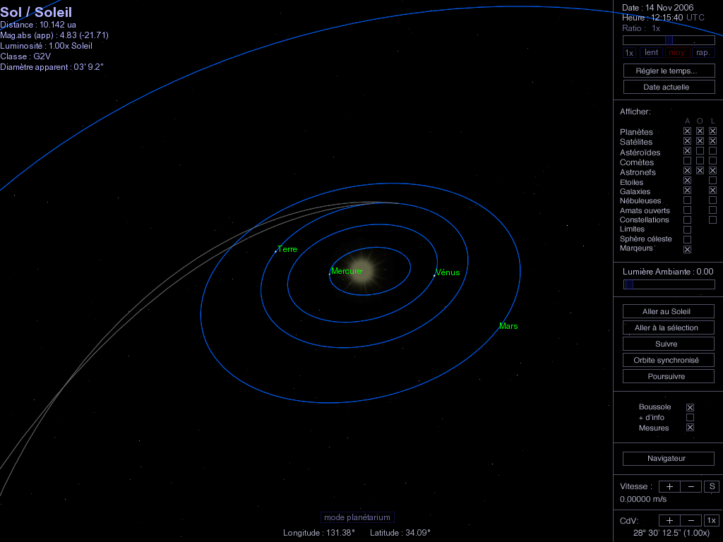
To all, what commands would be nice to have on screen? (we can imagine a kind of control panel full of buttons)

Posted: 13.11.2006, 22:48
by tech2000
ElChristou wrote:To all, what commands would be nice to have on screen? (we can imagine a kind of control panel full of buttons)


A control panel that would also be integrated in the cockpit of the space vessel... Maybe then they would appreciate Celestia abit more...

Then I button to accelerate to lightspeed would be a cool feature.

Bye, Anders

Posted: 13.11.2006, 23:35
by Paolo
:( Cham I'm sad for you.


1) Those kind of computers should have an Integrated Intel Extreme Graphics - 4X AGP. With the updated OpenGL driver they should run "Basic" Celestia without huge add-on almost nicely. I guess that some of them are at least misconfigured.

2) The usability of Celestia UI was one of the first issues that I've rised since 2002. At present time Celestia is for an audience of enthusiasts, not for everyone. Its not for kids (too difficult to use) and is not for professionals (lacks of some professional features). I think that a deep revision of the UI and of the internal data model are required. On the first side Hank and Vicent are going to implement some new tools in order to open a new way. On the other side Chris is working very hard to implement very important and complex changes to the data model.

My wife is a teacher and I can say that your situation is similar to hers. Its the children and the students in general that are changing. Its more difficult to teach something to them. Now she is attending to an upgrade course for teachers and she told me the last strategies to have success in teaching something to the new generations uses involvement of pupil through activities and contextualization. I think that the usage of tools like Celestia should help very much. The fact is that Celestia is not "yet" propery a teaching instrument, specially for not so young students like yours. With younger ones I can bet that it works very well. 18-20 years old students are more demanding against software. They are not more the ones of the command line interface and the shortucts using the "10 fingertips" technology. They are then toolbar, tooltip and F1 key generation, all aids that are not present in Celestia, but that are present for instance in Stellarium.

I think that you need to have a bit of patience. I don't know if my words will sound you ancouraging as they would be, but perhaps in the next semester the things will be a little bit better. :wink:

Kind regards

Posted: 14.11.2006, 01:35
by buggs_moran
For the keys I can suggest this, although it needs some updating...
http://learn.arc.nasa.gov/planets/main/keychart.jpg

Posted: 14.11.2006, 12:49
by ElChristou
What about something like this for our youngers pupils? (soory guys, it's in French, but I suppose it's easy to understand...)

Image

Posted: 14.11.2006, 12:54
by dirkpitt
ElChristou, is that screen done with Lua?

Posted: 14.11.2006, 13:59
by ElChristou
dirkpitt wrote:ElChristou, is that screen done with Lua?


Of course not! it's just to illustrate the topic, discuss the possible interesting functions to be on screen and also to give some ideas to our talented coders...

Posted: 14.11.2006, 14:32
by buggs_moran
Ooh I like that Chris.

Posted: 14.11.2006, 15:20
by ElChristou
Also, once more it would be important to create a low data pack for those low and middle config, less stars, less DSO's, well only the necessary to run some basic activities necesary to understand the basis of astronomy. In such a pack, all maps should be in 2k maxi, all models should be nicely optimised...

Such a pack would help a lot on most of the configs used for education...

Posted: 14.11.2006, 16:17
by Vincent
ElChristou wrote:
dirkpitt wrote:ElChristou, is that screen done with Lua?

Of course not! it's just to illustrate the topic, discuss the possible interesting functions to be on screen and also to give some ideas to our talented coders...


Well, that's not far from the actual state of the Lua tools.
So, if everybody agrees on the content and the layout, it can be done very quickly... :wink:

Posted: 14.11.2006, 16:52
by Toti
El Christou,

Almost all the functionality in your mock-up is already present In Celestia KDE via the standard menus.

I think Celestia needs more advanced shortcut management. The current system is pretty exhausted: there aren't many unmapped keys remaining and it's difficult to assign them to new actions under reasonable mnemonic rules.

I like Chris' proposal for a multiple state key binder. Renderflags, for example, could then be toggled by a key press sequence:

R->C (on/off cloud rendering)
R->C->S (on/off cloud shadow rendering)
R->A (on/off atmosphere rendering)


Note that after the first key press (shortcut group change), all the keys (including "R") are available for mapping to the real action, allowing for much more freedom to setup recognizable keyboard assignments.

Posted: 14.11.2006, 17:30
by ElChristou
Toti wrote:El Christou,

Almost all the functionality in your mock-up is already present In Celestia KDE via the standard menus.

I think Celestia needs more advanced shortcut management...


Toti, I agree with you on the topic of shortcuts, but this is another topic; here it's just question of displaying on screen some shortcuts for a very specific use, education, no more.

I won't imagine such UI in the default package of Celestia, of course...

Posted: 14.11.2006, 17:33
by ElChristou
Vincent wrote:So, if everybody agrees on the content and the layout, it can be done very quickly... :wink:


I'm not educator, so I put there the function I suppose to be the most usefull for a kid, now you guys (educator) should decide what to put on screen...

Posted: 14.11.2006, 17:56
by Cham
ElChristou's suggestion is very nice. That interface could help.

Posted: 14.11.2006, 20:06
by Toti
El Christou,

I am not that sure that they are entirely different topics, as you said. Cham wrote about (presumably too lazy :)) students being unable to memorize the shortcuts involved. While I like your mock-up proposal to complement the most spartan front-ends, a sensible shortcut redesign would help address this problem for both casual and serious users, and would definitely bring up some solutions where they are needed.

Posted: 14.11.2006, 20:16
by Cham
Toti wrote:Cham wrote about (presumably too lazy :)) students being unable to memorize the shortcuts involved.


Ooooh yesss they are, they are ! LOL !

Posted: 14.11.2006, 20:22
by ElChristou
Toti wrote:El Christou,

I am not that sure that they are entirely different topics, as you said. Cham wrote about (presumably too lazy :)) students being unable to memorize the shortcuts involved. While I like your mock-up proposal to complement the most spartan front-ends, a sensible shortcut redesign would help address this problem for both casual and serious users, and would definitely bring up some solutions where they are needed.


Yep, sorry, reading again your post I got your meaning; true, it could help of course, and for the official dev we will need such revision, now, the UI is usable from very young kids to teen without problem for the basic commands... I think this would really help the educator...

Posted: 15.11.2006, 00:48
by ANDREA
Well, my point of view differs a bit from what I read up to now here.
I?€™ll explain: I?€™m sure that Cham?€™s students are not so lazy or stupid to be unable to memorize a limited number of commands, as needed to use Celestia in a simple way, and that on the contrary each of them is able to memorize and use all the absurd commands needed to use a videogame, without problems, as scaddenp too wrote here.
So, what is the reason of this different approach? :?:
The reason is that, while the videogame is beautiful, fast, filled with sounds, vibrations, action, colours, punches, gun blasts, gasps and gulps, and what else, Celestia has almost nothing of all this, or better, it can have many of these things, but only if the hardware you use for teaching them astronomy is of top quality, so very expensive.
I have seen a very notable increase of interest AFTER using Vincent?€™s patches, that allow to add sounds, music, images and movies to the shows. :wink:
As Danielj says (too many times, IMO), I have a top rate PC (even if now it?€™s a second line, or even worst), and I always bring it with me when I make my lessons in schools, because I know very well that the only reason why the boys stay tuned on what they see on the screen is that it looks very nice, filled with music, sounds, images, movies, moving without gaps, so giving the real impression of a space walk, not of a C class ugly movie. :D
This is obviously helped by the addition of my speech, that varies a lot, accordingly with the age of the students (remember, I have students from 6 to 18 years old).
Moreover, as all of the teachers have seen, the interest on the various arguments, not only astronomy (generally speaking, obviously there are exceptions, thanks God!) apparently decreases with the age, but this is not real, IMO.
The problem is that, while younger students are still filled up with curiosity, and have absolutely no fear to ask for anything, even for stupid things, the older ones don?€™t make questions for the fear that someone could say ?€?Hey, are you stupid??€