Experimental "supertab" interface
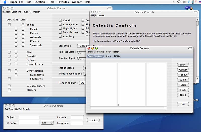
Currently the OS X version of Celestia has a proliferation of windows that you can keep open to change render settings, browse eclipses, etc.
However the user may sometimes wish to group all, or just some windows with similar functions into a tabbed interface.
Later, it might be useful to even tear off and close unwanted windows.
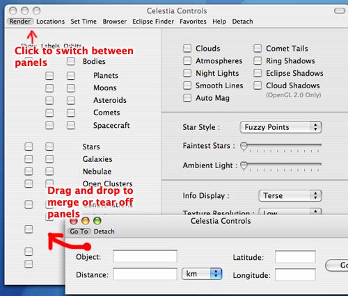
I made a test app that demonstrates how one such fully user-configurable, tabbed UI could work:
Most windows merged by the user into one, tabbed window:
"Tabs" can be torn off into separate windows:
The test app (this is not a full version of Celestia) can be downloaded from here.
A brief description is on my Celestia page.
Last edited by dirkpitt on 16.07.2007, 12:58, edited 3 times in total.
-
- Developer
- Posts: 3776
- Joined: 04.02.2005
- With us: 19 years 8 months
As I already tell you by mail, the only Supertabbed windows is already a very BIG step, the behavior of the tabs (change dimension of the windows) is just soft, quick and VERY pleasant.
For this reason I believe the drag and drop stuff with time will be completely forgotten by users (if they begin to use it someday! )
Perso I'm already sure I won't use the drag and drop at all.
Now, this is a very cool improvement for the osX GUI (even if we pas to a cross patform somedays). Tx again for the effort!
-
- Developer
- Posts: 3776
- Joined: 04.02.2005
- With us: 19 years 8 months
BTW, I believe the custom button is not necessary. I cannot recall an app having such kind of button. Also everyone knows the ctrl-click on the tool bar to customize it.
Because Celestia won't have any Customize Toolbar item in the menu, I suppose a note in the ReadMe would be welcome for newbies...
I think tear-off and merge might be useful in more cases than you're making it out to be..
For example, I almost never use the Goto and Set time controls, so what I'd do is tear them off, then close the windows thus reducing clutter in the tab bar.
I might also tear off the Browser and Eclipse Finder and since the two are similar in function, I'd merge the two into one window.
Anyway, it's good to know this interface can cater to users who want everything in one window, as well as to users who only want some stuff in one place.
-
- Developer
- Posts: 3776
- Joined: 04.02.2005
- With us: 19 years 8 months
dirkpitt wrote:I think tear-off and merge might be useful in more cases than you're making it out to be..
For example, I almost never use the Goto and Set time controls, so what I'd do is tear them off, then close the windows thus reducing clutter in the tab bar.
I might also tear off the Browser and Eclipse Finder and since the two are similar in function, I'd merge the two into one window.
Anyway, it's good to know this interface can cater to users who want everything in one window, as well as to users who only want some stuff in one place.
Completely agree, of course.
ElChristou wrote:I cannot recall an app having such kind of button. Also everyone knows the ctrl-click on the tool bar to customize it.
Because Celestia won't have any Customize Toolbar item in the menu
The customize button is actually present in many apps that have toolbars, but it's usually not visible by default. It's visible by default in my test app because it's... a test app
-
- Developer
- Posts: 3776
- Joined: 04.02.2005
- With us: 19 years 8 months
dirkpitt wrote:ElChristou wrote:I cannot recall an app having such kind of button. Also everyone knows the ctrl-click on the tool bar to customize it.
Because Celestia won't have any Customize Toolbar item in the menu
The customize button is actually present in many apps that have toolbars, but it's usually not visible by default. It's visible by default in my test app because it's... a test app
Ok...
I don't think I'd use the drag and drop feature much. But an integrated control panel using tabs has been on my wish list for a long time. I don't think I'd be bothered by clutter from tabs for functions I don't use much. But it might become a problem if the number of tabbed panels grows large. In that case, having a "Customize" tab to select a panel where you'd have checkboxes for adding/removing panels from the tab list would suffice, I think.
The big advantage of an integrated control panel is that it simplifies window managment. In fact, an integrated control panel could be operated as a sheet that slides down automatically when you move the mouse to a hot spot at the top center of the window, and slides up automatically when you move the mouse out of the panel. I think something like that could be very convenient to use.
- Hank
Thanks for the feedback guys. I updated the test app.
Changes:
- Bug fixes
- Detach button
- Locations separated out of Render controls pane
- New look for Browser, Render, Go To, and Set Time panes
- Keyboard shortcuts now correctly activate Render, Browser, Eclipse Finder, Set Time, Goto, and Favorites panes. If the user has "customized away" the relevant item from any of the open windows, the keyboard command will open a new window instead.
hank wrote:an integrated control panel could be operated as a sheet that slides down automatically when you move the mouse to a hot spot at the top center of the window, and slides up automatically when you move the mouse out of the panel. I think something like that could be very convenient to use.
- Hank
I thought about this too. For example, I can see how in full screen mode on a single-monitor setup, something like showing/hiding the controls automatically on a mouse action might be handy. BTW, I'm more of a fan of the Photoshop way of toggling on-screen palettes (the Tab key) but since Celestia already has too many shortcut keys a mouse action is probably a better alternative.
Moving the mouse to the top of the screen in full screen mode currently causes the menu to appear, so maybe offering the other parts of the screen (corners, top/bottom/left/right edges) as choices might be useful?
Dirkpitt,
using the corners may cause some problems. I'm already using the corners to activate or disactivate several OS X features (Dock, screensaver, etc).
"Well! I've often seen a cat without a grin", thought Alice; "but a grin without a cat! It's the most curious thing I ever saw in all my life!"
-
- Developer
- Posts: 3776
- Joined: 04.02.2005
- With us: 19 years 8 months
-
- Developer
- Posts: 3776
- Joined: 04.02.2005
- With us: 19 years 8 months
dirkpitt wrote:How about: Cmd+Option+Shift+Delete. Pressing it will activate the SuperTabs alien that shoots out obscene slogans deriding the A**** Corporation. After a few seconds, you can suddenly fly the alien inside Celestia. Change direction by shaking your tilt-sensitive MacBook!
This seems to be THE optimal solution, I definitively vote for this one!
I've uploaded an experimental build of Celestia that implements the super tabs interface.
Download page (Unofficial 2007-08-04 build)
Improvements:
- Lone panes (windows with only 1 tab) automatically hide the tab bar, and vice versa
- The first window opened after closing all control windows shows all tabs
Known bugs:
- UI in French, Spanish, Japanese localizations is broken
- Favorites menu is broken
- Invalid render path warning message is broken
-
- Developer
- Posts: 3776
- Joined: 04.02.2005
- With us: 19 years 8 months
dirkpitt wrote:I've uploaded an experimental build of Celestia that implements the super tabs interface...
Tx Dirkpitt!
A few comments:
- (I'm not sure this is part of the UI localization problem so...) If I have the system in French (or Spanish), all items calling panels in the menu (e.g pref, Set Time etc) are broken (grey) less the help item. If I switch the system to English all is ok.
- The help panel still need a tweaking for the resizing behavior (must be only vertical).
- Drag and drop panels don't work over the GL window of Celestia.
- If you drag a panel, then drop it immediately because you change your mind, the Supertab goes to render and the dropped panel goes at the last place; this behavior seems odd... (the panel may stay at it's place without any change?)
-The Help panel seems impossible to drag...
-The default width of some Eclipse Finder columns can be reduced to reduce the whole panel
- The app remember what panels were open on last session, is this really wanted? (Perso I have no idea if it's cool or not, but let's say you quit with 3 panels on your screen, then 2 days later you open Celestia, you get those 3 panels over the main window and to me this gives you a strange sensation of a brutal intrusion... ...do you see what I mean?)
- The possible use of (inexistent) icons in the ToolBar should be avoid (menu in the custom panel)
Another comments not related to the Supertabs, do we get ride of the "Run demo" feature or not?
I don't remember about the Close command (File menu); is there any interest in keeping it? (the Quit command do the same or not?)
-
- Developer
- Posts: 3776
- Joined: 04.02.2005
- With us: 19 years 8 months
Dirkpitt, could it be possible to have the hubble type next to the barred Galaxies in the Browser? (as previously, between () and in grey)...
I'm wondering if there is not any way to make the browsers in general, more... interesting... What about a few more data within the columns (size, magnitude, classes or else?) and a way to sort the data... possible?
1. Yes, if anything doesn't work in French or Spanish that's normal.
2. The Help window can be tweaked in English.lproj/Controls.nib to get the desired resizing behaviour I think.
3. Panels are not designed to be dropped on the GL window - is this what you mean?
4. The problem with dropped panels shifting places is a bug - thanks for letting me know.
5. Help panel was always impossible to drag - just click the Detach button instead
6. Not sure what you mean with the Eclipse Finder..?
7. Open panels are remembered, this is a feature. If the panels are tool palettes it would make sense, but in this case it's a toss-up. Is this feature really annoying? This is definitely an important point and should be discussed more.
8. I have not found a way to hack the menu in the toolbar customization palette to not show Icons.
9. Run demo will be removed when we get a new demo script, not sooner.
10. Close will close any kind of window (e.g., the Help window). It's not the same as Quit.
11. Should we show Hubble type for barred spirals only?
12. Sorting is hard to do with the current UI, but data filtering by size, magnitude etc could be interesting. Perhaps this ought to be a separate forum thread?