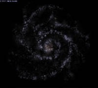
Spiral Galaxy Template set for CVS
-
Topic authort00fri
- Developer
- Posts: 8772
- Joined: 29.03.2002
- Age: 22
- With us: 22 years 7 months
- Location: Hamburg, Germany
Spiral Galaxy Template set for CVS
Today, I was working quite a bit to "finalize" our new PNG spiral galaxy templates, such that I can commit the whole stuff with the new code to CVS tomorrow.
ElChristou has invented a multi-layer scheme, of how to arrive at a standardized set of such templates. We have followed it throughout. Yet, in detail it's a lot of work.
To give everyone an idea about the new galaxy shapes
in Celestia 1.5.0, look at the composite image below. From top to bottom, the left-hand row displays Sa, Sb and Sc, while the right-hand row displays the respective barred spirals, SBa, SBb and SBc. The second image below is a reminder of how the custom MilkyWay template will look like. All known arms, the angle of the bar and the sun's position have been carefully implemented and checked.
In our systematic design of the various spiral types, we used the generally accepted features that are used for the Hubble classification. Like the amount of opening of the arms and the core sizes.
Certainly, during the pre-1.5.0 testing phase, we may still straighten out or tune some possibly unsatisfactory aspects, should they arise.
Bye Fridger
-
- Developer
- Posts: 3776
- Joined: 04.02.2005
- With us: 19 years 9 months
ElChristou wrote:Adendum:
One have to keep in mind this rendering is designed to be used with high FOV (galaxies seen from earth)...
You mean low FOV.
Those templates are looking VERY good. Except maybe the Sa representation, which looks a bit unatural (too regular?).
"Well! I've often seen a cat without a grin", thought Alice; "but a grin without a cat! It's the most curious thing I ever saw in all my life!"
-
Topic authort00fri
- Developer
- Posts: 8772
- Joined: 29.03.2002
- Age: 22
- With us: 22 years 7 months
- Location: Hamburg, Germany
Cham wrote:ElChristou wrote:Adendum:
One have to keep in mind this rendering is designed to be used with high FOV (galaxies seen from earth)...
You mean low FOV.
Those templates are looking VERY good. Except maybe the Sa representation, which looks a bit unatural (too regular?).
Cham,
as to Sa, I tend to agree, but the regularity only shows up in this face-on view (which is rare in practice). Realistic inclinations look pretty good. But there is certainly some room here for possible tunings. And of course as soon as pre-1.5.0 is out, everyone is welcome to try own custom designs for all 10000+ galaxies, if so desired
Bye Fridger
Fridger,
this new galactic code (and templates) is a MAJOR feature of version 1.5.0. That alone is well worth the upgrade ! I'm very happy that you finally made it !
"Well! I've often seen a cat without a grin", thought Alice; "but a grin without a cat! It's the most curious thing I ever saw in all my life!"
-
Topic authort00fri
- Developer
- Posts: 8772
- Joined: 29.03.2002
- Age: 22
- With us: 22 years 7 months
- Location: Hamburg, Germany
This is to let people know that my galaxy update together with the new png templates & custom MilkyWay.png is now in CVS. The templates were done together with ElChristou. Last fine tunings may still be done in the pre-1.5.0 testing phase.
Here is my ChangeLog part:
affected files: galaxy.cpp, galaxy.h, render.cpp, deepsky.dsc, ChangeLog, models/Makefile.am, celestia.iss
added: S0.png, Sa.png, Sb.png, Sc.png, SBa.png, SBb.png, SBc.png, MilkyWay.png
deleted: S0.pts, Sa.pts, Sb.pts, Sc.pts, SBa.pts, SBb.pts, SBc.pts
I updated celestia.iss to the new png templates and custom MilkyWay.png, but it must still be done for /MacOSX/!
Bye Fridger
Here is my ChangeLog part:
Code: Select all
* galaxies:
-changed galaxy template format to standard (grayscale) PNG
-allow a custom template for each galaxy in deepsky.dsc
-new approach to thickness of galaxy (arms): assumed proportional to read-in
brightness values
-emulate dust lanes around galactic plane (y=0)
-considerable improvement of Milky Way appearance as seen from Earth
-implement galaxy labels of transparency increasing with distance, thus
providing a neat 3d effect
* galaxy templates:
-designed an entirely new set of PNG templates using a uniform multi-layer
technique
-provided a custom Milky Way template including all known arms with correct
location of the Sun. Supply adapted deepsky.dsc
affected files: galaxy.cpp, galaxy.h, render.cpp, deepsky.dsc, ChangeLog, models/Makefile.am, celestia.iss
added: S0.png, Sa.png, Sb.png, Sc.png, SBa.png, SBb.png, SBc.png, MilkyWay.png
deleted: S0.pts, Sa.pts, Sb.pts, Sc.pts, SBa.pts, SBb.pts, SBc.pts
I updated celestia.iss to the new png templates and custom MilkyWay.png, but it must still be done for /MacOSX/!
Bye Fridger
-
- Developer
- Posts: 1356
- Joined: 07.01.2005
- With us: 19 years 10 months
- Location: Nancy, France
Fridger, ElChristou,
Thanks a lot for this very nice set of galaxy templates, whose shapes
have been improved a lot compared to the former one (.pts).
I also think the use of .png format represents a great improvement.
I just have one question concerning the resolution of the templates.
For example, when you look at the MilkyWay.png template in an image
editor, you can notice that the size of the "points" is very large
compared to the size of one pixel, as if the maximum available
quality was not used.
Here are 2 shots showing the original template and the template with a little blur effect :
The first template looks as if it had been drawn in a lower resolution,
and then increased in size.
And here are 2 other shots showing how they are respectively rendered in Celestia :
The 2nd shot seems to give a better resolution in Celestia...
So why didn't you use the maximum pixel resolution to draw the templates ?
I'm sure you have a good reason to have done so, but I'm really missing it...
@+
Vincent
Celestia Qt4 SVN / Celestia 1.6.1 + Lua Edu Tools v1.2
GeForce 8600 GT 1024MB / AMD Athlon 64 Dual Core / 4Go DDR2 / XP SP3
Vincent
Celestia Qt4 SVN / Celestia 1.6.1 + Lua Edu Tools v1.2
GeForce 8600 GT 1024MB / AMD Athlon 64 Dual Core / 4Go DDR2 / XP SP3
-
- Developer
- Posts: 3776
- Joined: 04.02.2005
- With us: 19 years 9 months
Vincent, I don't get the point...
The templates are 128x128 px, coresponding to 72ppp. At this res, you can enter in this square 16384 px and from what I know the size of a pixel don't change from a system to another...
Can you explain exactly what have you done at the res level (without talking about the blur)?
The templates are 128x128 px, coresponding to 72ppp. At this res, you can enter in this square 16384 px and from what I know the size of a pixel don't change from a system to another...
Can you explain exactly what have you done at the res level (without talking about the blur)?
I also don't understand the connection between the resolution and your blur effect.
but it really looks better
most recent celestia win32-SVN-build - use at your own risk (copy over existing 1.5.1 release)
-
- Developer
- Posts: 1356
- Joined: 07.01.2005
- With us: 19 years 10 months
- Location: Nancy, France
ElChristou wrote:Vincent, I don't get the point...
The templates are 128x128 px, coresponding to 72ppp. At this res, you can enter in this square 16384 px and from what I know the size of a pixel don't change from a system to another...
Can you explain exactly what have you done at the res level (without talking about the blur)?
Chris, I'll send you an e-mail.
I don't have the required technical vocabulary to talk about that in english.
But I do have it in french.
@+
Vincent
Celestia Qt4 SVN / Celestia 1.6.1 + Lua Edu Tools v1.2
GeForce 8600 GT 1024MB / AMD Athlon 64 Dual Core / 4Go DDR2 / XP SP3
Vincent
Celestia Qt4 SVN / Celestia 1.6.1 + Lua Edu Tools v1.2
GeForce 8600 GT 1024MB / AMD Athlon 64 Dual Core / 4Go DDR2 / XP SP3
I think that what he means is this (I'm not sure this is making any sense, actually) :
Considering the 128 X 128 resolution, the templates could hold more information than what is actually saved in the file. The way the galaxies were drawn wasn't "optimal". The blurr he made "added" some more information in the template (of course, a blurr should actually reduce the information stored in the picture). It's a bit like the tool used to draw the galaxies was a rough pencil (so the "low resolution" effect), while adding a blurr reduced that "roughness" aspect.
Vincent, could you post more pictures of the before/after blurr results, in Celestia ? What about the side views ? Please, post some larger pictures.
EDIT : And what happens if you add color spots in the templates ? This may be interesting to make custom templates. I can't wait to try it myslef, but I don't have a recent built of Celestia 1.5 (beta).
"Well! I've often seen a cat without a grin", thought Alice; "but a grin without a cat! It's the most curious thing I ever saw in all my life!"
-
Topic authort00fri
- Developer
- Posts: 8772
- Joined: 29.03.2002
- Age: 22
- With us: 22 years 7 months
- Location: Hamburg, Germany
Well, that's the good thing about the new PNG
format
Everyone can become creative easily and design
templates WAY better than ElChristou and I were able
to.
One word of warning though: we have checked our
designs against many galaxy photos under many
different perspectives! That experience went into the
design.
Also, ElChristou's systematic layer approach gives the
template design a well-defined aspect.
If one or both of us had more time, we'd certainly offer
very soon a nice little course about template making in
CelestialMatters. Soon or later this will certainly
happen...
This would be a good starting point for lots of further
experiments, I am sure!
Moreover, I see that most people use the wrong way of
looking at galaxies after hitting G (goto). The
difference is illustrated in case of our new MilkyWay
template below.
I always see screendumps of images like the top one.
But you should inspect galaxies like the bottom display
illustrates! The difference are just some CTRL+mouse
left and SHIFT+mouse left forward/backward moves!
Good luck
Bye Fridger
I'm testing right now a new built of Celestia (made 10 minutes ago). I immediately noticed something wrong with the MilkyWay template :
See that straight line in the middle ? It's also visible from Earth.
"Well! I've often seen a cat without a grin", thought Alice; "but a grin without a cat! It's the most curious thing I ever saw in all my life!"
About the "resolution" and template bluring, here's my experiment :
Here's the original Sc.png template :
Here the same file with a simple blur applied with Photoshop :
Now here's the same object, as rendered in Celestia (click on the pictures below) :
Original template :
And here's the one with a simple blur :
Clearly, the effect is extreme. The original one is better looking, in this case. The second one looks like a fractal.
"Well! I've often seen a cat without a grin", thought Alice; "but a grin without a cat! It's the most curious thing I ever saw in all my life!"
-
Topic authort00fri
- Developer
- Posts: 8772
- Joined: 29.03.2002
- Age: 22
- With us: 22 years 7 months
- Location: Hamburg, Germany
Cham wrote:I'm testing right now a new built of Celestia (made 10 minutes ago). I immediately noticed something wrong with the MilkyWay template :
See that straight line in the middle ? It's also visible from Earth.
Sorry,
there is nothing "wrong" with the Milky Way template. It is a admittedly simplified emulation of the familiar "dust lane" near the galactic plane that most galaxies have. I discussed these new features in detail in another DeveloperTalk thread of mine.
Here is a reminder:
That's how the "straight line in the middle" looks from Earth in comparison with a photo:
compared to
That's certainly much more realistic than it was before, notably also as to the apparent "width" of the MW-band.
From a distance the visible "dark lines" (as you called them) match quite well one of many such sideways photos.
Bye Fridger
-
Topic authort00fri
- Developer
- Posts: 8772
- Joined: 29.03.2002
- Age: 22
- With us: 22 years 7 months
- Location: Hamburg, Germany
t00fri wrote:Cham wrote:I'm testing right now a new built of
Celestia (made 10 minutes ago). I immediately noticed something
wrong with the MilkyWay template :
...
See that straight line in the middle ? It's also visible from
Earth.
Sorry,
there is nothing "wrong" with the Milky Way template. It is a
admittedly simplified emulation of the familiar "dust lane" near the
galactic plane that most galaxies have! I discussed these new features
in detail in another DeveloperTalk thread of mine.
Here is a reminder:
That's how the "straight line in the middle" looks from Earth in
comparison with a photo:
compared to
That's certainly much more realistic than it was before, notably also as
to the apparent "width" of the MW-band.
From a large distance the visible "dark lines" (as you called them)
match quite well one of many such sideways galaxy photos.
Let me emphasize again that our galaxy approach is only meant to
account for generic features of galaxies besides correct
orientation and shape type from catalogs. True imaging of dust lanes
may be possible in the future using genuine depth sorting code (once
this works for .dsc objects) .
Bye Fridger
-
- Developer
- Posts: 1356
- Joined: 07.01.2005
- With us: 19 years 10 months
- Location: Nancy, France
OK, I've explained my idea to ElChristou, and we finally agreed about all that stuff...
That gave me a new idea and, of course a new question : since the galaxy templates are from now in .png format, would it be possible to place them in the "textures" folder instead of the "models" one ?
And then, would it be possible to have different templates with different resolution for each galaxy type ?
For example, the template with a 128*128 size would be placed in the "texture/lowres" folder, the one with a 256*256 size (or even 512*512) in the "texture/medres" folder.
I'm asking that because :
- a 256*256 sized template doesn't cause a big drop in FPS compared to a 128*128 sized one
- a 256*256 sized template looks really better than a 128*128 sized one (of course ! )
@+
Vincent
Celestia Qt4 SVN / Celestia 1.6.1 + Lua Edu Tools v1.2
GeForce 8600 GT 1024MB / AMD Athlon 64 Dual Core / 4Go DDR2 / XP SP3
Vincent
Celestia Qt4 SVN / Celestia 1.6.1 + Lua Edu Tools v1.2
GeForce 8600 GT 1024MB / AMD Athlon 64 Dual Core / 4Go DDR2 / XP SP3
Fridger,
the problem with that dark line is it's just too straight. It feels unatural. Is there a way to make it a bit wavy, or more subtle ?
EDIT : By the way, Fridger, the transparency code of galaxy labels don't work well on my OS X compilation. I don't see much change on labels, from the previous version. The transparency effect isn't strong enough.
Last edited by Cham on 14.09.2006, 16:15, edited 1 time in total.
"Well! I've often seen a cat without a grin", thought Alice; "but a grin without a cat! It's the most curious thing I ever saw in all my life!"
-
Topic authort00fri
- Developer
- Posts: 8772
- Joined: 29.03.2002
- Age: 22
- With us: 22 years 7 months
- Location: Hamburg, Germany
Vincent wrote:OK, I've explained my idea to ElChristou, and we finally agreed about all that stuff...
That gave me a new idea and, of course a new question : since the galaxy templates are from now in .png format, would it be possible to place them in the "textures" folder instead of the "models" one ?
It is trivially possible, but I think models/ is more appropriate. A template is definitely a model.
And then, would it be possible to have different templates with different resolution for each galaxy type ?
For example, the template with a 128*128 size would be placed in the "texture/lowres" folder, the one with a 256*256 size (or even 512*512) in the "texture/medres" folder.
I'm asking that because :
- a 256*256 sized template doesn't cause a big drop in FPS compared to a 128*128 sized one
- a 256*256 sized template looks really better than a 128*128 sized one (of course ! )
All this is possible but from my own respective investigations, I am not convinced. In my code I allowed templates to be as big as 512x512. ElChristou and I studied the effects of higher template resolution and put it aside, since the improvements did NOT appear dramatic enough.
+++++++++++++++++
It is important to realize that the connection of the template pattern with the final sprite rendering of the galaxy is quite indirect in many aspects! One should first understand /precisely/ how the code works, before considering such extensions.
+++++++++++++++++
At this time, it would be more important to create an extended /standardized/ template set, as is used in most professional galaxy catalogs. This would both reduce the "deja vu" effect and create a more accurate class description of galaxies.
Bye Fridger
-
Topic authort00fri
- Developer
- Posts: 8772
- Joined: 29.03.2002
- Age: 22
- With us: 22 years 7 months
- Location: Hamburg, Germany
Cham wrote:Fridger,
the problem with that dark line is it's just too straight. It feels unatural. Is there a way to make it a bit wavy, or more subtle ?
EDIT : By the way, Fridger, the transparency code of galaxy labels don't work on my OS X compilation. I don't see any change on labels, from the previous version.
If you look both at the Milky Way image as seen from Earth and to the long distance imaging I don't think it's all that bad. Of course I am thinking since some time how to make the "dark line" a bit more wiggly via suitable randomization.
As to the transparency code, I am surprised, since it works for ElChristou. Since Dirkpitt is without computer for one week, the implementation of the new galaxy stuff into the macosx/ in CVS is still lacking. I did not touch that dir since I cannot test what I am doing there. All the rest should work, however. The modification is only in render.cpp.
Bye Fridger